Play game
Grim Rejoiner's itch.io pageResults
| Criteria | Rank | Score* | Raw Score |
| Roguelikeness | #44 | 3.674 | 4.500 |
| Overall | #69 | 2.858 | 3.500 |
Ranked from 2 ratings. Score is adjusted from raw score by the median number of ratings per game in the jam.
Successful or Incomplete?
Incomplete
Did development of the game take place during the 7DRL Challenge week?
Yes
Is your game a roguelike?
Yes
Turn-based
Yes
Roguelike Elements
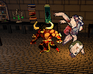
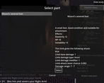
Procedural maps, turn & tile based, procedural player bodies!
Screenshots
Yes
Leave a comment
Log in with itch.io to leave a comment.


Comments
I'm a huge fan of nostalgic games like this and enjoyed it a lot while playing the game. This art style brings me back to my childhood and it is great to see that there are games like this still being developed!
There's a lot of cool stuff here! It's not a finished game of course, but it's very interesting anyway. I really liked reading your devlogs. There were some things in the post mortem that really resonated with me, like being so focused on making the game but not taking the time to interact with the community of other developers. You guys did a much better job than me on that, though, by writing down you thoughts and progress.
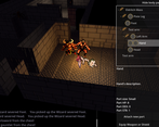
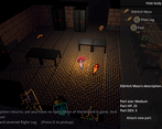
The game has a cool and unique concept and I was impressed by the complexity by the game when I tried it. Being able to piece together your monster bit by bit and seing it reflected in the graphics was really cool. I can imagine making the GUI was a big task :P. I also like the general unsettling vibe of the graphics. The 3D/2D blend is very cool.
I'm sad more things didn't make it into the game, like the music you mentioned in the post mortem entry. Looking forward to seeing where this goes, and to your 7DRL entry next year ;)
Thanks! I'm glad to hear you liked the devlogs. There's a lot of games and not much attention to go around when everyone's so busy. I really want to take the time to play through other's games, though I'm still busy working on an update to the game (the scope of which I fear is already getting too large). Well, your game looks quite stunning, so I'll give that one a go!
Seilburg actually seemed to get the GUI done quite quickly with not much code this time. At least, it was one of the first things he did so it wasn't a worry. Unlike our last few games where the GUI turned into huge time sink (especially for me whenever I tried to help, not understanding what I was doing). As for the title music, I was expecting him to add it to the intro, actually. I think it would have fit.
I'm surprised how well billboarded sprites can work (though I think the treasure chests in isometric perspective are problematic), and think I'll do it again.
Wow, cool to hear that the GUI came together quickly. I'm sure that's down to experience (and skill). I know doing something like that would have taken me a long time :P Making interfaces takes a lot of work! You're using Godot, right? I've only tried it a bit, and I never got around to the UI part, but maybe I should check it the tools to see how it works.
Yeah, the 2D sprites worked great, and I think I forgot to mention that I really liked the contrast with environment having shading and shadows.
Looking forward to the update ;)
The sprites are shaded, actually, but intersting that you thought it contrasted. You can sometimes see a shadow cut across one, which I think is a cool effect. I haven't seen it make them look flat. At one point the sprites also cast shadows, but that looked really bad when they were edge-on to the light source, plus the shadow often didn't connect with their feet, Otherwise, I thought enemies casting shadows looked nice, so I'd like to try adding it back, using a custom "shadow mesh" (turn the sprites towards the light rather than towards the camera to fix the edge-on problem).
Yes, I don't know that there's anything wrong with Godot's GUI features, but I just find it unintuitive because Control nodes are quite different to what I'm used to (the OHRRPGCE) and I need to unlearn!