Indie game storeFree gamesFun gamesHorror games
Game developmentAssetsComics
SalesBundles
Jobs
TagsGame Engines

Does this look the way I think it does?

A topic by TheSneaK created Aug 11, 2020 Views: 281 Replies: 4
Viewing posts 1 to 3

I was wondering if you friendly people could have a look at these screenshots and tell me if it intuitive or not.

It's actually a bit hard to tell if things look to other people the way they look to me.  I know what things are supposed to be, so my brain can't see it critically.


So, I decided to make some buildings you can go inside.

I was wondering what you guys thought of the look of the outside and inside of these buildings.
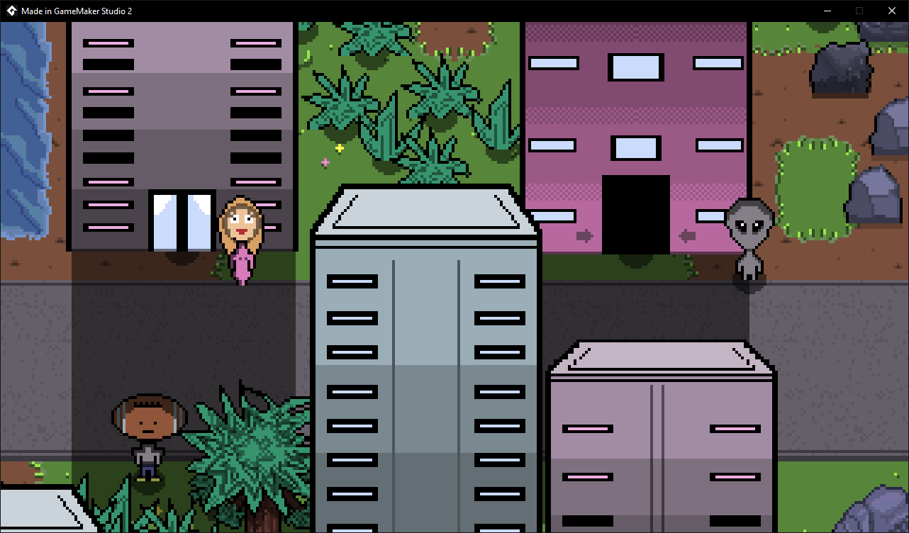
For starters, is it obvious which building you can go inside?

Here is the other store, which has a name on it.  Do you think it might look a bit too out of place with the other buildings?
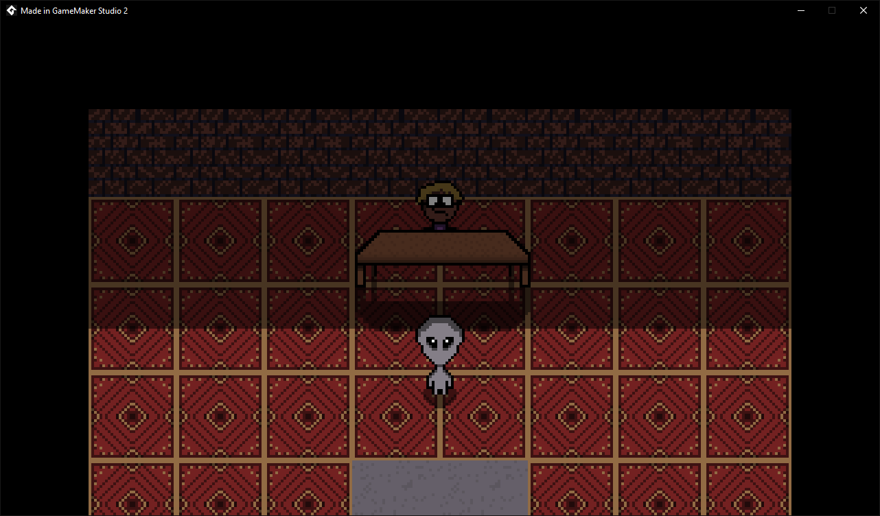
This is the inside of the building from the first screenshot.

It isn't finished yet.  What I would like to know is, is it obvious where the back wall is and where the exit is?
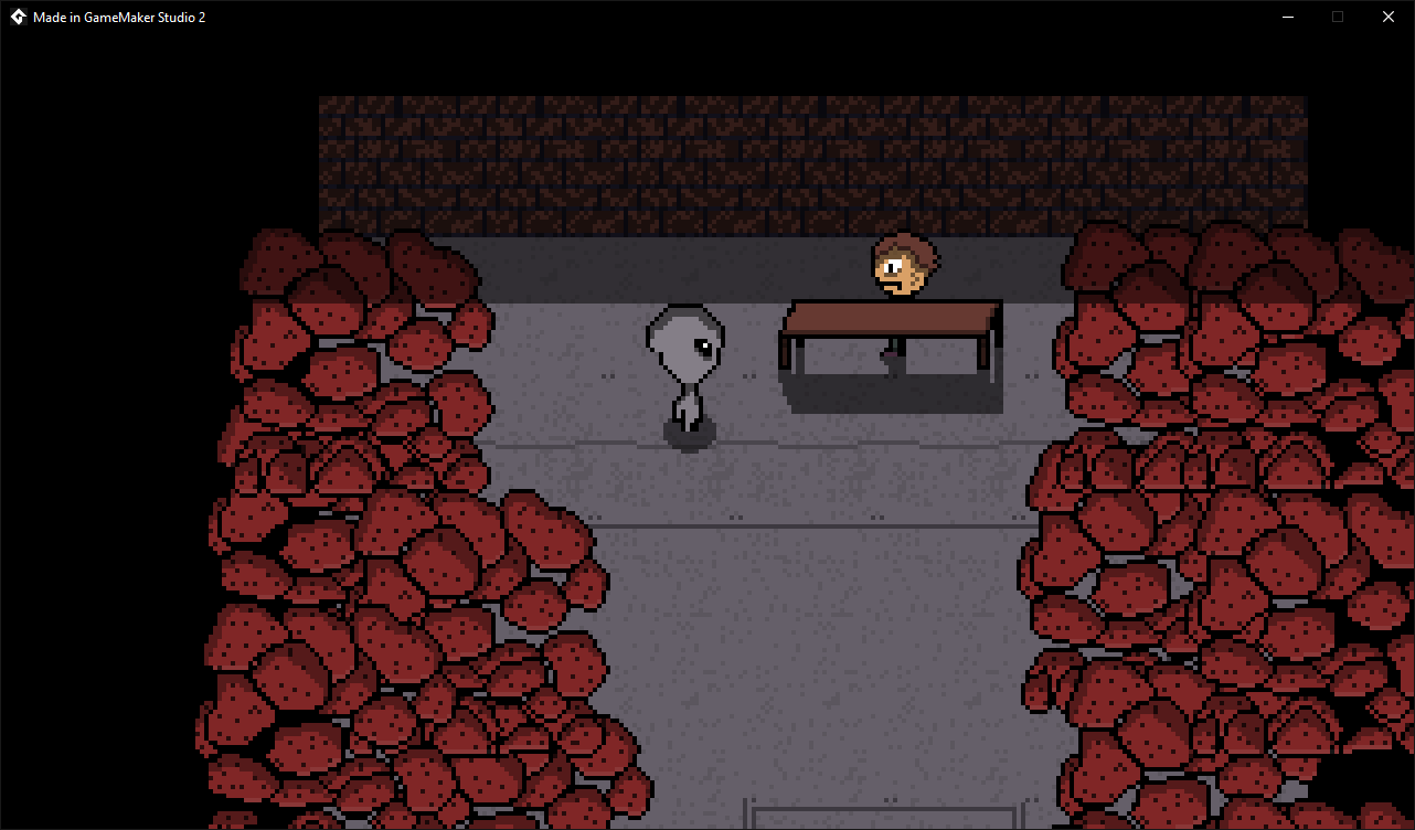
This is inside the mediocre bomb store.  It is ment to look tacky, being "mediocre bombs" and all..

Same as before, is it obvious where the wall is?

Thanks for your help!  :)

(+1)
For starters, is it obvious which building you can go inside?

Not really. Is the top left door an automatic door or a locked door? 

Do you think it might look a bit too out of place with the other buildings?

The "mediocre bombs" building looks out of place but that seems to be intentional.

 What I would like to know is, is it obvious where the back wall is and where the exit is?

Yes, the back wall is on the top of the screen and the exit is on the bottom.

Same as before, is it obvious where the wall is? 

Yes.

Thanks so much!  Very direct and helpful.  :)

(+1)

"For starters, is it obvious which building you can go inside?"

It's obvious that you can go into the door with the arrows pointing towards it. However with the lady standing by the double glass doors some players might think that is an entrance as well. Maybe put a little "Closed" sign across the door to make it more obvious? The arrows pointing to the door entrance should be consistent as well (see 1st and 2nd pics to see what I mean).

"Do you think it might look a bit too out of place with the other buildings?"

No. I would leave it as it is. If you named the other buildings then the names might be a distraction and players might think they should try going into those buildings as well.

"What I would like to know is, is it obvious where the back wall is and where the exit is?"

Looks obvious to me. The assumption is that the player can only get to that screen one way (via the front door), so it makes sense that the only way out is the same way they came in.

"Same as before, is it obvious where the wall is?"

Yes, but I did notice that the wall width is not consistent. The wall in the last pic is a little bit narrower than the wall in the second-to-last pic.

Hope this helps! Looking forward to it!

(+1)

Thanks for taking the time to be so precise with your help!  Appreciate it mate!  :)