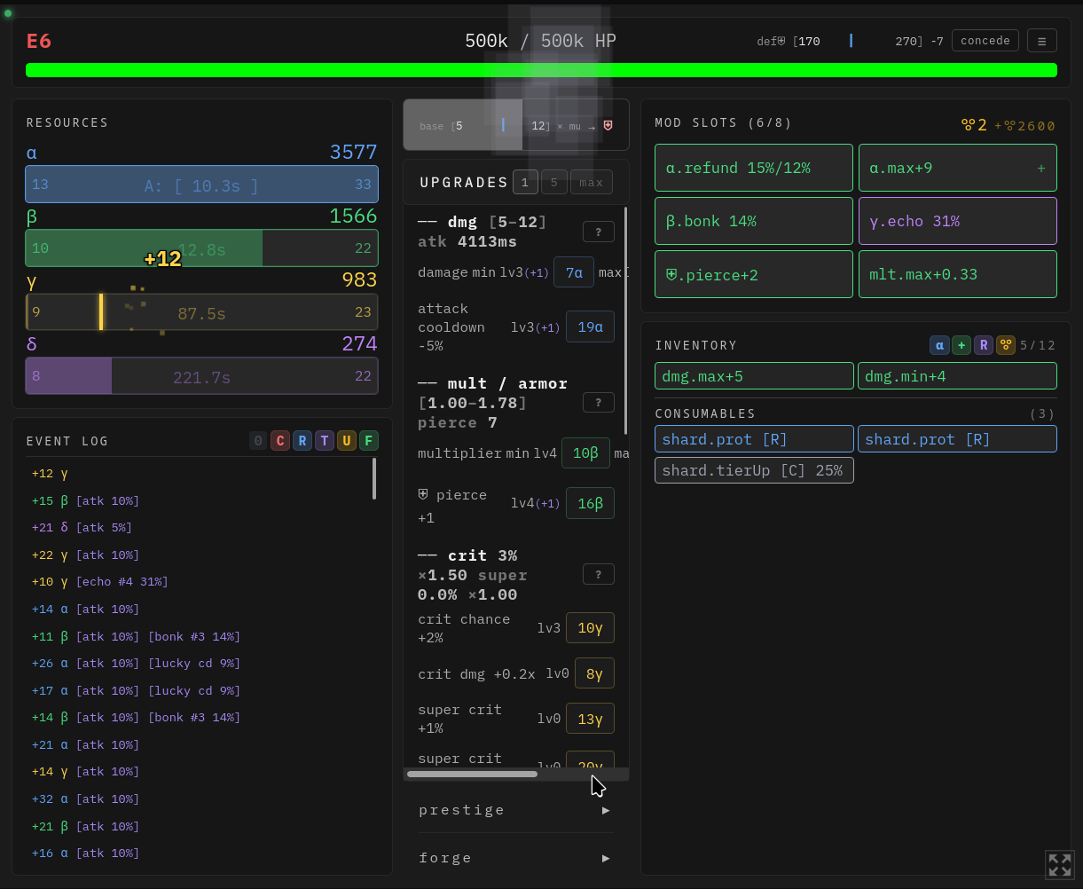
i recommend move mod to the left side with the resources, the upgrades to the right and the event log to the bottom. that way you can see all the upgrades.
Lot of people don't have second monitor to play in full screen so they play it windowed and then the middle buttons for upgrades are super annoying. i recommend atleast option to hide mods/inventory.
Part of my next update will focus on improving mobile responsiveness as well as better support for smaller screens. Thanks for sharing a screenshot to illustrate this


 i hope this helps, going live later today