Indie game storeFree gamesFun gamesHorror games
Game developmentAssetsComics
SalesBundles
Jobs
Tags

Sand: A Superfluous Game

An open world, base-building, adventure survival game with quirky humor and Llamas!​ · By Voided Pixels Studio

Suggestions and Improvements

A topic by Fool created Jun 03, 2019 Views: 579 Replies: 7
Viewing posts 1 to 4
(5 edits)

I want to start out by saying how fantastic this game is Adam, thank you for your wonderful work!

I've wanted a post-apocalyptic base builder for some time. Atom Society looked cool but it just wasn't my thing.

This is something else entirely. So with the spirit of that, I've compiled a list of paper notes while playing, because I enjoyed it so much and would love to see it succeed and have as many others enjoy it as possible too.

Lets get started:

- I'd love if the player just 'popped' through doors (maybe with an accompanying sound of the door slamming). Having to open/close doors as it stands is a little bit difficult, over and over so I just end up leaving them open as it stands.

- Stamina made sense, felt like it had just enough juice in combat, however health bar wasn't immediately obvious to me. I only made the connection between it and my health once I was close to death.

- Fade out during death took too long. Shorten the tween, or use bounce-in/out on the fade, dunno. Something. Could just shorten it.

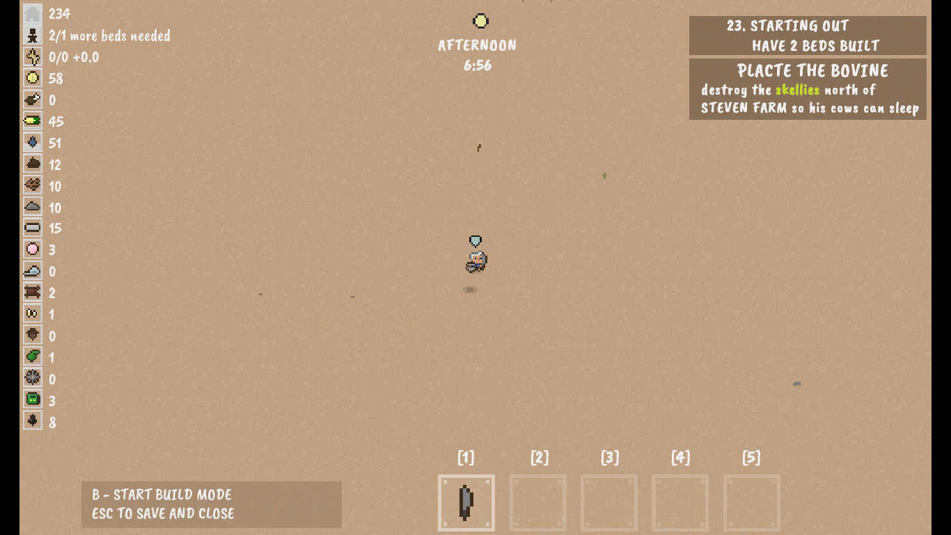
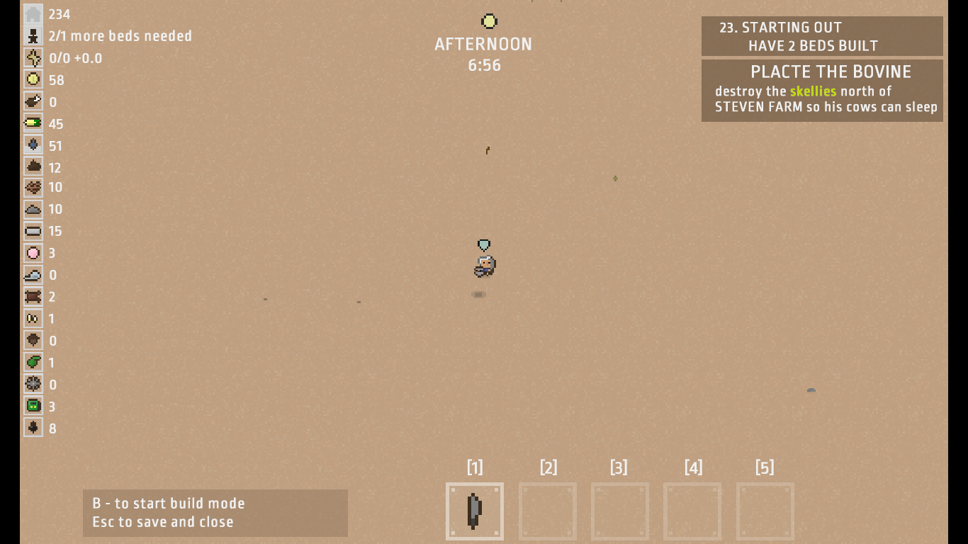
- Font on build menu was painful to read and navigate repeatedly. I went through and looked at font alternatives. I looked at several, including raleway bold and various DIN type fonts (I'm a UI designer) like Barlow. I found a couple that maybe you'd like, or at least ones that appeared to fit the feel of the UI, are legible, free for commercial use, and then did some mockups.


Thats Caveat Brush at a couple different font sizes. It's similar in look to the font used in Terraria, which I've always loved.

Another font os is Capital Darren. It's non-commercial, but the has that all-uppercase feel that seems to fit so it's worth checking it out and looking for similar fonts.

The other font I tried was Ropa Sans..


..which you can find on google fonts, again, open font license, so it's free to use commercially. I don't like how big the clock element 'afternoon' is here, but this was just a quickie to eyeball what it'd look like.

The focus was 1. contrast, 2. legibility, 3. multiple weights, 4. open licensing, 5. matches the 'light and cartoon feel' feel of the pixel art and I think both Caveat Brush and Ropa Sans check most of those boxes.

Other observations:

- There were a few headscratchers about what some of the resources were. Putting names next to them would create an ugly distracting wall of white text on the left of the screen, but maybe put the resource name in a tool tip that pops up when hovered?

- Be sure on each level when you spawn objects that produce resources, that you set a limit for balance. For example, if testing shows that the ideal amount of metal resources on a map is 30, don't spawn more than 30 *objects-worth* of objects bearing metal resources. That makes it easy to diversify the kinds of objects per-resource that are spawned and the amount each type of object spawns, without overdoing it. You'll always know, by drawing on a limited set pool, how much of any given resource will be on any given map.


I have other input but I don't want to flood you.

Thanks again Adam, you've made a cool game. When do my family and I get to play it on the switch?

- J

Edit: I don't know if you meant "PLACATE THE BOVINE" but I chuckled and left it as is in the mockups.

Additionally:

- I thought the metal bars and oil drums were cool. Felt like scavenging in a world hundreds of years old. Like finding the remnants and garbage of civilization lost in the sand.

- A nice progression and goal for the players would be resources that require bigger, better, or sturdier tools. Maybe better tools harvest faster, or harvest more, maybe. 

- The name is hard to spell (though charming!), and i'm not sure if it will survive the google filter because of the spelling issue. Maybe some of us will finally learn to correctly spell 'superfluous'.

- the music gets tiresome after a while, add some silence, or the sound of the wind blowing.

- I think the trees growing and still being dead is hilarious. Don't change it.

- Digging the "Harvest Moon meets Fallout" theme.

- Well need a little sprite work, at least on the small ones. Both the large and small ones are distinctive I just think they could be even better.

- Where are the tumbleweeds? Wheres the crazy plants-vs-zombies-pot-on-head survivor chasing tumbleweeds and chickens? Some say hes still out there to this day, still trying to catch em.

- For sound work go watch "rango" and a play through of New Vegas. Pay attention to the sound effects when you come upon a new location.

- If a well or other object is exhausted give us some sort of indication, maybe darken it or show a small meter as it recharges, or physically have the water level drop.

- The up/down arrows on trade boothes are kind of ambiguous. Do they mean 'sell/buy for more/less'? 

- I can hear chickens from far too far away.

- You know how q/e are used in both the build menu & the crafting menu? Do the same for the trade menu to prevent breaking the player's expectations of the UI.

- The dust falling on screen kind of looks like snow. Is it snow?

- If you want to generate new things on the map, like stones, metal, cacti, etc, just do it when the player travels and arrives to a given location. Alternatively have it fade in as it comes onto screen with a small effect, as if the wind "blew sand off of it, revealing something that was buried", as sometimes happens in deserts.

- The signs on trade booths are hard to read. Try adding the item and amount to the sign tooltip

- Remaining storage space wasn't immediately obvious to me as a new player. Probably could have the remaining space in the form of 'n/m' where 'n' is the current amount of stuff, and 'm' is the total amount you can store so players know, at a glance, when they are running out. Obviously this is in addition to the resource square 'filling up' the way it is now.

- Sleeping or a new day, could be used to show events or survival costs per day. I believe "sheltered" does this (if you you've ever played it).

- I sometimes got stuck in fences and doors when I happened to be walking forward at the same time as I closed them. Once stuck I tried opening and closing them, jumping, etc, but nothing worked until I saved and reloaded the game.

- You know what would be cool? More salvaging from objects like you did with the oil drum and metal bar. It's a big desert world, lots of semi rusted, semi ruined items buried under those sands I bet!

- would love using a dowsing meter or rod to find water deposits. It's an apocalypse, and the lore is water is highly limited. Seems a little too abundant early game.

- making signs and resources legible is extra important if you're focusing on crafting and trading as game mechanics. This is double important if you're even considering porting to other platforms//where an existing legibility issues will become greatly magnified problems.

- if you're gonna let players jump, let them jump over fences or use it to climb things or dodge in combat.

- traders sometimes get stuck in or against trade booths until I go over and remove the items from the booth/switch the item being bought/sold.

I know this is a lot of feedback all at once, but I hope it helps.

I've really enjoyed testing what you've made so far, and I look forward to the full release later on.


Developer

WOW! Yeah those are awesome suggestions.  I will definitively have more things to scavenge. Tumble weeds are something I should have thought of my self duh. Sound system is wonky right now, I think I fixed it (maybe not). Chicken are going to have a purpose besides just food. I think you'll like it :) Monster and enemies need some work. I only have a few and I haven't spent too much time developing them. Those things should come in time. Have to have 'rad' roaches and sand worms right? My development on this game is kind of all over the place haha. I've never released a game in an alpha state so I am really just experimenting right now on what works and what doesn't and you guys get to see my spastic side :). Once I lock down the direction of everything then I can start pumping out content and have an actual game plan. All these are excellent suggestions and observations The font and UI is something I struggle with, which is why I wanted to do most in game without many menus.

(+1)

I really like that you released it alpha. A lot of 'early release' games and 'alpha' games get a bad rap and I think some of it is deserved, but a lot more of that reputation is from people jumping on the ea/alpha band wagon not understanding what they are getting into.

But for us, for people who buy alpha games and are comfortable with 'forever in ea/alpha/etc' thats part of the appeal, being able to comment on development direction.

It's really a big leap. I know releasing something unfinished to the outrage mob of the internet can seem like a trial by fire, so thanks for doing it anyway.

Obvious things like tumbleweeds aren't always obvious when you're coding and designing for a dozen other priorities. Can we get giant mutant chickens, like as pack animals (I loved the chocobos in final fantasy, and every kid I've met find chickens adorable for some damn reason). 

For worms I'd call them 'giant weevils' or 'annelids' or 'nematodes.' For some reason I can't stop thinking about the monsters from that campy horror movie series 'tremors.'

If you have giant roaches I'd call them "regular roaches", and in the description it'd be "just a regular size everyday roach." because why not? Everythings mutant and giant these days, thats people's new normal, it's all they know. Some tinpot crazy NPC could be like "could you imagine? Tiny little roaches? Like bite sized ones?" and you or another character might reply. "Thats absurd. This guys crazy." lol

The UI direction you took is good. You look at games like Metro Exodus and a lot of the focus is away from UI, lot of mixed fonts, and environmental indicators where possible, instead of upfront UI. A lot of things are ambiguous. Whos an enemy, whos hostile, what the place you are in is named. It's why your overworld map is so fantastic, because sure, you're in alaska, but it could be *anyway*. I remember watching early movies like six string samurai and thunderdome and loving the feeling of being 'lost' in the world that was presented. Being short on UI really helps to focus on the world in front of you and the immersion. Just, like a said, be sure to pay attention to legibility, theres been a lot of great games (and okay games) with horrible UI and font design that people didn't notice but thats no guarantee.

(+1)

Wanted to jump on this suggestions thread. Really fun game, it keeps your attention while at the same time its something that's easy to drop/pickup.

A few thoughts (and maybe these are implemented, and I just can't figure out the controls):

- Zoom In/Out feature OR map  - It's kind of hard to figure out where you want to go with such a limited view. I don't know if a zoom-out would break the risk w/ enemies, but at the very least a map  local to each sector of your structures/keypoints could be added.

- The ability to pause the game - It kinda sucks when I just want to pause the game and swap to a chat window or  work and the game continues in the background. 

- Build by region, rather than square by square (this may be in the automation section, I'm new to the game)

Seconded on the auto doors/gates & resource labels. I locked myself in with the robot (i shrunk his room) and had to demolish the door hahaha

Thanks for the cool game!

Oh god yeah, zoom in/out is badly needed. It doesn't even need to be by a lot. Just 2-3 levels of zoom. Standard, close up, and zoomed out.

Minimap would probably break the sense of exploration (players in practice tend to focus too much on the minimap), so adding a zoom balanced to area size will largely negate the need for it.

Could you elaborate on the build-by-region PE?

(+1)

I'll jump on the suggestion train (awesome work so far btw)

  • Controller support :) Not an easy thing to figure out, with how building works.  But there are a lot of repetitive tasks (harvesting for example). Controllers are just a bit more comfortable IMO. 
  • Someone mentioned pause not pausing really. Died a couple times now :(
  • I always liked the "interact-suck" in games like Don't starve. If I hit E, move me to the closest thing to interact. Again, a less button press thing :)

My suggestions are mostly usability it seems. As far as gameplay, I think you are on your way to building something really neat. I really enjoy finding little "dungeons" to fight and loot at. The missions are great too. Keep it up!!

Yep, interact-suck works good for that button masher dopamine hit from the fine grained low level tight cycle between button press and interaction.

It's why clicker games are so terrible and addictive and fun..and terrible. They hit the sweet spot for Don't Starve. That game had some other issues of course but the interactions weren't on that list.