
Indie game storeFree gamesFun gamesHorror games
Game developmentAssetsComics
SalesBundles
Jobs
TagsGame Engines
0

DUNGEON.mode : roguelike-inspired textmode font / tileset

A topic by datagoblin created Mar 27, 2025 Views: 206 Replies: 4
Viewing posts 1 to 2
(2 edits)
DUNGEON.mode

https://datagoblin.itch.io/dungeonmode

DUNGEON.mode is retro textmode font/tileset inspired by old-school roguelikes and dungeon crawlers. Free and CC0!

It's packed with hundreds of glyphs for composing scenes and illustrations, in a typeface designed to invoke the look & feel of retro terminal fonts, but with a fantasy dungeon crawler spin to it.

The font comes in two variants:

dungeon-437 : DOS-like code page 437 compliant


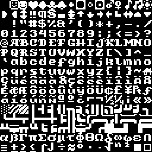
dungeon-mode : textmode-focused chars & tiles
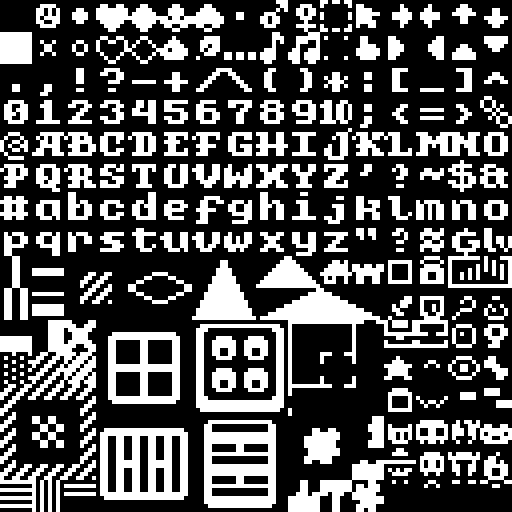


FEATURES:

  • 8x8 pixels
  • 256 glyphs per variant
  • full extended ASCII support


FORMATS:

  • .png bitmap textures
  • .ttf font + inverted variant
  • Playscii .char font & example scene
  • REXPaint .xt font & example scene
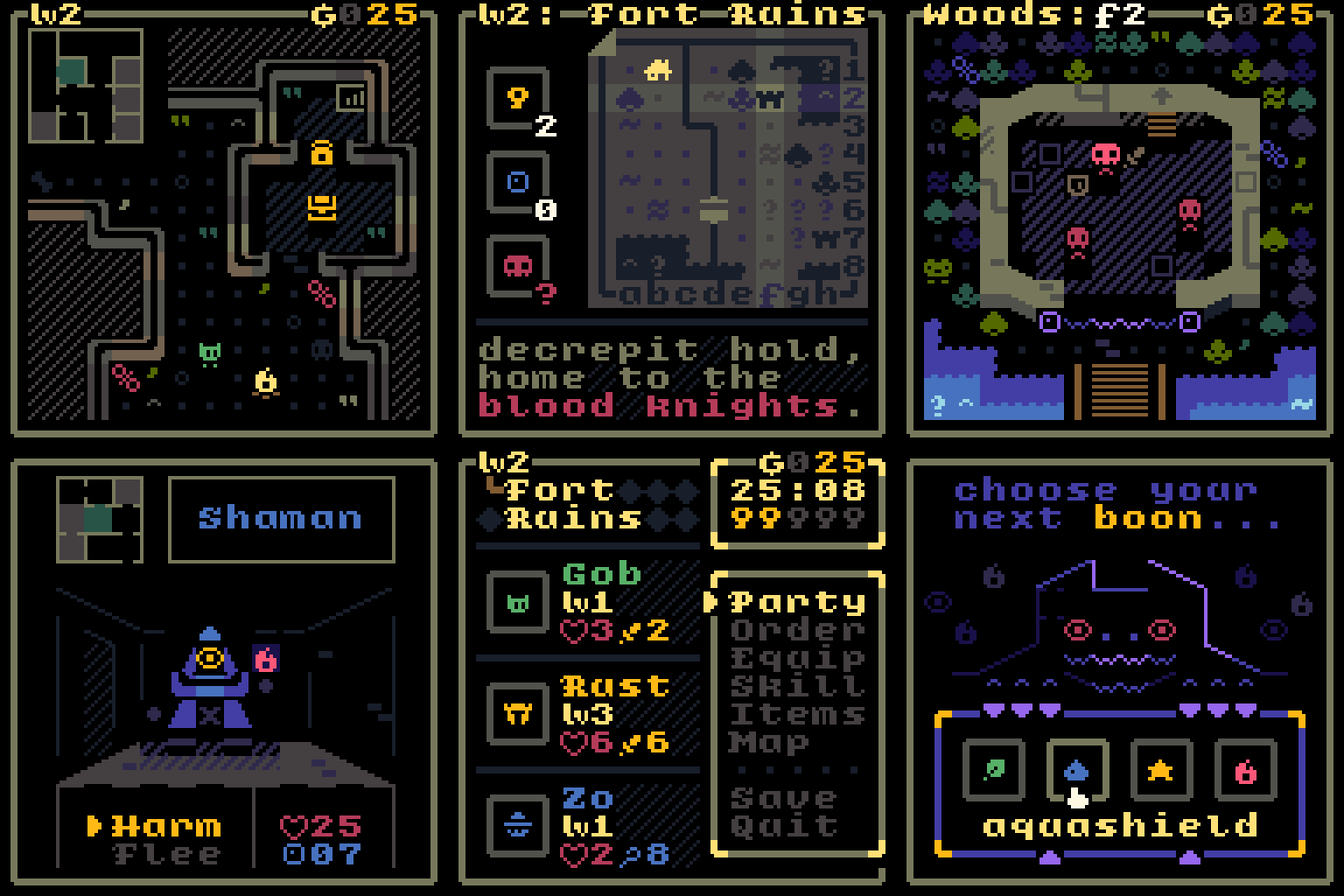

EXAMPLES:


Frickin' beautiful...  the mockups really sell it too. Although I really don't like the CRT effect on the project page, to me it takes away from appreciating the font itself and doesn't look consistent with other parts of the page.

Hm, I see what you mean. I've been developing this CRT shader alongside the font, so I guess I got used to seeing these scenes through the filter, but I do see how it might be distracting when the focus of the page should be the font.

Do you think a transition gif showing the scenes both with and without the effect would work better? Something like this:

https://bsky.app/profile/did:plc:3mvae5lbs4seeds4g355muhm/post/3lkvjybqzvs2j

(Sorry for the social media link, all I have is an mp4 of the transition and I can't seem to embed it here)

In any case, thank you for your comment! I hope you enjoy the font!

Hmm... honestly that makes it seem even more like the CRT filter is the focus. It's really not a big deal since the description side is "unfiltered" and besides being written in the font itself, includes a mockup as well (selectable, neat!). I was thinking more along the lines of just including at least some of the plain example images as seen here

Oh, yeah, I wanted to make that little mockup selectable so that people unfamiliar with textmode would have a tactile example of what it is.

Butregardless, I do think you have a point. I'll swap some of the screenshots for the unfiltered version later today. 

Thanks for the thoughtful feedback!