Indie game storeFree gamesFun gamesHorror games
Game developmentAssetsComics
SalesBundles
Jobs
TagsGame Engines

How do these pieces of character artwork for my untitled game look?

A topic by DiamondCore created Oct 25, 2023 Views: 412 Replies: 10
Viewing posts 1 to 2
(1 edit)

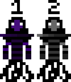
I've been starting to plan out what exactly i want my first commercial game to be (so far i am thinking of combining precision platforming and metroidvanias but that's not relevant to the current subject) and using aseprite and a bit of inspiration from Celeste, i've made some artwork for my Protagonist and some artwork for the Antagonist (which i will likely alter the proportions of)

How do they look? Is the players scarf a good enough standout feature of the character, or should i do something else? And does the antagonist look better in grayscale or purple?

Note: These characters are limited to 1 color, like the protagonist can only have a red palette ranging from White, Dark-Light Red and Black
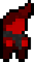

PROTAGONIST

ANTAGONIST (The bottom looks weird but it makes sense when animated)


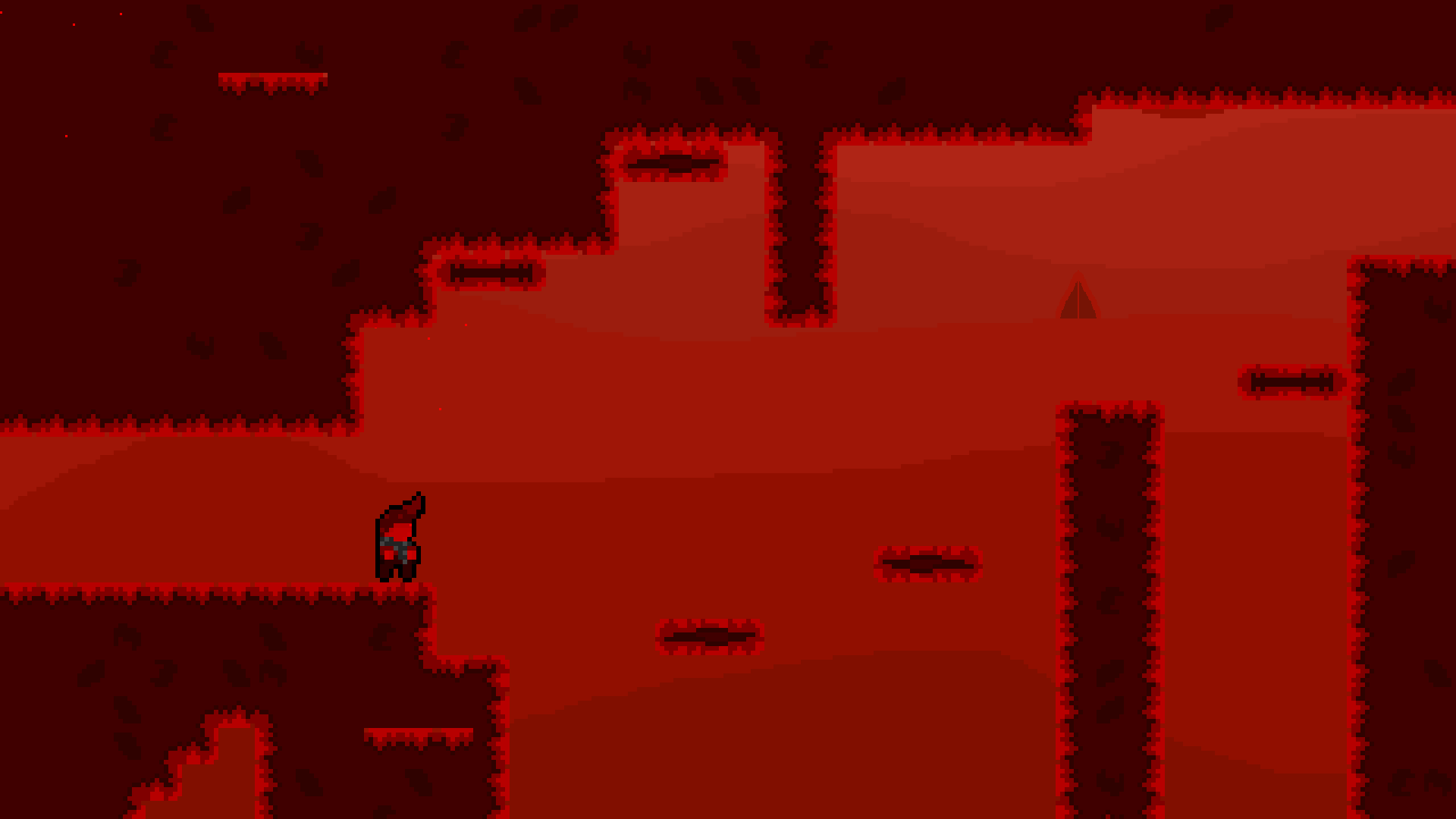
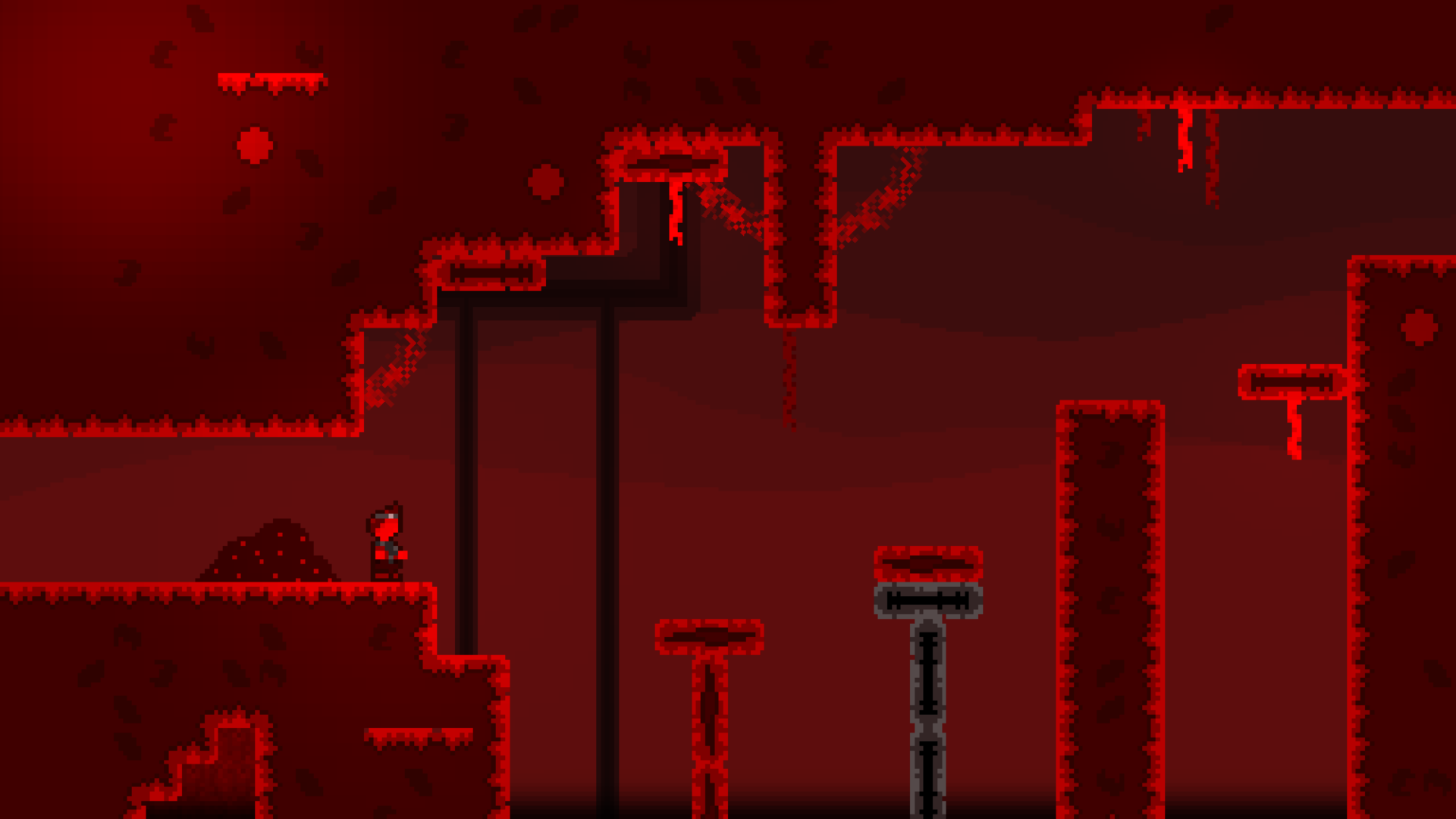
Edit: I also would like some feedback on how this screenshot looks! Its a piece of concept art for what the game could roughly look like (missing stuff like bloom and some additional art elements right now)
How does the background look, and how does the art of the ground look?
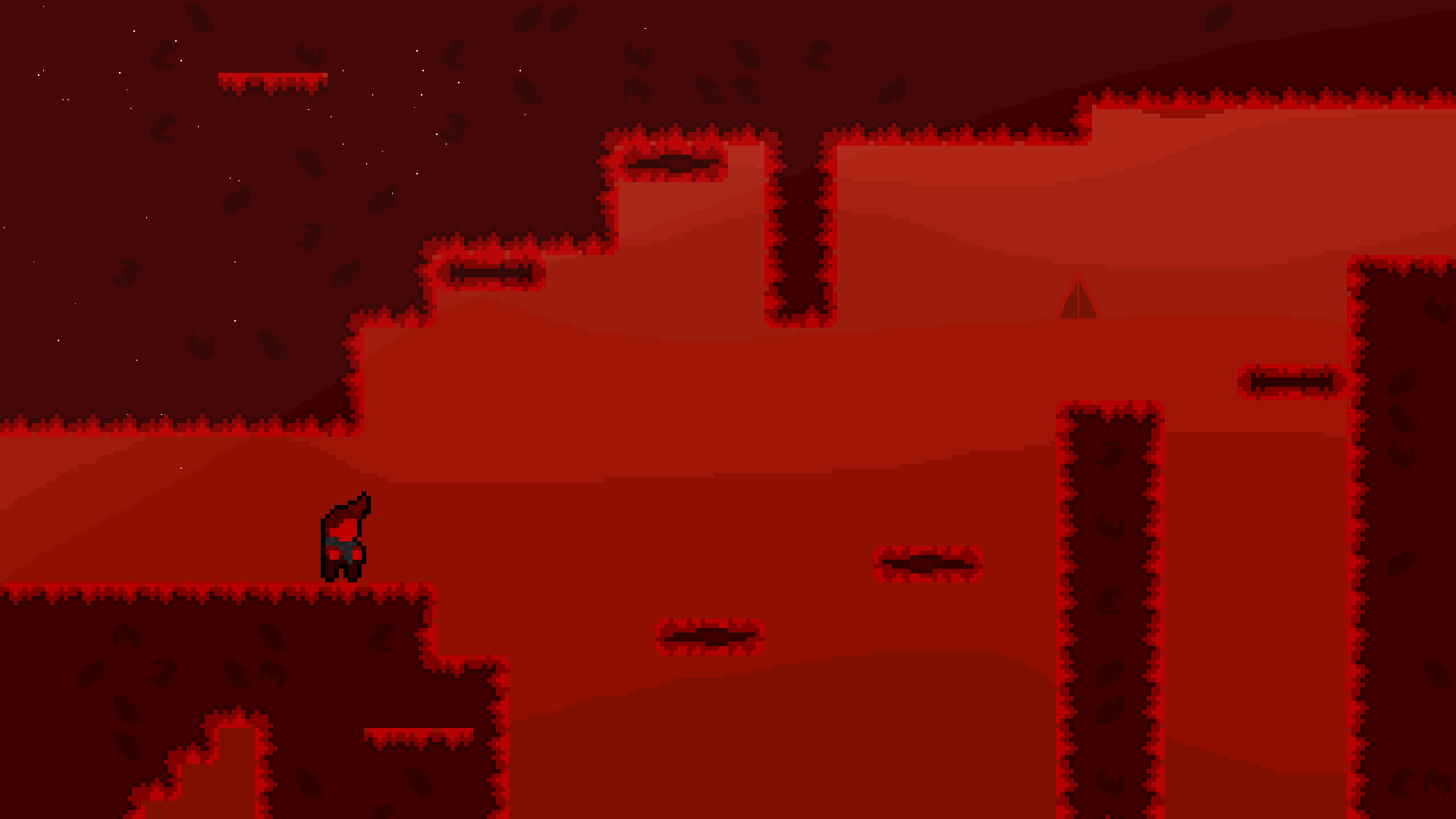
Is there any special reason to use reddish color on all elements of the game?

Also, I get impression that both protagonist and antagonist are less detailed than the walls and platforms.

(1 edit)

Im not using the red color throughout the entirety of my game, im swapping between single-color palettes for each world of my game

In a very simple nutshell, the game is about traveling 6 kingdoms each with a unique, identifiable color (red, blue, purple, etc) while doing precise platforming and adventuring some cities between the platforming

The protagonist is from the “red” kingdom, so his design is only capable of using the red palette, and later on he’ll meet people from other kingdoms like a blue character from the “blue” kingdom.

(Also, just to clarify: the protagonist doesn’t swap into a blue palette when entering something like the blue kingdom, he keeps his red palette regardless of where he is)


Also yeah, I think the character needs more apparent detail too.


I changed the protagonists' sprite a bit to make some more detail apparent, and i also made the main empty face less big

I like the direction the concept art is going, and the updated screenshot of the level: looks like you are in a deep furnace (OwlBoy's The Floating Continent - Lava music comes to mind lol)

The outline helps, but it seems like you are using a ton of colors in your sprite work for him. While I think it does look good, I've heard advice floating out there to not go crazy with all these different shades of color. I think the underlying principle (at least my rationale) is that it makes working quickly more difficult.

eg. Imagining you have to now make individual sprites for the run animation or jump animation. It's gonna be really tough to produce all of them at the same granular detail. And making quick updates will take time. I imagine starting simpler will be better for iteration.

Just saying, I'd love to see an idle animation and the tiles glow too 👀

(1 edit)

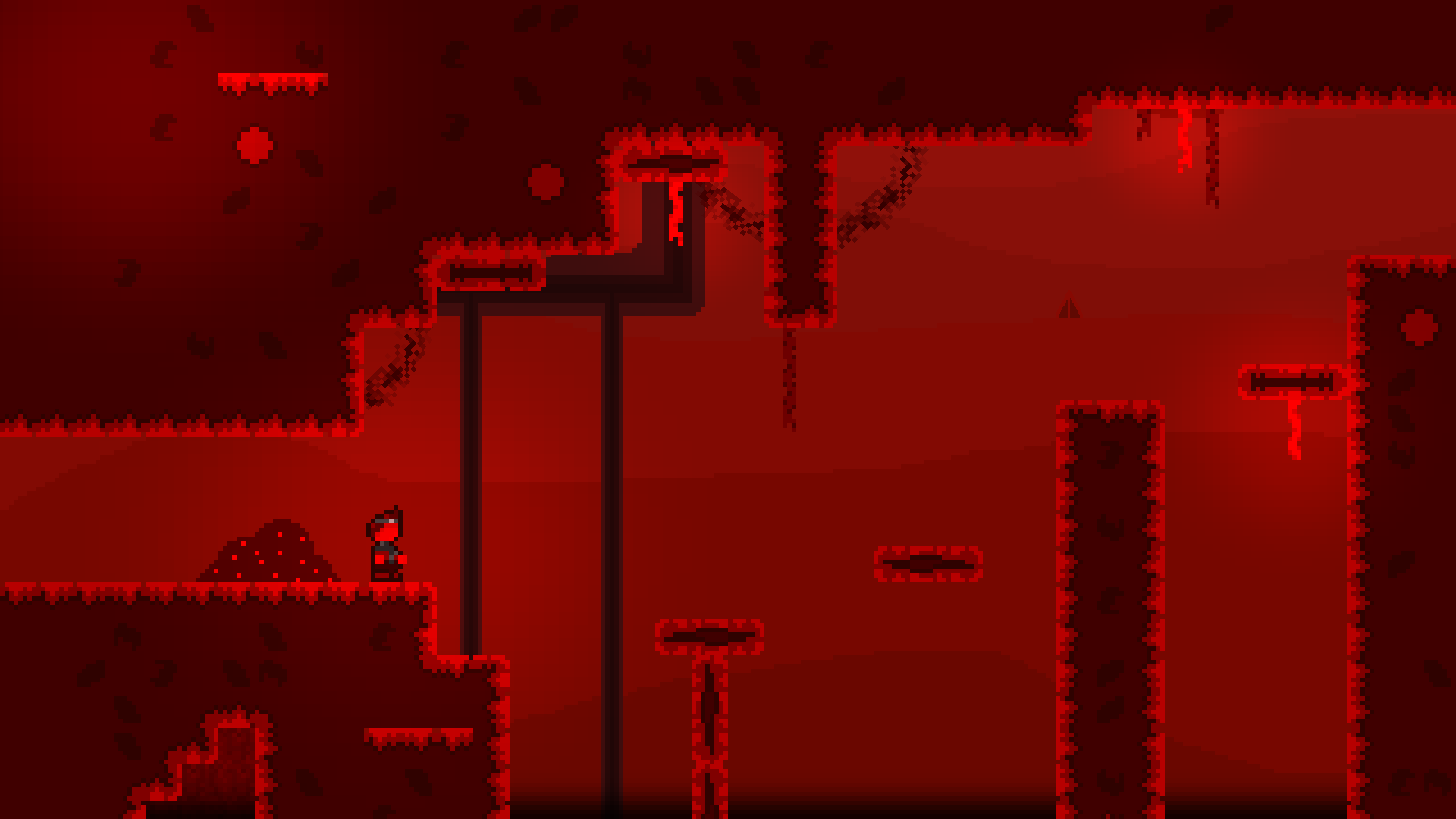
This post shows quite outdated versions of the sprite and layout xD

Here's a new version that has glow, a new character sprite, and more!

(Note: Sprite in image is at a transitioning frame in the Idle animation, so it looks a little off from what the main frame of the idle animation is.)


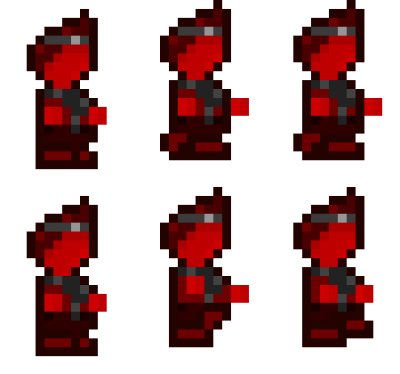
Also, here's the run animation!

Also, the more complex sprite shouldn't be an issue, the way I have my workflow set-up allows for easy and quick changes to be made!


Thanks for the Feedback!

Nice stuff, did you make all this cause I asked about it?! Would be really cool if you did, just saying. 🙂

I like the glow, the run looks more like a prance through the meadow. Is that intentional?

No, i just made the changes myself really, with a bit of tweaking here and there via input from select people


As for the run, it kind of is, but i also dont really like it that much, so i may redo it.

So right now, consider it a serviceable placeholder

(+1)

Hahah, serviceable placeholder it is! Looking forwarding to seeing the next rendition, and your other levels. 🔥

Would like to see these levels move and stuff like that.

Thanks!

Actually, no need to wait because my next rendition of the concept art is done :P


I made a completely new BG that is darker this time, and also made some of the for-visual assets near the top of the screen lighter, and i think it helps with the atmosphere a lot!

I'll see if I can send a gif of the level moving later, not sure if I will be able to actually do it though