Indie game storeFree gamesFun gamesHorror games
Game developmentAssetsComics
SalesBundles
Jobs
Tags

Need help and advices for improving graphics of my game

A topic by BlueFlameGames created Jul 30, 2023 Views: 230 Replies: 7
Viewing posts 1 to 5
(+1)

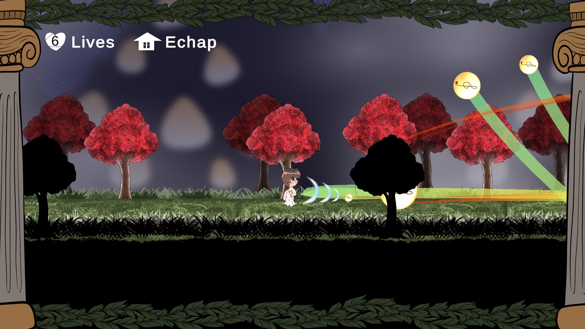
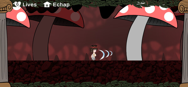
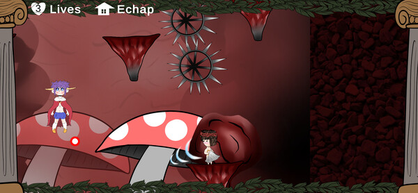
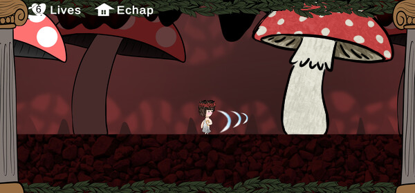
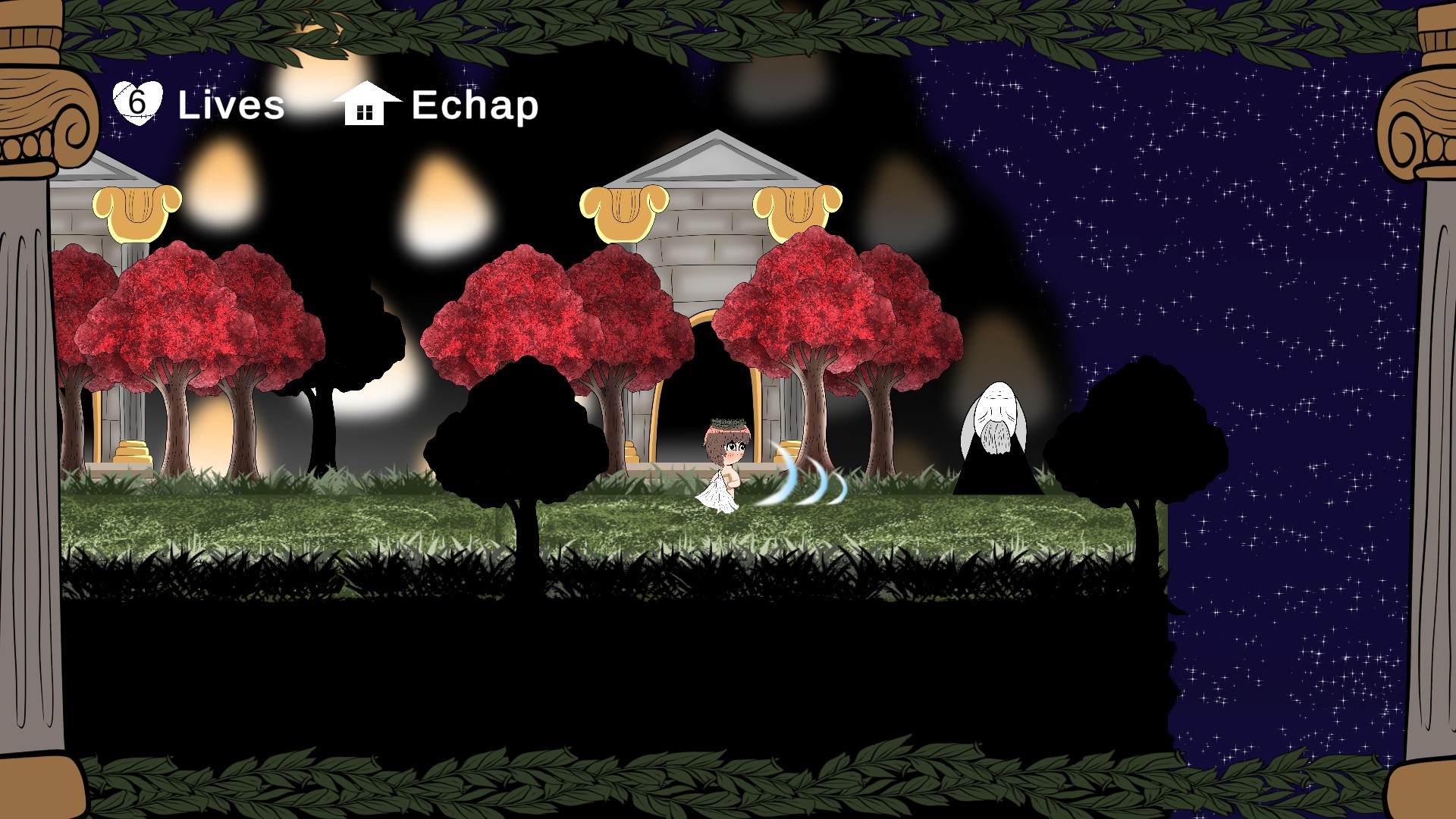
Hello, I will soon release my first game on Steam, gameplay is good but I would like to improve the graphics and replace some elements, I know that the backgrounds need to be a little more uniform. Do you have any suggestions to improve the graphics by redesigning the different elements of the background.  I would like to improve the grass ground, the trees, the mountains in the background and especially the level of the cave (in red) the one that has the most to change for me, especially compared to the ground of the cave but I was thinking about how to do it (if you have any suggestions for the UI, please feel free)

Thank you for reading

(+2)

The first thing I notice is that the trees have much more detailed textures than the mushrooms. I'd add some texture to the muhsrooms to match the rest of the art style, plus give the mushroom more... volume? If that's the right word. Mainly the mushroom cap. I made a quick sketch to illustrate what I mean: 

And for the night sky, I'd add more stars to fill out the blue space, but make them more spread out than the stars you already have.

In any case, I think you got a pretty nice style going. :) I like the way you've mixed 2D and 3d! (Personally, I think the grass looks good.)

(+2)

thanks you for your comment :) i take note

Unlike Eko Dev, I don't really like the mix of 2D and 3D. I'd say stick to one (so of course this is personal taste). 

I'd also change the two pillars you have on the side to rendered 3D images, rather than 2D.

I found the perspective odd - the buildings are taller than the trees but it appears to be single-storey buildings.

You can also break-up your night sky by including some clouds.

(+1)

I would suggest having everything be the same art style as the giant mushrooms.

thanks you :)

(+1)

I might echo the words of a couple of people above such that it helps to make everything feel the same artistic style. But that style can be in whatever form. Consistency is key! As such, it's important to choose something where the amount of work you'll have to do to accomplish that takes less effort. 

From my own experience from playing around with placing textures, people's eyes need to see slight variations; even if their brain doesn't see them.

A couple of ways to do this is to:
Generate a bunch of patterns with the same general look and reference each variation of art asset for each object of that type
Introduce some irregularity to a repeating pattern with sprite masks and/or translucent pixels (that is — colours with alpha-channel values to let you see through them).

thanks you :)