Indie game storeFree gamesFun gamesHorror games
Game developmentAssetsComics
SalesBundles
Jobs
TagsGame Engines

Looking for feedback on my engines itch page and list of screenshots

A topic by Yana created May 02, 2023 Views: 247 Replies: 4
Viewing posts 1 to 3


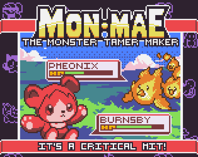
Click the image above or the link below^^
https://yanako-rpgs.itch.io/yanas-montamer-maker

I'm looking for feedback on my engines itch page. I'm worried if I have too much, or too little information or screenshots, or if the text/images aren't organized very well. Additionally I'm not sure if I should list the YouTube tutorial videos (or maybe I should list only the first 3)? Also curious how people feel about the embeds/widgets at the bottom of the page, is it organized well? Does it look professional? is there too many?

Any feedback would be greatly appreciated, I'm still learning a lot about itch and want to maximize my itch coverage and also make sure my products pages are as easy to understand as possible!

(1 edit) (+1)

Hmm.. In my own subjective opinion, your Engines page seems cluttered, has multiple redundant elements, and has clashing contrasts. To name a few:

-You link to your tutorial series four times. Once is enough, and you can embed the playlist in the screenshots section at the top starting with the trailer.
-You have multiple screenshots embedded in your description text section, and in the screenshot section. Try to keep screenshots/videos in the screenshot section only (the exception may be your free starters pack promotion on discord). The talking avatar images may be fine in moderation.
-Too many screenshots. Curate which ones best represent the capabilities of your engine, you don't need multiples that show essentially the same thing. Less is more. You may also not need the soundtrack or Starter's Pack 1 in the screenshots section if they aren't actually part of the bundle.
-The contrast with the animated images on either side of the page are bright enough to interfere with the more subdued darker color's of the central page. Consider applying a mask and dimming the brightness of those by 50% to draw more focus to the central page.
-I'm not sure you need a disclaimers section. Is there any particular risk for data loss that's greater than any other tool? If itch.io doesn't offer refund's, you may not need to repeat that, people can just check itch's payment policies.
-You can have the licensing section title be the same as the other white titles aligned to the left. Also, instead of embedding all the tileset buy links included in the bundle, just add the bottom text: "The assets above are included with your purchase of MonMae, and when purchased individually from the links, include licenses that allow use in any engine.", into the license section.
-Don't link to, or mention G2A. Its notoriously associated with key scalping, and your cross promoting a different platform. Leave it to your customers to find their own purchasing solutions for GameMaker.
-Your current dependency on GameMaker isn't clearly included in your promotional materials, as seems to be mentioned by others in your comments. You may want to mention that earlier in/throughout your description/title image to clear up any confusion.

Feel free to take any of this with a pinch/pound of salt.

Thank you very very much for the detailed response :) I will assess and improve it as much as possible!

Hey! I updated the page and I'm pretty happy with it now :) I think it's much more efficient and a better use of the space, a few of the things you mentioned I was already aware of but a couple were great ideas!! I still have a couple more things I need to do but I need a little more time to prepare those.

Do you mind checking it out again and letting me know if you think it's better? I'm also curious if you think I still have too many screenshots, whether or not I should delete or change any of them, and also if you think the use of the red bear multiple times is redundant (should I use different monsters in every screenshot?)

Thank you again so much!! Link for convenience:
https://yanako-rpgs.itch.io/yanas-montamer-maker

(+1)

it looks pretty interesting to me, it feels a bit dense though like at a glance it looks like a lot of information to take in. perhaps space out the paragraphs a little more. otherwise it looks pretty cool.