I agree, could use something there. This might be a good font for the titles: https://www.dafont.com/capture-it.font?l[]=10&l[]=1&text=LORE
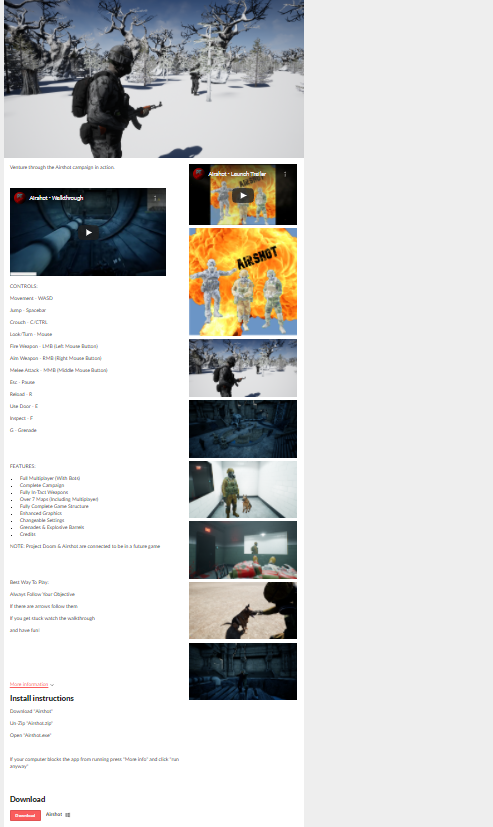
I think the number of pictures you have is really good. I would say that the repeated pictures (the ones in the "main body" that also appear in the screenshot column) don't add anything, since they're repeats. I would remove them from the screenshot column.
Also, having red text (your "more information" section has this, along with all of the tags inside it) on top of a green background is kind of hard to read / can cause eye strain. Desaturating the green or the red (or changing the red to a black or dark grey like the rest of the text on the page) would be a good way to work around this!