
Colorblindness is more usual than one could think, about 1 in 20 people have it to some degree. Games should always be designed to be accesible, but how can one do it when emulating a retro aesthetic, where both the color palette and resolution are very limited?
Enter "shaders"... Yes, I know, I know. A few months ago I had no idea what those were too, they seemed like this crazy complex visual thing that only run in the highest end GPUs and was useful for AAA games. But the truth is, they can easily be applied to retro games too! A shader is, in plain terms, just a program for the GPU. The same way you write (or use a program that writes) code for your player movement, enemy ai, an so on, a shader tells the GPU how to put images on the screen. Most of your games already use shaders even if you never heard of it! This all sounds great, but why should you care about them for a simple retro game?
Usually when you make a retro game, you choose a small color palette, the original GameBoy, for example only had 4 colors plus clear!
You can very much take those colors, put them into your pixel art program of choice, and start making sprites. That is very easy and fast, and a good solution most of the times. However, if you then want to change the color through code, it is going to be restricted to the most basic operations, like hue-shift. And you may not be colorblind, but it is not hard to see (no pun intended) that some people might have trouble distinguishing those four colors. Now let's try something a little bit different. Instead of coloring your sprites with those colors, do it using a grayscale code. This is taken from my GMTK 2021 jam entry, vogue.

This definitely doesn't look that awesome, but here is where the magic begins. In your code you can write (or use those beautiful shader graph programs most engines come with) what's called a "fragment shader". This takes every pixel in the screen (not exactly, but the details are beyond the point) and applies some rules. Usually it just outputs the color of the texture that should be there, in this case, a shade of gray. I will post some code for a GLSL shader (for OpenGL) but please keep in mind this is a method that can be done in any language or engine, and there are tools to help!
uniform sampler2D tex;
uniform sampler2D palette;
uniform float palette_index;
//Sample color from texture (the grayscale one)
color = texture(tex, uv);
//Compute the luminance (*)
float luminance = (color.r + color.g + color.b) / 3.0;
//Apply the palette texture
color = texture(palette, vec2(luminance, palette_index));
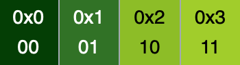
Ok, phew. I know that may be a lot to take in, but I'll explain it step by step. The first lines are three variables that we pass to the GPU. "tex" is the sprite we want to draw. We will leave the "palette_index" for later, but "palette" is the palette texture. For example, this is the one I used:

Now for the actual code. First, we take the color that corresponds to this pixel on the screen (with the coordinates "uv"). Then, we calculate the luminance. Since this is a grayscale image, all three RGB components of the color are going to be equal, but I like to do it this way because you can add a colored image too and it will take the mean of the three values. Whichever way you go, now you have the luminance of the pixel, and that can act as an index for the palette. It already goes from 0 to 1 (Colors in GLSL are from 0 to 1, not from 0 to 255), so it can perfectly map into the palette. For example, if the luminance was 0.7, it will fall about here:

Now we just need to take that color and apply it to the pixel, and we have a palette!! And in a few lines of code we can go from this to this:
Ok, you may be wondering, why go through that effort, even if it is not much, to get the same result. Well, this has more than a few advantages. For example, you can get easy lighting and make it look nice simply adjusting that luminance value we calculated before, and it clamps it to the palette colors.
However, let's get back on track. Designing with colorblindness in mind. There is more than one type of colorblindness, so having an adaptive palette can help you accommodate the differences in your players.


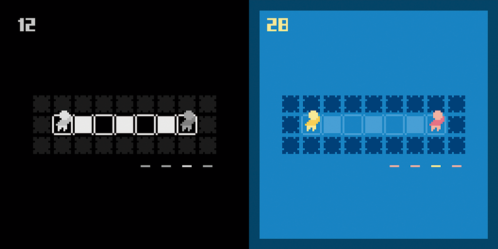
Additionally, you need to make it easy for users to change the color palette. If your user doesn't see the game, they won't be able to search through buried menus. Here is how the high contrast mode looks in vogue:
It definitely can be improved upon, but it showcases all the techniques we learned today. As you can see, making your games accessible is not as daunting as it might seem, specially with the modern tools that pop every day. Shaders might be great for AAA games, but they also can make you game look nicer and reach more people!
I hope you had a good time and learned something, I tried to explain everything as clear as I could, but I'm still learning every day so please, if there is anything that needs correcting, message me and I'll fix it right away. Thank you so much for your time and have a beautiful day! ✨