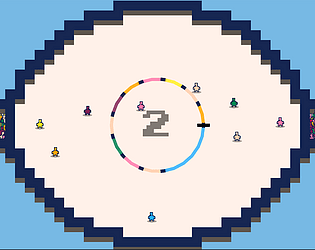
Hey! I finally got to play it! Awesome job :D Big fan of PICO-8 in general. I enjoyed the gameplay - you had nothing to fear with it being polished, this is a banger of a game base already. I've hit the follow button, so if you ever revisit it down the line, I'll be ready to play again :)
Zombrodo
Creator of
Recent community posts
I like the idea too! The atmosphere, dunno if intentional or not, was one of loneliness as I went through and clicked across multiple stars. I agree though, to improve it would be less clicking, more just scanning the sky with your telescope, and getting a hot/cold noise, similar to how the Signalscope works in Outer Wilds
I like it, I enjoy the lighting effects, great job!
One piece of feedback could be how unforgiving the collisions are with the blue squares. There were a couple times where I would be on safe ground, and a few pixels of the rectangle would be on the blue squares, instantly resetting me. Perhaps this by design, and I'm just a big baby, but could have been neat if there were, say, 1px or something. I dunno.
I also agree that failures were a bit sudden.
Overall, good work :)
I got a hearty chuckle out of this one, I share much of the sentiment of the others. I've also recently rewatched Office Space, so I got the vibes from that. Pachelbel's Canon also seems oddly cathartic to hear while beating printers.
The feedback I'm gonna give is pedantic, I dont' want it to go amiss that I think this is wonderful!
The first minigame, I'll call it the Long Jump one, I seemed to reach 100m, then rubberband backwards - I couldn't really tell what had happened, but on one go, I seemed to be flung from 100m back to 8 (I think it recorded the max length, anywho)
The volcano one was almost too easy, I just had to click on the right segment five times in a row - perhaps if the optimum point shifted ever so slightly, or something?
The last one was wonderful. Although, if I ever hear "AUH-MAZING" from now, I'm just gonna think of beating up printers.
Great job!
I watched the discord when you first came up with this mechanic, and I've been interested to give it a go since! Great job :) I agree with everyone in that the concept is really cool, but I think some added touches here and there could make it easier - for example some extra sound component for when you're closer to certain things. Definitely need the rulers, before I turned those on, I definitely felt like a Bat in Hell, not knowing where to go!
Great job :)
Thanks for the comment! And yeah, there were so many different avenues I couldn't explore in the time allotted, but would like to in the future - for example, each slice is one toon, however you can have multiple toons with the same colour, so you'd have to remember, say, which green toon was moving next. I wanted to see if that, or the idea that all green move on their tick would work better, or if there were powerups to slow down the clock, etc.
Great comment on agency, though. I think if I build this out, perhaps multiple game modes? Certain powerups? Different types of player? All things to explore when you have the time to build it out.
Thanks for giving me stuff to think about, and glad you played :)
Haha! I got some good nostalgia outta this one. Reminded me of some of the roadtrips with my Dad where I'd be in charge of getting him snacks, making sure there was always a CD playing - so hilariously, this was very wholesome... right down to Dad being mad he didn't get his Licorice
I'll admit, I didn't read the itch page right off the bat, so I was rather confused why Dad got mad at me, but after reading the description, I was away laughing. If you had a little more time, maybe a couple indicators the first time around to show the player what Dad wanted at certain actions could have been a neat little addition
Great job :)
I'm familiar with Fourier series, and I had a lot of fun with this puzzle! I can see how it might make a nice little game, great job :)
I think most of my feedback is around the controls (I used a mouse) - it's a little unclear what those two knobs down the bottom of the screen are for until you successfully pass a level, or want to reset your shape.
As for the controls on the left, was the intention that they remain unclear to provide the player a little bit of exploration? I'm not against them, but perhaps some further visual indicator to describe which arm it belongs to?
All in all, I can see this as a nice small mobile game, or something. Congratulations on the effort!
The idea of switching frequencies to reveal Platforms was an amazingly elegant mechanic! Just with those three blocks you managed to come up with a bunch of cool puzzles. Graphics were perfect for the game type, the tone noise was okay, I agree with +7 though, it did get a little annoying, but I'm a huge sonification fan, so having to use ears to find solutions was up my alley. Perhaps when switching frequencies a little quicker, or, some visual indication of where you're going, or heading to, rather than just the white noise could be easy, yet effective additions. The opening was also very cool. Big fan, would love to see this expanded


