Indie game storeFree gamesFun gamesHorror games
Game developmentAssetsComics
SalesBundles
Jobs
Tags

Zeepso

5
Posts
3
Followers
A member registered Dec 11, 2016 · View creator page →

Creator of

Recent community posts

Just got the full version a little while ago, and I'm having a lot of fun with it. Really makes getting into music production approachable. Good to see the next update isn't too far away.

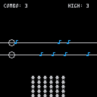
I've messed around with the beta. The new features are a welcomed addition for sure. However, there seems to be a bug. If you hold down shift on a note already placed, you can't increase the length, but instead, it'll place single notes as you drag it along empty space. Intuitively, it feels like it should just overwrite what's already there, instead of having to delete it manually first. Otherwise, it's a great new feature.

The additional scales are also very welcomed, but I do feel they lack in a couple of ways. First, keys with more notes have less octave ranges to play with. The full scale keys only contain a single octave and some change. It'd be nice to allow moving the starting octave up or down an instrument's grid to compensate. For example, let me bump up C major's starting note of c3 to c4 (or anything between). I also wish you could choose the scale per "song block" Instead of having to change it for the entire song. 

Lastly, a bit off topic, as it doesn't quite have to do with the new features, but more of a request. It'd be nice to be able to skip over grid sections.  Something equivalent to the loop button, but instead, make it red and have it skip over to the next non red section (or the next song block). I'd make working with different time signatures, and riffs that don't loop evenly within the 8 gird blocks, easier to manage. (A time signature setting, to alter the grid, would be nice, but that'd probably be way more of a challenge to implement.)

Anyway, I wrote a bit more then I intended, so I'll leave it there. Overall, it's a great, much needed update. Keep up the good work!

(3 edits)

As others have said, allowing rebinding of the controls is always a good idea. But, ideally, your hotkey system should tie into your GUI. A good GUI/Hotkey pairing makes things intuitive, and thus, they should influence each-other. So without knowing how your UI is setup, It's hard to give you an answer on which would work best for your game. So I'll give some examples.

In most ARPGs (Torchlight, for example), the hotbar is a horizontal menu, which has a similar layout to the row of number keys on the keyboard. So, the number keys act as a one-to-one representation of your hotbar (the '1' key is the 1st option on your hotbar, and so on). The number keys are easy to reach, and it's intuitive to understand what you press correlates to what you'll get. If the hotbar wasn't displayed this way (say, as circular menu or a list), the number keys would be much less intuitive to use. Sure, for some, it can be annoying to click the higher numbers, but that's where rebinding comes in. Players can rebind to make the hotkeys more comfortable to them, but the default layout helps the player wrap their head around how the system works. In addition, usually the most used items are lower on the bar, since those keys are easier to reach. Plus, the hotbar layout works well with a mouse, which is good for newer players who aren't comfortable with using hotkeys.

The other thing is, it's nice to have context sensitive buttons. If your game has sub-menus or the menu has a bunch of "hotkeyable" options, it's nice to have a uniform system for selecting things. A great example is Age Of Empires 2's hotkey system. The menu options are setup on a grid that represents the player's keyboard. The first 4 options are selected with 'qwer', the middle four 'asdf,' and the last row with 'zxcv' The game's GUI makes it intuitive to understand and keep track of what keys to press by just looking at menu, just click the corresponding key for the option's position on the grid. So, if I want to grab the stone mining upgrade, I select a Mining Camp, and then press 'E', since it's the second option on the top row of the camp's menu. If I want a villager to build a farm, I select 'Q' to open the economy build list (first option, first row), and then 'A' (first option on second row) to select a farm.  Plus, again, it's still easy to use the menus with a mouse (but much, much less optimal). The player can even hover over an option to see what it does if they're not sure. For additional clarity, you can even have a little icon displaying what key to press on the icon.

You couldn't really do a system like this as intuitively with the mnemonic button layout, since the keys would be all over the place, and there's a lot of different options for different units and buildings. But, it can be done. Most text editors use a mnemonic system for their tool bars. Alt to start selection of the tool bar, then the first letter of the drop down menu's name, then the first letter for the option. The menus usually even highlight the letter in the option's name that corresponds to the hotkey, to signify what to press. But even then, the most used shortcuts make don't make much "mnemonic sense."

Ctrl+c makes sense for copy, but ctrl+v doesn't make much sense for paste. Ctrl+Z for undo and shift+ctrl+Z for redo don't really correspond to anything either. Both cut/paste and undo/redo shortcuts are placed next to each-other because they're used together all the time, and they're placed in a position out of convenience and ease of use, since they're used extensively. And, because they're used so much, they're very easy to remember regardless of what they are. The tool bar selection makes it easier to dump a bunch of infrequently used options in a quick to find way, but the more useful options are placed out of ergonomics.

But, this leads to the problem of overlap. You could, for example, have 'U' as the universal button for "Upgrade unit," but what if there's multiple upgrades? Or what if multiple things make sense for the same letter? In your own example, 'P' for 'Party Members', and 'P' for 'Parliament' causes an issue. You could have 'M' for 'party Members,' but what about 'Map?' The more options, the less intuitive it becomes. The letter highlighting helps, but it defeats the purpose of mnemonic layout making it easy to remember, since you're scanning the vertical list for what to press. The toolbar could just as easily have random keys to represent the options, and it'd probably work just as well.

In addition, you could implement a system that allows key rebinding for each individual sub menu, but it can get unwieldy pretty quickly, but can be a good option to give the player if possible.  Also, It's not as big of a deal, since it's turn based, but for mouse heavy games, it can get pretty tedious to have to constantly move your left hand around the keyboard for different options, since your right is preoccupied with using the mouse. Which brings up an important point on rebinding. Rebinding isn't important just for comfort, but accessibility as well. Just because the layout works well for you, doesn't mean it's a one size fits all option, especially for those with disabilities.

Anyway, I think I'll end it here, I wrote way more then I was planning to, but I hope it helps


In Summary:

  •     Make sure the default hotkeys and GUI complement each other.
  •     The more an option is used, the more comfort wins out.
    • It's easy to remember a shortcut you use all the time anyway. Even if it doesn't "make sense."
  •     The more complex the system, the more the mnemonic layout breaks down
    • And the less intuitive it becomes.
  •     Always allow for key rebinding.
    • There's no excuse if you're using an engine that makes it easy to do.

For the crash, after attacking, the animation plays, then the game freezes for a split second; afterwards the window closes. I'll add I'm on x64 Windows 10.

On the seals, like I said, it's not a deal breaker, and if you feel like you can do interesting things with them, go for it!

Overall, the game has promise. From what I was able to play, I had fun. I agree with what Oles said, so I'll just add onto it.

The main problem I ran into is the game seems to crash randomly after attacking an enemy. It was never consistent, but the new enemy introduced 4 or 5 levels in would always crash the game. Needless to say, I wasn't able to finish the demo because of it.

Overall, I though the mechanics worked well, but I did find it kind of odd that you had to go into a specific square (their back) to attack instead of just occupying the square they're on. It's not a deal breaker, but It does feel a little arbitrary and a bit of a lazy way to enforce certain setups. The spirit can't hurt the lantern, so why go behind for a sneak attack?

Visually, the game looks great, props for the art! But, I did have some issues with game-play related feedback. I think the main reason is the relatively small game area on-top of an already small resolution, making the spirit enemies hard to differentiate, and making their silhouettes harder to make out at a glance. I'd get sniped thinking I was out of range of the sword, but it turned out it was I was looking at an archer.

All in all, I look forward to seeing the game once it's polished up and expanded. Nice work so far!

I would just keep the ball's color to be the same as the goal's. So just remove t`#FFF`; and you'll be at 558 characters. Alternatively, you could also change the goal to the ball's color (#FFF) and again, remove the ball's color change to be at exactly at 560.