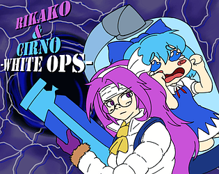
I love personalized entries for collectable items in games and this is pretty much a Cirno version of that, very cute
Jorge
Creator of
Recent community posts
Very in-depth and well written feedback comment, I really appreciate it. That stage 3 enemy is not a bullet but rather an enemy by itself yes, it just looks way too much like enemy bullets which was a huge mistake I somehow missed (Probably because of the usual jam panic).
Stages have this timeline which activates and deactivates different enemy spawners which start sending you a set type of enemy in a random direction (With some limits of course), RNG is definitely a huge risk to take when it comes to games like these even if it makes things a bit quicker. Honestly since it turned out decent enough I might mix it in a bit with actual enemy placement in a future game, I'm thinking of new ways to program and make levels as I type this and it says a lot about how differently a person thinks during and after a jam.
The composer of the game is Caramel64, they haven't uploaded the track to Youtube yet but I'll reply to you here again once it's available to listen. In the meantime here's their page: https://tinathecyclops.itch.io
Once again, thank you for your comment, it was very interesting to read.
Thank you very much for your feedback! Stage length was something that really bothered me when making and testing the game and they were all actually reduced in length before publishing it, the fact that they feel more like rounds in a single spot rather than stages probably adds to that feeling of length. I'm happy you managed to push through the hardships and beat Mai!
Thanks for your comment, I'm surprised to see it can be describbed as HELLA addicting so that's good! I have to say I designed the ice burst thing as this sort of safety field where projectiles are destroyed so the player is encouraged to stay there but seeing how the visual effect turned out to be maybe it would've been better for it to follow the player, never thought of that
Good job on the use of the theme, the concept is pretty nice overall too. I love the shadow effect around corners, it's really well made. In my opinion the camera should be a bit far away from the player because sometimes I had trouble seeing if there was a button on the other side of the laser. Pretty neat overall!
I like the concept of giving the player decisions on how to use their time based on the actual objects you can place, this idea is great for puzzle games and I encourage you to develop it further in a future game, it has a lot of potential. Over here however the platforms don't seem to work for me for some reason, I've read through the comments and followed what other people said but they just never activate under any circumstances. Very creative game
They all look good, don't get me wrong. I was talking a bit more about the fact that the tools seem to have a very different style from the rest of the world or the character. Oh and don't worry too much about the sound effects, it's understandable and I just missed on a couple of things due to my audio configuration


