

Love to see the Bayou Billy name generator. A L Hurt! Toulouse L’attack! Clean layout and good use of space. I would have liked to see a bit more formatting on text. Taking on the booklet size was no joke and you did a great job! Love the variety of encounters and faction play.This one's a real contender, great work.
A member registered Jul 16, 2021 · View creator page →
Creator of
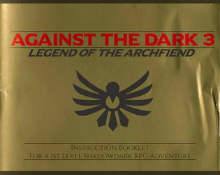
Shadowdark adventure of relic hunts, lethal traps, and an archfiend.

LV 3-5 Shadowdark dungeon crawl. The wife of the village mayor has an affair with three demon lovers.
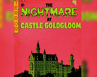
Gauntlet Nightmare for Shadowdark RPG
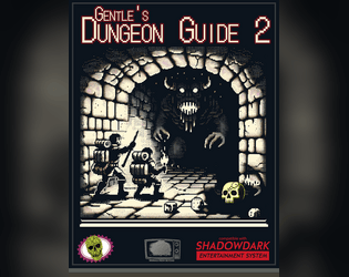
Gentle's Dungeon Guide 2 improves and refines modern dungeon design principles into one condensed checklist.
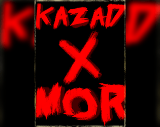
A classic dwarven fortress dungeon crawl for 1st level characters.
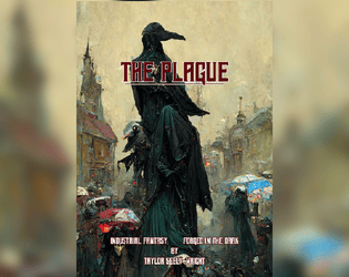
Nine weeks to live.
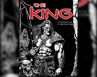
A Conan-inspired class to Shadowdark RPG,
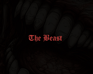
Become a half-feral adventurer with the ability to transform into the beast.
A Word file with all the stylings you need for a clean Shadowdark layout!
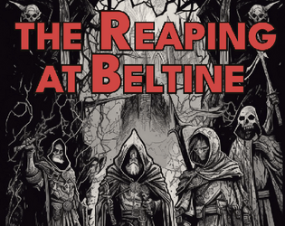
The reaping has begun. Adventure for Shadowdark RPG