
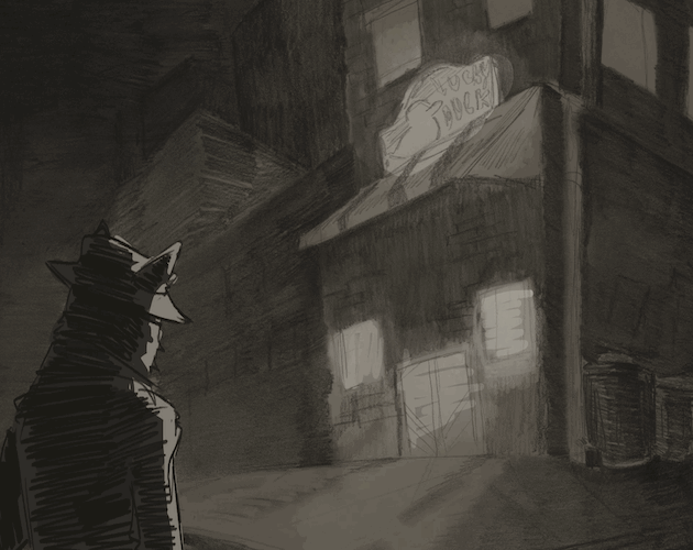
I do agree that some of hit boxes could be adjusted, sometimes jumping felt very finicky and I would get caught on a few of them. The red triangle at the end also doesn't trigger anything even though it feels like its supposed to. Other than that this is super cool and I can't wait to see it with the rest of the assets! :)
scribblyspoon
14
Posts
9
Followers
1
Following
A member registered Mar 02, 2024 · View creator page →
Creator of
Recent community posts
This is super cool! You've done a wonderful job with utilizing everything the playground scripts had to offer!
My main issue is that the game/screen seems to be aligned a bit more to the lower right than center. It isn't as apparent during the rocket part but during the player segment it definitely threw me off a bit since it cuts the player off of the screen entirely.
That's about it though, you did a great job!
I love how the foreground elements look like cut paper/stickers, it's super cute!!
My main issue is that you can bypass the platforming entirely by just holding w and breaking the boundaries of the game. Being able to move up is helpful at times for when the jumps aren't high enough but it can be a bit disorienting. I definitely agree that the hit boxes and placement could be tweaked just a bit.
Other than that you guys did a great job!
The art for this is so amazing omg, I love how this turned out. Everything is just so cute!!! My only major issue is that even when in fullscreen the game isn't actually in fullscreen (but that might just be something that can be fixed with the camera setting?). Overall this is really well done, I agree with Cody it really does remind me of Minish Cap
I love the story, it's very engaging and spooky! I agree that having the links be a different color could help them to stand out. Also, having the sidebar background be a different color or maybe a bit farther away from the text could give the story some room? The type and color for you've chosen is really nice but having it all the same can make it feel a bit crowded at times. Other than that, I think you've done a wonderful job and I'm excited to see what you add to the story! :)
love love love the artwork and story. You've clearly put a lot of care into this game and it really shows, I had a lot of fun going through the story loop and exploring all of the options! If you ever decide to go back in and add some sound effects or some music it could help to give it just a bit more ambience. My only critique is only a bit nit picky, but when you run out of hp nothing really seems to happen? If that was intentional that would be completely fine (given the narrative), but maybe adding an additional passage to incorporate that into the story or to add a sort of game over screen could give the hp more urgency or relevance. That's honestly the only note I have, i just adore the art and world you've created here (especially the creature), well done! :)
When you get to desk and the painting the passcode is made from the only numbers on the page. When you type it into the text box correctly the prompt to continue will pop up underneath it and you can click the yellow link to continue. From the feedback I’ve gotten I’ll be adding an update soon that makes the passcode information a bit clearer, sorry about that!
The presentation really adds to the narrative here! Once you have all the pieces together for the final I think it'll really elevate it. Normally I would want an option to skip through text but for your game to not have one honestly kind of works. It forces you to slow down and take in all the information being given to you and traps you in a really depressing conversation (like an actual breakup). You've put lot of care into the stylistic choices and layout and it shows. I'm excited to see where this goes when you add more of those elements. Great job! :)
i can't express how much i love your writing, it is genuinely super good. As the game is now, your styling and narrative are already so solid that it holds up super well even without the illustrations (but I'm really excited to see them in the final :) ). My favorite part is the background color switch to indicate morning/night. It seems like such a simple thing but I 100% would have never thought to do that, it works so well. Honestly I don't have a whole lot to critique, you're in a very good place with this and have clearly put a lot of care into it. If I had to nitpick anything, maybe giving the content warning more visual interest or putting it as a popup so it's a little more clear (but that's more an accessibility thing than technical issue). Overall you've done an amazing job!
You've done a wonderful job with world building and mechanics, it definitely is an extremely engaging narrative. I definitely agree that the oxygen drain could have a bit more of a sense of urgency to it. Also there was a passage where the player character gains a health boost, but honestly having both health and oxygen may be a bit redundant as the mechanics are now. I think the oxygen drain idea was a really great one and it could stand really strong on it's own with a few tweaks. In the future if you were going to include both adding more narrative elements that utilize both of them could help with that but that may lead to more work with having to balance them. Overall this is a great game and it was a super interesting story to play through! :)
This is already super creepy (which for this is good :) ). I enjoy how engaging you've made this, it definitely really takes you into the narrative you've created and adds to the unsettling experience. I definitely agree that forced full screen could really enhance this and prevent some of the clipping image issues. I know some of the passages are still a work in progress but you have a really fun game already and I'm really excited to see where the story goes! :)
This is such an interesting idea for a game, it's honestly really beautiful. The music and colorful visuals help to make it feel super whimsical and charming. You've done a really wonderful job of building a whole universe and characters around a concept like this. My only feedback would have to be that at the point where you have to make a choice (the R, G, B section) with the timer there's a bright, flashing white screen that pops up every few seconds. It does appear less often in other sections too but it really shows up in that passage specifically. If that was intentional that's definitely fine but it would be helpful to put a flash warning on the title screen for people who may need it. Besides that though, I really enjoyed this! :)
I really love this game so much. The art and sounds were considered so carefully and really add to the narrative and environment. Not having a background track for music honestly worked extremely well for the mood you were trying to set up (it definitely made me feel a little paranoid). I think my only critique might be that the clock chime effect was a little bit loud even when I adjusted my volume? Honestly that could just entirely be me and is super duper nitpicky. Overall you did an amazing job, super engaging and fun! :)