Haha! Better late than never!
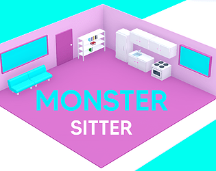
If I remember correctly, you click-drag to move things and then when your cursor gets close to left or right edge of the screen, it takes you to the cupboard, stove, or table area. Let me know if you got it working 🤞
Riker
Creator of
Recent community posts
Hi, thank you for making this game, here is my feedback (round 1):
- The game is very beautiful and clearly a lot of effort has been put on textures, lighting, and creating an atmosphere. Please give credit to any assets, textures, music etc. which you didn’t create yourself
- I really like that you have the controls added on to the wallpaper
- zooming in didn’t work, not sure if I am misunderstanding the image or if it is broken
- moving objects is a bit difficult because it's hard to see where they will land in 3D space. I would suggest adding a directional light that points straight down and casts a shadow on the ground that helps communicate where it will fall (you can prevent it messing with your lighting by making sure it only applies to these moveable objects)
- I would also only activate the function (what happens when you match an interactive object to a trigger) only when the player lets go of the ball, not when it touches the trigger while still holding it.
- the blue ball doesn’t match the style of the rest because it has no texture and looks like a standard game object.
- For UI text I would suggest replacing the font with something that matches your art style better but is still readable
- I love that you created a typewriter effect for feedback on placing objects, but because your text is centred, it isa bit tricky for the eye to follow - I would recommend left-aligning the text
- Once the typewriter effect is complete, prompt the player the click to display the next line (click to continue)
- While displaying this feedback text I would disable the movement controls - otherwise there is a chance that the player is initially unaware that there are multiple lines of text, and moves to a different part of the room, and may be confused about what the text refers to.
- I like that you placed the second moveable object right next to the entrance, and a board that displays all objects that should be found. (It would be extra cool if that board could even tell you if something was already found and or matched correctly) It shows that you thought carefully about the tutorialization of the core mechanics and made sure the player is fully aware before introducing the puzzle challenges
- when picking up flat objects like the dream city poster, I would recommend keeping it rotated to face the camera
- I didn’t understand why the poster should be matched to the mouth, not the eye
- I like your interpretation of the theme and how it gets slowly revealed by matching the objects to the oracle parts
- I like that the eye rotates to follow me
- I wish there was some music playing from the old vinyl player to add to the ambience of the room.
- I cannot find the cassette tape and am stuck in the game. Consider some way for the player to get help when they are stuck.
- Allow players to return to menu by pressing ESC
Please let me know where to find the cassette tape and I will continue playing
Hey there, thanks for making this prototype! Here is my feedback:
- the controls overall feel pretty good
- the art is beautiful, well done. For maximum polish I would pay attention to the pixel size - you can see that the pixel size on character and interactive objects are not the same as the underground or UI. This can be done on purpose sometimes, but seems more like an oversight in this case
- It isn’t visually clear if I will collide with an object (car) or not (lady with cart). I’d try to use something to distinguish objects with collision from background, maybe via a color difference, for example: non-collidable background objects are litte desaturated OR smaller pixel size?
- if possiblle, align the collider of the car with its shape, maybe use 3 colliders to get closer to the car shape? (not sure how Godot works).
- the enemies don’t move and don’t do any damage to me, so there is no need for me to “remove” them. At the moment they might as well be simple collider objects. If they were pushing me off platforms for example, they would feel more meaningful.
- The parallaxing background doesn’t communicate falling, only left-right movement - that’s ok, but if falling isn’t part of the game design, place walls on the sides to prevent the player from falling
- the most important issue so far: There is only a tiny playground, but no levels yet. A game like this is not ready to be shown to the public without at least 3-5 levels or a longer passage with challenges. The space is too small to really feel out the mechanics of dashing, coffee boost, and combat. If you are struggling executing your vision, try to break it down to something smaller - instead of going underground, maybe the player needs to catch the taxi that is driving away before it reaches a bridge which the player falls down. I’m happy to help with this, but I’d like you to tell me more about what you are struggling with exactly
Good luck!
Hey, thanks for making this game, its very cute! Here is my feedback:
- I like that you phrased the description of the game as an email to the player <3
- please enable fullscreen options on itch
- the typing mini game is great (but without full screen the beginning is cut off and I have to guess the first letter. There is no feedback for spaces, consider some visual feedback here, or play sounds for correct and incorrect letter typed. I love that there is this whole email but I only have to type a few words, really gets this concept across nicely. It feels like there are only 3 templates for emails, which gets repetitive, I would suggest to add more variation
- time passes so quickly its hard to keep track of the progress bars while doing things
- players might need help understanding what scrolling does. It takes too much time and I want to be able to stop, it doesn’t seem to help me feel any better. this mini game could be improved by making scrolling simpler (just click and the game autoswipes to next picture), and allow players to like with some satisfying sound and particle effects. It should reduce stree or increase satisfaction but nothing seems to happen.
- Not being able to finish an email because the day ends, that doesn’t feel good. I would allow them to complete it.
- I forget how many days I have been doing this, would like to see a day counter on the menu screen
- I failed but I am not sure why. My stress maxed out but I don’t know how I could have prevented that. Should I spend more time scrolling, less time writing emails? That seems counter intuitive.
- Add an option play again at the end when the game is over
- Consider adding background music that helps communicate stress levels (let me know if you need more help figuring out how to do this)
Good luck!
Hey, thanks for making this game, here is my feedback:
- thanks for making a web build! I’d recommend changing the settings on itch to allow players to play full screen
- I like that is clear where I have to go with the red circle that is moving
- consider adding background music to help communicate the mood
- changing movement direction in a sidescroller is rather unusual - the best way to communicate this would be to place wall on the right. its ok to change convention but you have to be aware that players may not expect it and get frustrated, so the first time you do it, help your players understand. making the character face the correct direction was already a good step. since most of the game
- the character suddenly walking without me controlling it doesn’t feel good, why did you take player agency away here? (the scene where there are paper floating in space)
- encountering the poster for the second time feels strange, like you didn’t use it to tell the story, but to fill up time and make the game longer. The 3rd time I encounter it I really don’t know what its meant to represent. I probably saw it 5 or 6 times before I realised it means I got caught in the loop.
- there is a lot of repetition of scenes, would be nice to interrupt the monotony with changing music and the characters inner dialogue that helps communicate the story and what they are feeling
- players might get stuck in the same loop for a long time, not realising that you don’t want them to walk towards the first red circle you see. You should introduce this type of choice sooner in a way that helps the player understand that sometimes there are more than 1 place to go and it might have different outcomes. Its a bit unclear what the choice of going left or right mean in the context of this story. we need more feedback for correct and wrong choices. not being able to see both choices on the screen at the same time (when I encounter the “wrong choice” I need to see that there was another one available so I don’t get stuck in the loop. also consider what it means. leaving the underground means staying stuck, staying underground means progess. Why? When the player makes one wrong choice they lose all progress, that is very punishing considering how hard it is to tell the difference between the choices
- I like the metaphor of color to represent a better life choice, would definitely be stronger with music and some narrative
Hey team, thanks for making this lovely game, I enjoyed playing it. Here is my feedback:
- lovely background music, credits? who made it?
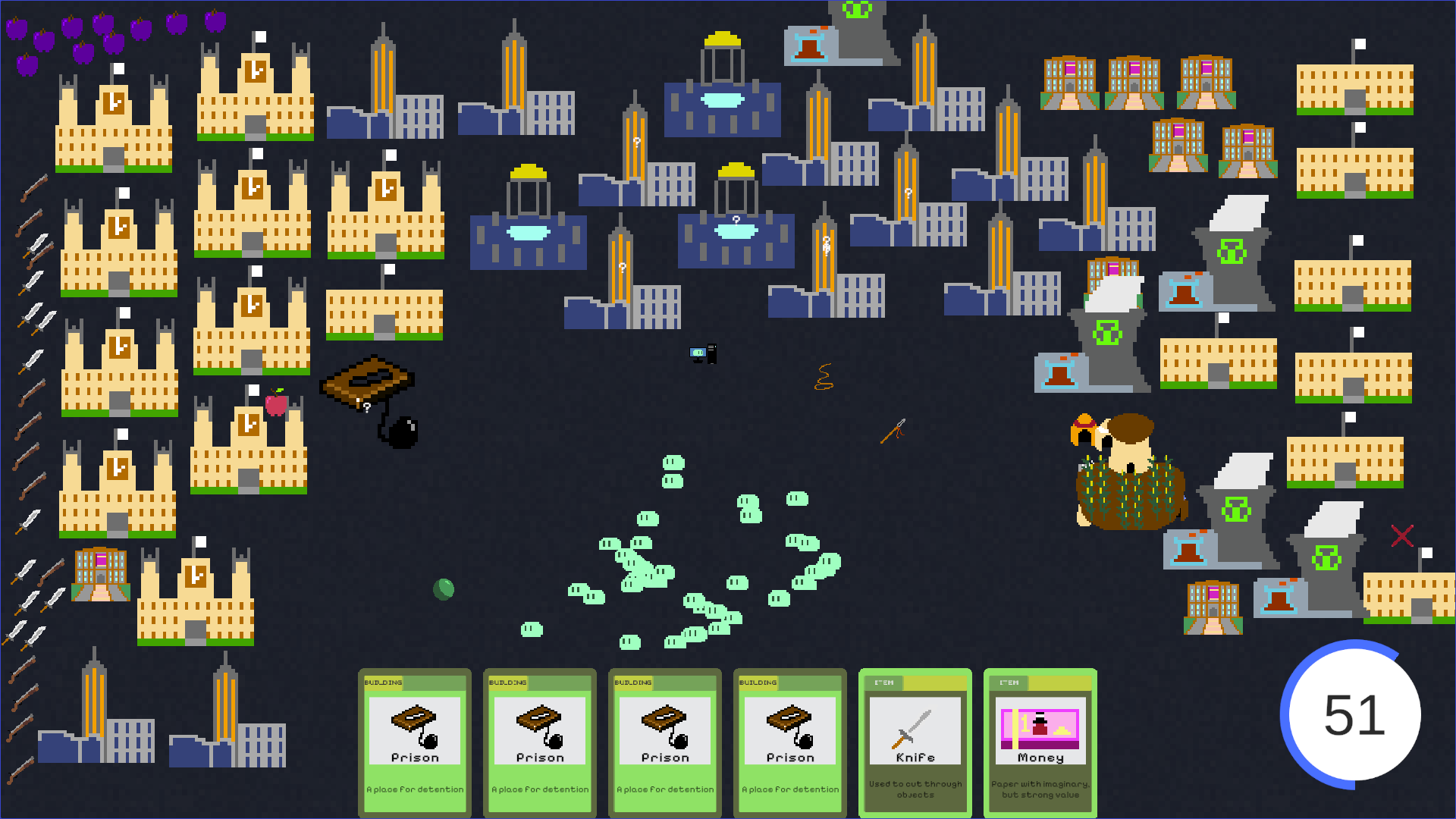
- on inital playthrough I was missing feedback that there are individual blobs that have different thoughts or behaviours because of what they have been exposed to → change color or shape of blobs to visualize how they evolve, allow players to hover over the blob to find out its stats - eventually I see some blobs darker and with white highlight, but I don’t know what it means
- it’s not super clear that you have to click on the number to generate a card → it looks rather like non-interactive UI, maybe consider changing it to look more like a button, or jiggle it to draw players attention to it?
- unclear why sometimes the golden apple has no effect (especially consider how big the effect of the first one is)
- bug? when placing a red apple, the blobs moved towards it but stopped. it never got eaten for some reason, this happens with a lot of other items as well
- overall the game needs more visual feedback that tells players the effects of their actions, like placing buildings. We do get the numbers of peoples heads, but because I’m basically forced to place all cards, it doesn’t seem like I can really apply a strategy
- I want to be able to discard cards that I don’t plan on using, eventually I am stuck with bad apples, knifes, and guns. I used a workaround of placing a ton of guns and knifes and bad apples behind buildings where the blobs don’t seem to be able to reach
- unclear why items increases specific values, often items don’t seem to have any effect, some seem counter intuitive - like why does the bad apple increase love? why are those the same values as a red apple?
- what does the hut and the man in the hut do? what makes it grow and change?
- blobs dying isn’t very clear, I can see they are less and the x is blinking in the corner, but I’d rather see a specific blob maybe getting slower and lighter in color and fade away
- I know from the presentation that I can drop the items directly on to specific blobs which is cool. I am not sure whats the best way to help players know this, maybe just something they find out with experimentation
- there is no indication how far along in the game I am and how close to reaching an end. since this is a simulation it could go on forever, and players might drop off before the end → some visualization like a progress bar would help
- after some time of playing around and discovering some effects but mostly being clueless I wonder what my goal is. do I try to give things to more evolved blobs or rather the other ones? do I try to level every one up? Do I try to generate as many blobs as possible, whatever the cost?
- stop generating new cards while the deck is full. consider shortening the timer to generate new cards as well, this would force the player to spend more time observing the effects of their actions instead of frantically placing cards without understanding their effects
- I have played for 25 minutes, run out of screen real estate and haven’t reached any ending, so I’m gonna have to call it now.
Hope this helps!
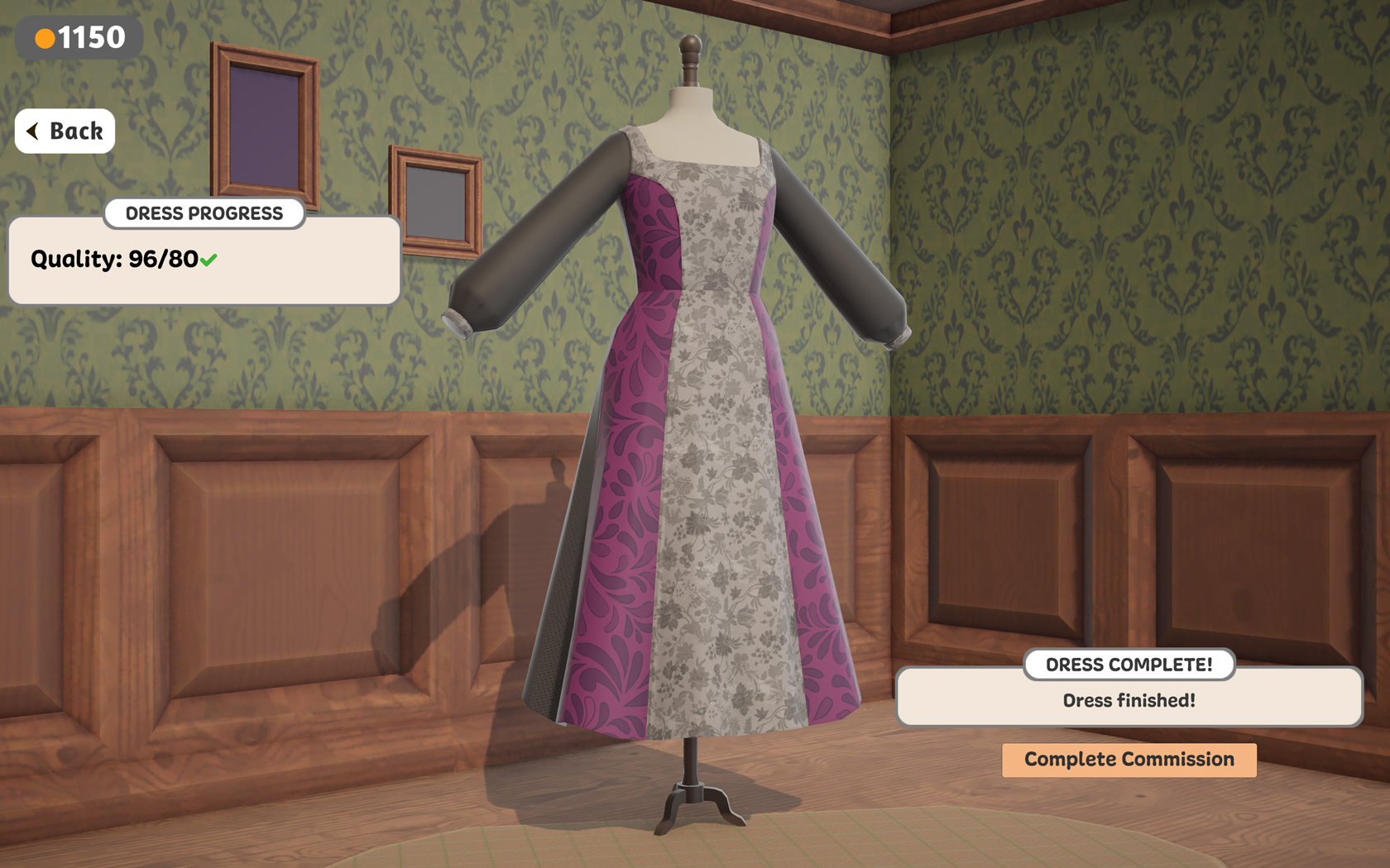
I really enjoyed playing the prototype. At first I thought the sewing would become annoying, but now its zen-ing me out. The feeling reminds of Lake where its so soothing to just deliver mail. A simple manageable task that requires effort which makes me even more proud of my achievement. Obviousy I want more variations in patterns, as well as androgynous and men's outfits.
I think what would really bring this game home for me is how this is tied in with the characters and the narrative. Starting with seeing the character receive and wear their dress, twirl with a smile or shrug with a sigh as feedback for success instead of the stats. Maybe a little design session where clients describe what they have in mind, even if some are terrible designers. "It MUST have Onyx Silk!" But in my wildest dreams, behind the seams, I am Lady Whisteldown, secretly controlling and manipulating the entire society. I can comply requests or fail and therefor support certain missions. I can make dresses that make the wrong client trip, I can help them hide their pregnancy, I can chose the favorite colors of their admirers, flatter their figure, or ridicule them. For the prototype the newspaper updates are good, but seeing the characters at the event in their outfits that I made in a short narrative sequence, that would make my heart sing.
Can't wait to see how this project progresses. Congratulations to everyone involved, this concept is outstanding.
Thanks! As we are only at demo stage we didn't do proper QA testing just yet, so while this issue is rather rare, I've seen it happen before. Unfortunately we haven't been able to debug properly. No mistake on your side, definitely on us. We will also address the mark getting stuck on way points and find a way to fix that. Thanks for reporting!


