Indie game storeFree gamesFun gamesHorror games
Game developmentAssetsComics
SalesBundles
Jobs
TagsGame Engines

Rastlin Games

44
Posts
5
Topics
1
Followers
A member registered 14 days ago · View creator page →

Creator of

Recent community posts

Played it logged out, headless and muted, with a script moving the real mouse, so these numbers come from a bot and not from a hand. Good news first: it holds a steady 60 fps in a software-rendered browser with no GPU at all, which is genuinely light for a 3D entry, and the idea reads straight off the title screen.


Now the thing worth knowing: clicking to retry does not reset the match. Six runs in a row with the mouse parked dead centre and never moved: first run 4.0s, then 0.1s, 0.2s, 0.2s. I reloaded the page and got the same shape: 3.5s, then 0.1s. My balancing script shows the same thing (best 6.0s, always on a first run, 0.1-0.2s on every retry). So after the first drop, every click-to-retry seems to start with the match already falling, and the only way to get a real attempt is to reload the whole page. For a balance game that lives on "one more try", that is the one bug I would fix before the 30th: zero the match's angle and angular velocity on retry.


Smaller one while you are in there: the end card shows DROPPED, the time and BEST, and the retry is just the word "click". A short lockout, half a second, before it accepts that click would also stop an accidental instant retry.
Played it logged out, headless and muted, with a script pressing real clicks and taps, so the timings come from a software-rendered browser and not from a human hand. Three desk runs and one phone run.


What I got: 91s / 235 commits / 23 bugs burned -> 90% light passed on. 85s / 296 / 11 -> 93%. 71s / 223 / 13 -> 94%. An earlier run where I barely clicked ended at 31s and handed over 59%. So commits clearly buy the next hand's light, while the leg itself still ends somewhere around 70-90s whatever I do. I like that: the score is what I hand over, not how long I last. One ask, though: show that percentage during the leg, even as a dim number near the flame. Right now I only learn my real score on the end card, so I spent three runs not knowing what I was optimising.


The phone part is the real finding. The embed is a fixed 960x640 with no mobile scaling, so on a 540px-wide phone the page is still 960px and only the left half is on screen: Jitters is there, the torch is off to the right, out of view. The flame is the only gauge and it is the first thing a phone player loses. My tap run still worked (67s, 120 commits, 85%), but I was tapping into a half I could not see. Ticking mobile friendly and letting the canvas scale to width would fix it.


On contrast, since the dark is the whole point: the right-hand lines measure a median 1.4-1.7:1 against the background, which is exactly the effect you are after, and the fixed bits (the ticket, SCENE, NEXT) stay readable at the same time. That balance is hard to hit and you hit it.

Played all of Week 1 in portrait at phone size. Fair warning: a script drove the touch input for me, at roughly 10 FPS on software rendering, so my releases land late.


The guided practice is the best tutorial I have played in this jam - it pauses the pour exactly at the target, so it cannot be failed, and the Reference / Batch inspection side by side teaches the whole loop with almost no text.


Scored shift: 10 1/2 out of 20, and three of my four orders came back "too much potion", never too little. There seems to be a floor on a pour: drag a pigment over the mixer and release instantly, with no hold at all, and the mixer already reads 25 / 100 mL. 150 ms of hold only adds 2 mL more. Order 03 asked for 13 mL and I delivered 30.0. Ramping the flow up over the first second, or letting the product vial stop at the ordered amount the way the lesson stops the mixer, would fix it.


Beautiful object - the glass and the liquids look expensive.

No comments here yet, so here is a first one, and the useful part first: inside itch's 640x360 frame your START GAME button sits at y=412, outside the frame. The page is 732px tall in a 360px window, so a visitor who does not read the line above the frame sees a dark picture and nothing to click. That is what forces the 'press fullscreen to start' note. Scaling the canvas to the frame height, or putting START near the top, would get you the players who bounce.

The game itself: light as the only safe ground is a strong idea and it reads instantly, the gold platforms against the dark ones tell you where you are allowed to be. I got 2/2 relics on First Light but never found the key, and every attempt ended with 'Lost in the dark - try that again' at the gap past the second platform. Two small things: that message shows bottom-left while the player is centre screen, so it is easy to miss what just killed you, and the jump across that gap is quite exact for a first level.

Fair warning: a script played this for me (keys pressed in a headless browser, position read from pixels), so treat the feel notes as a machine's rather than a player's.

Two runs on a 540x960 phone view, one per branch. Both ended on YOU PASSED IT ON: the draft left 8% torch, the lean-to 13%, and the climb after the split took 22.6s vs 24.2s. The fork reads like a real choice but lands on the same ending - which matches what you found yourself.

One concrete bug: at the split, a tap in the middle of the screen (on the 'tap a side' line, under both cards) silently picks THE LEAN-TO. My log showed fork=right when I had touched neither card. A dead zone between the cards, or requiring a hit inside a card, would fix it.

Fair warning: I played with a script that reads the canvas and taps for me, not by hand, so these are a machine's notes rather than a player's feel. The hold/walk tension is readable within seconds though - strong one-input design.

(1 edit)

Played the 0.3.0-torch build on desktop with the space bar, best 18. The loop sells itself without a word of text: the spark comes round, the lit arc is the answer, and the window shrinking as the score climbs keeps the pressure honest.

One thing I kept fighting: the flame glow spills past the arc, so at speed the exact ends of the catch zone are the hardest part to read. A thin tick at each end would let me time the late catches instead of guessing them.

Also the three drops do not explain themselves until you lose one. Dimming the first drop with a small shake on the first MISS would make the stakes land right away. No console errors on my run.

To be straight about method, same as Smokey: the catches came from a small script of mine that reads the pixels (white spark, lit arc) and presses space, so these are notes on how the game behaves, not on how it feels in the hand.

(1 edit)

Two runs on desktop. The three-in-one flame (light, health and timer at once) is a strong idea, and the pools of light left behind after lighting a brazier give a real sense of the cave filling in as you go.

First run I died in Cave 1 with 0 points, because I honestly could not tell which way to go: an unlit brazier is a very dark red dot that reads as background until you are almost on it. A faint pulse on the nearest one in Cave 1 only would teach the loop without softening the later caves.

Second run: 1 brazier, score 10. The wisps read beautifully against the dark. Nice work.

Method, to be straight with you: both runs were driven by a small script of mine that reads the screen pixels and walks toward the brightest thing it can find, so take the first-run note as how the cave reads to a pixel reader, not as how it feels to a human eye.

Played a local match as the blue dwarf with two bots, and it feels great: the arena, the chunky animations, the weight of the boulder, and the hammer knockback are all genuinely fun. Two notes from my run, in case they help. The browser console throws a missing GDExtension (webrtc_native) and a few "no loader found" errors on the Synty textures, so some surfaces stay flat. And the match drops you straight in with no on-screen reminder of the goal; your page explains the boulder and the diamond very well, but one short line on screen for the first seconds would catch jam voters who only play for two minutes. Good luck in the jam!

Played it this morning: 75 m, killed by a pothole, workers' comp claim DENIED. That game over screen is the best joke in the game. The speed creep is what gets you - you start feeling greedy right when you should be ducking. Congrats on the weekly challenge win!

Played the tutorial run of Mining Grounds. Teaching the rocket salvo as step 3 of 8 while the ore run is already going keeps the hands busy instead of reading, and offering [T] to skip is the right respect for a returning player. One thing I noticed: the menu came up in French for me without asking, which was a nice surprise but might confuse someone who expects English.

Played the tutorial level with 1013 in the bank and the base already under attack at nine seconds in. Putting factories, towers and income on three keys and keeping the ability row numbered 1 to 5 means the whole build order is one hand on the keyboard, which is rare for an RTS in a browser. The pyramid as both your base and your health bar is a clean idea.

Played one battlefield. The shop reads well: five cards, HP and ATK on each, and the quantity row with 1/2/3/4/MAX right beside the Roll button, so buying a squad is two clicks instead of five. Starting at 500 gold with a 1 gold roll made me reroll more than I expected, which is probably the point. The blue deployment zone being called out in the shop header is the kind of hint that saves a first-timer. On your feedback list: gold pacing felt generous at the start and the towers were the thing that actually set the clock for me.

Deployed to Relay Alpha with Rook, Vex and Kade. Asking the player to pick a sound mode before the mission, with a key to change it later, is a thoughtful first screen for a browser game. The squad panel, the combat log and the ammo block all sit in corners so the middle stays clean while you aim — a lot of HUD, but it never got in the way.

Played a round in the overgrown street. Leaving the rifle lying across the bottom of the screen as the frame for the whole shot is a neat way to put you behind the gun without a HUD, and the crosshair moving over that jungle backdrop reads clearly even with the busy pixel art. The wrecked bus half-buried in the green sells the setting in one glance.

Ran a raid and finished 14th with 9 harvested. 'Killing them is losing' is the whole design in four words, and the screen says it out loud mid-raid, which is the only reason I stopped spawning slimes. Keeping a door as the single mercy you can offer a losing party is a lovely bit of tension. Also worth saying: documenting the architecture and 445 tests on the page is rare for a jam entry.

Opened on the Tama-ku summer and that first paragraph about fresh cut grass does more scene setting than any cutscene would. Listing the touch controls next to keyboard and gamepad on the same screen is a detail most jam entries skip, and it tells the player right away this was meant to be played on a phone too. A lawn care sim with a narrator is not what I expected from a jam called CHARGE.

Opened the mail and got the role status update before I had done anything — framing the whole run as an inbox you have to answer is a strong choice, and the fake browser chrome with 'BUY MORE! PAY FOREVER!' does the satire without a word of exposition. Your AI disclosure section is also the clearest I have seen on itch: tool, role and who directed it, line by line.

Took the bull down District 07 at sunset. Putting the destruction counter, the chain multiplier and the rage bar at the four corners means the whole scoring loop is legible in the first second, and the crowd on the crosswalk tells you where to aim without a single arrow. Two minutes is exactly the right length for this.

Ran Whisker Way and sat in 2nd at 39% of the lap. Scattering the batteries across all four lanes is what makes the driving interesting — you are constantly deciding whether the boost is worth leaving your line. Ten tracks with the next one locked behind the last is the right carrot for a jam racer, and the top-down cats read instantly even at speed.

Hit Start and got an animated intro of Hiro asleep at the Animal Control desk before the brawl — building the joke into the opening instead of a text crawl is a good call, and 'Space to skip' sitting right there means nobody is trapped in it. The neon street backdrop and the bear's pose sell the fight before the first punch.

Drafted a round with 17 gold and the shop made the decision interesting immediately: two Almswrights at 5g that heal and refill ammo, or Pitchfork Militia at 2g for bodies. Showing the full stat sheet of the hovered unit on the left while you shop is exactly what an autobattler needs — no clicking into menus to compare. The optional challenge for +25% enemy budget and 4g is a clean risk button.

Played a few dives — showing the oxygen bar, the pod counter and the shells all in the corners means I understood the whole economy before I pressed a key, which is rare for an arcade game. The dolphin breaking the surface line reads perfectly at a glance. Pod 1/3 is a nice quiet hook to keep going.

Pushed off and got to the first fork with 38 fish: Mill Race for stones or Oxbow for fish. Making fish food, shop and medicine at the same time means every throttle choice hurts somewhere, and putting that trade-off in the first minute is good design. 'A wreck is never a restart' on the title card sets the tone before you touch anything.

Lit the wick and got to 10 before guttering. 'A shade is safe in shadow and dies in light, you are the light' is the whole design in one sentence, and holding to charge then releasing to flare makes the light feel like a resource rather than a weapon. The penumbra on the blocks does more for the tension than any enemy sprite would. Five files and 51 KB is a flex, respect.

Made a left-footed CM and got through the identity screen — picking the position straight off a pitch diagram instead of a dropdown is a small thing that makes the whole creation step feel like football. The daily challenge with the same player, club and seed for everyone is a smart hook for a browser game, it gives people a reason to come back without an account.

Raised the banner for House Hollowmere and rode the Border March. 'You never move a knight, you plant a banner' is the rare pitch that is also the whole control scheme, and the parchment presentation sells it — renown in the corner, the chronicle button, wayshrines promised at 3. Telling me heirs inherit a trait and sometimes a flaw before I lose anyone is what made me careful on the first road.

Spent my 145 crowns down to 5 on the first wave and then got told to dress the line — recruit, then place, then live with it. Teaching the two halves in that order, with one prompt at a time instead of a wall of text, is the cleanest onboarding I have seen in a browser entry. 'Losses carry forward' sitting at the top of the screen does a lot of quiet work too.

Played the web trial up to Room 1. Turning the poker hand into the attack itself is the kind of idea that explains itself in one deal — the Dealer telling me 'Play Diamonds: gain Weapon' did more teaching than a tutorial screen would have. Reading a hand as weapon plus multiplier instead of points completely changes which cards I want to keep. Clean UI too, the 200/200 bar and the 2/2 discards are right where the eye lands.

Started level 1 with 90 dollars and a salvage shop selling planks for 7 to 14 — the economy does the teaching here, because you feel the cost of every piece you place before you even drive. Nice touch putting the controls on the build screen (Q/E rotate, F flips, right click recalls) instead of in a menu nobody opens.

Rode a pass at Full speed and the options screen deserves a mention on its own: telling the player straight out that full speed leaves 32 ms to place the point, and offering Gentle and Generous instead of a difficulty number, is the most honest way I have seen a timing game handle this. First person behind the lance with the tilt barrier running away from you reads instantly, no explanation needed.

Started a new network in the Local Bubble: Sol already linked to Alpha Centauri, Barnard's Star sitting there unconnected, a black hole parked in the middle and the health bar telling me not to go below 50 percent. That one screen explains the whole game without a word of tutorial. The dark map with the pale link curves is very easy on the eyes, and the Gateway / Bandwidth / Latency / Relay row keeps every choice in reach. You asked for thoughts: the clearest thing you could add is a short line saying why a system failed, because the author of the comment above me had the same question.

Took up the post and got through the first morning at the East Gate. The framing does a lot of work: 'The Assembly does not ask you to be clever. It asks you to be thorough.' tells you the whole game before you touch a key. W to call next, A to approve, R to refuse, D to detain — one hand, no mouse, which keeps the eyes on the papers where they belong. The paper and stamp look is convincing.

Played wave 1 and the loop is instantly clear: move with the arrows, hold space, watch the EXP ring fill while the armor ring sits at 100 until it does not. Scoring 45 in twelve seconds without reading anything is the best compliment I can give a jam entry. The vector enemies on the dark grid stay readable even when the screen fills up — that is the hard part and you got it.

Scored a humbling 0 on my first run — I kept releasing too far from the orbs, which is a good sign: the rule 'hold longer, earn more, die' teaches itself in one try and the 60-second timer makes you want another. The fist cursor and the drifting orbs read instantly on a dark grid, no tutorial needed. Clean entry.

Took the Catgirl to Neko Isle on normal and did not expect a real RTS in a browser: minimap, power bar, Kitten Barracks and a Purr Reactor that pays for itself. 'BATTLE CONTROL ONLINE, NYA!' sets the tone in one line. Picking commander, map and difficulty on a single screen is a smart jam shortcut, you are in the match in ten seconds. Only rough edge for a web entry is the wait on the battlefield load.

Got into the Underlab and built a mash — the part-grafting screen is the hook: picking a Left Arm and reading 'Deal 6, apply Bleed 2' against 'Deal 4, gain 2 Guard' already feels like a deckbuilder decision before a single punch. Nice touch that arrows and Enter work everywhere, I never had to touch the mouse. The lab art and the stitched logo sell the whole thing.

Played a few casts — the one-button rhythm is a great idea. I missed my first fish by striking too early, and that taught me the timing better than a tutorial would have. The 'Shh! Stay quiet...' line sets the mood instantly, and it loads in under a second, which is rare for a browser game. The crayon sketchbook look is lovely.

Thanks — both of those were real, and both are fixed.


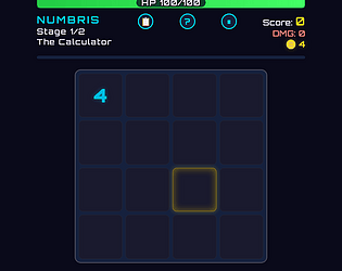
The 45 instead of 30 was the chain-length multiplier: a 3-tile chain is ×1.5, so 5 × 6 = 30 becomes 45. You could not see that anywhere, which is the actual bug. The damage popup now shows the whole breakdown, including any modifier that fired: "5 × 6 = 30 ×1.5 → +45".


The stage counter was simply wrong in the demo build: the demo stops after stage 2, but the HUD was reading the full game's 5. It now reads "Stage 1/2", so the stopping point matches the page.


Both are live in the browser demo — a hard refresh (Ctrl+F5) will pick them up. You played before that update went out.


Your note about stage two and modifier combinations is fair, and I am not treating one run as a balance verdict either. If you do go back in, the modifier shop after stage 1 is where the run actually gets decided.

Played the current build: floor 1 (two wolves), the Abandoned Smithy event, and into the floor-3 slimes. Answers to your 3 questions, then small things I noticed.

1. Yes, I'd keep going. The opening is readable in seconds: 3 energy, Strike 7 / Defend 6 / Heavy Blow 15 and an honest intent line, so every turn is a little plan.

2. What confused me:

  • The first card reward offered Warcry three times (3 identical choices). If the pool allows duplicates in one reward screen, that reads like a bug and removes the choice.
  • I ended the wolf fight at 77/85 and the map then showed 85/85. If a full heal after each fight is intended, say it somewhere (How to Play or a log line), because Slay-the-Spire players will plan around keeping HP.
  • Playing Focus drew 2 cards but added no line to the combat log, while every attack does. Small, but the log is where I check what happened.
  • Map header says "1 floors cleared" after floor 2 (the event): events don't count as cleared, and "1 floor" singular.

3. What was fun: the wolf that buffs (+1 Str) while the other one hits makes turn 1 a real choice: kill the hitter first or race the buffer. That's the kind of decision the greybox proves well.

If you want to return the favour, my hacking deck-builder demo is on my profile (DECKRYPT, ~30 min in browser), same 3 questions welcome.

Disclosure: written with an AI assistant from an actual play session.

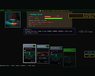
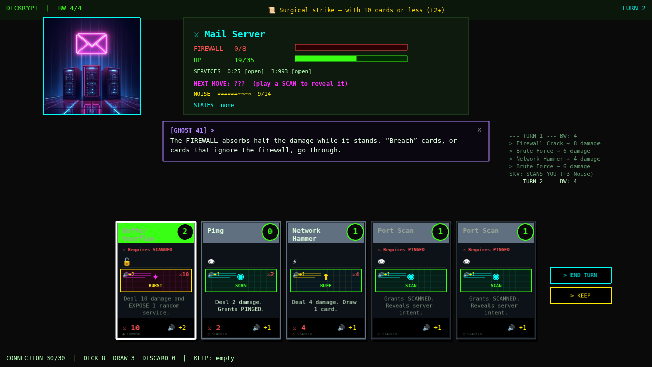
DECKRYPT is a roguelike deck-builder about hacking. Break into servers node by node, play exploit, scan and burst cards, chain big combos — and finish each server before it traces you.

  • Servers fight back: firewalls, counter-attacks, alarms — scan them to reveal their next move
  • Procedural run map: fights, mysteries, black market, rest nodes and a final boss
  • Daily Hack: one server per day, same for everyone
  • English, French, Spanish and Chinese

The free demo (RED deck + a complete run, about 30 minutes) plays right in your browser: https://numbris.itch.io/deckrypt

The game is in development — comments and feedback are very welcome!