It wasn’t there yesterday, thank you for checking it out. That’s so cool, it means the platform’s moderation fixed the visibility issue :D
A member registered Oct 13, 2018 · View creator page →
Creator of
A fast-paced low-poly racing game where precision, timing, and jumps lead to perfect runs!
Racing
Play in browser

Slide, launch, and outlast opponents on a collapsing ice platform in chaotic physics-based rounds!
Action
Play in browser
Self destruct at will. Use your discarded bodies to reach the top of the minaret.
Puzzle
Play in browser
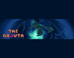
An inventor shrinks herself to microscopic size to destroy the cancer cells in her mother’s body.
Platformer
Recent community posts
itch.io Community » itch.io » Questions & Support · Created a new topic Tiny Cars seems to have been deindexed after launch traffic dropped