
Hey Cal! I wanted to put in a request for an update to the pack (or maybe this is already a feature and I'm missing it). There are a few choices in my game where it would be nice to have a little bit of extra space in the choice box. Currently, I have to keep it pretty short otherwise the text clips out of the box. Would you possibly be willing to update it so that if the choice goes beyond the normal bounds it uses a second box asset that has two rows in it? 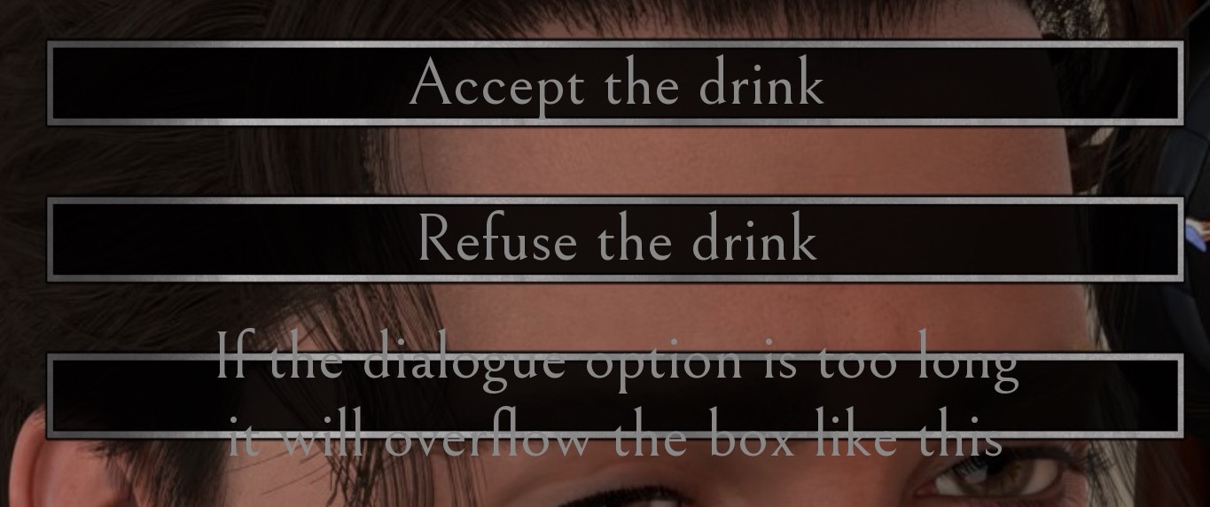
A member registered Jan 24, 2019 · View creator page →
Recent community posts
Hello! I noticed that when I switched in my custom main menu BG, there was a red filter going over it. I've tried messing around with turning off some of the overlays, but even with the main menu sidebar turned off I'm still getting the same reddening effect. I'm guessing there's an overlay I'm missing somewhere. Can you point me to the place in the code where I can remove this red filter?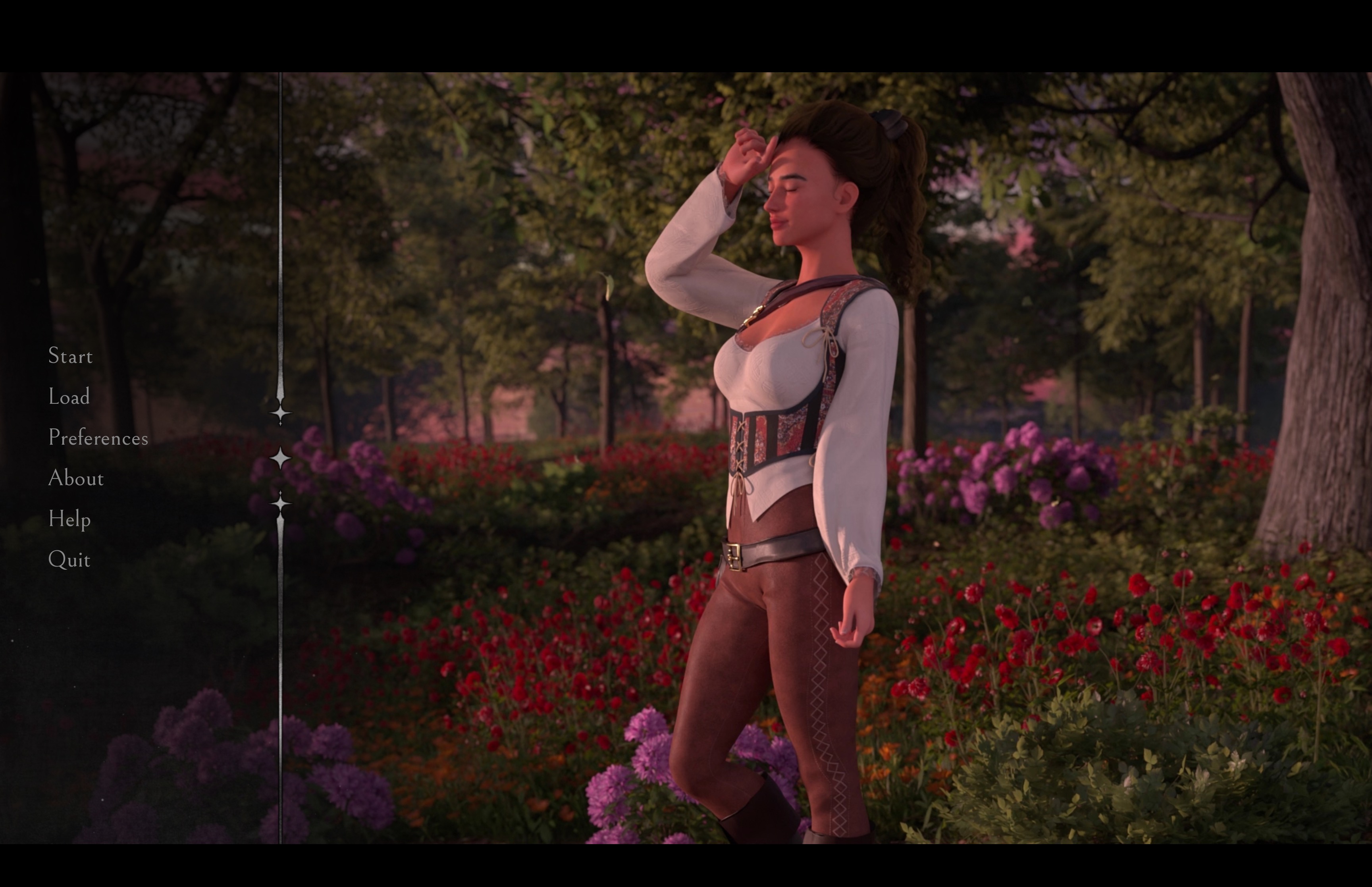
itch.io Community » General » General Discussion · Replied to Bmaster4114 in List of shadowbanned NSFW games