If you need help with the Template please post here.
Hello! I noticed that when I switched in my custom main menu BG, there was a red filter going over it. I've tried messing around with turning off some of the overlays, but even with the main menu sidebar turned off I'm still getting the same reddening effect. I'm guessing there's an overlay I'm missing somewhere. Can you point me to the place in the code where I can remove this red filter?
Hello, thanks for the message. Did you use my template without merging the project or any edit/adjustments to my code? The Template shouldn’t have any red filter as seen in the preview on the itch page.
I have also tested it on my code and it didn’t have a redness issue, so I think the issue isn’t from my code:
Thanks for the quick response. I dug deeper, seeing it wasn't happening on your end. I'm not actually using the exact file I attached here (.png), this one frame of an animated loop that I have in there as a .webm. Apparently other people are also having this issue from scattered forum posts, but haven't found a solution yet. But, more relevantly, it's not your fault.
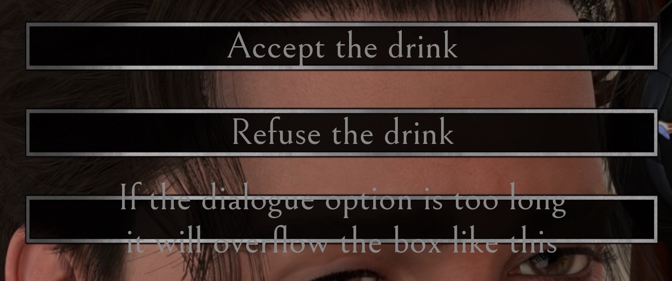
Hey Cal! I wanted to put in a request for an update to the pack (or maybe this is already a feature and I'm missing it). There are a few choices in my game where it would be nice to have a little bit of extra space in the choice box. Currently, I have to keep it pretty short otherwise the text clips out of the box. Would you possibly be willing to update it so that if the choice goes beyond the normal bounds it uses a second box asset that has two rows in it?