Indie game storeFree gamesFun gamesHorror games
Game developmentAssetsComics
SalesBundles
Jobs
TagsGame Engines

mildmojo

29
Posts
1
Topics
26
Followers
1
Following
A member registered Jan 12, 2016 · View creator page →

Creator of

Recent community posts

(1 edit)

Played a whole bunch, rarely got thru level 2, only got thru level 3 to the final boss once (and failed). It's hard! Finally had to put it down when I experienced the high of beating the level 3 boss for only my second time, followed by the absolute low of the final reward chest being a game-ending mimic. Whew. (Feels like this shouldn't be possible!)
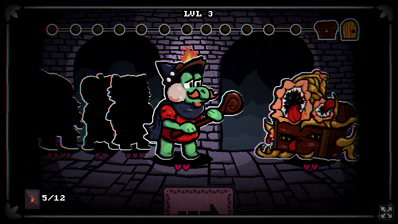
I eventually figured out that it was important to tune my deck by kindling something at every opportunity (like any deckbuilder). And for the first few runs, it was key to use Snooze cards to grind level 1 or 2 for a better deck before proceeding. Then more Snooze in level 3 until the RNG delivers a level configuration your party can pass.

I love the simplicity of the gameplay with the large number of possibilities for deck/hand/level combinations. The art really lines up with the AGBIC source art, too! Music's great, sound effects are varied and fitting, and there's good variety in the way the encounters play out. Great work!

Oh no! If you're using the mouse or a touchscreen to drag the slider around, try clicking the buttons on either side of the slider instead, or using the keyboard keys. Sometimes it's easier to zero in on the right wave shape with buttons.

Once in a while, the right value might be very close to one end of the slider or the other, and they can look very similar. If it feels like it's very close, but you're at the end of the slider, try moving to the other end of the slider.

If nothing works, you might've found a bug! 🤓 I just tested the game a couple of times myself and didn't hit any snags, but the wave configurations are randomly-generated (with constraints), so you might've happened upon something I've never seen. Try restarting the game (Esc).

Thanks a lot for giving it a try, anyway!

Thank you, enui! What a lovely Secret Santa gift!

The artwork is beautiful. The forests and the persimmon tree are my favorites, and the brickwork detail in the front wall of the house is evocative without being distracting. Inverting the chair backs over the table to lend perspective? So smart.

I'm impressed at how well you used the theme suggestions, too. I tried to leave them pretty open, and this is such a smooth blend.

I like the blinking pixel as a dialogue indicator! I'm going to have to borrow that. The scrolling exit transitions do such a good job of making the rooms feel connected spatially, too, especially when half of the previous room is still on the screen.

Walking outside thru the kitchen walls, or back inside thru the walls from the backyard, or climbing down the chimney may not have been intentional, but didn't take away from the experience for me.

Excellent work, enui! Merry Bitsmas!!


This is a really cool way of documenting your dental history! I've got my own complicated history, and it was fascinating to learn about yours.

I was long into adulthood before I took brushing and flossing seriously, but so far it's working out okay.

A tech once explained to me that dentistry is about *prolonging* the lifespan of your teeth, since they're likely to fail sometime in your life. Everyone should definitely see a dentist regularly if they're able.

When I package up games, I've had good luck zipping a game with the Windows built-in folder right-click "Send To => Compressed (zipped) Folder". It marks everything in the folder as executable when Linux and Mac users unzip it. Third-party archivers like WinZip or 7-Zip usually don't mark files as executable, and require the permissions fix with chmod u+x.

The art is very, very pretty. Great use of panels. I did have some trouble finding exits from time to time, like in the final sun room.

I like the way you reused screen space for more and more panels; it wasn't just a static set of them that appeared and disappeared.

Oh no, poor star! John's a monster.

The crevice is definitely a cool addition. I like the way you reused that single room for a bidirectional passage by warping the player to the top or bottom of the crevice adjacent to the exit for the direction they're headed.

I think it doesn't end? You collect the faffins and then you're stuck?

The pink and purple look great together. The bit about "you can't go to the city" is a cool way of indicating there's more to the wider world that you can't access.


Cool story! I really like Bitsy games that present computer UIs with a cursor avatar. It's very different from map-walking, but still feels good. 

I get why the reboot button is there, but I hit it twice by accident. =P Maybe it could show dialog that says "Please press CTRL+R to reboot"?

I like that the game ends (I think) with the "where is anon?" answer, but I dismissed it too quickly the first time I got there and it wouldn't redisplay. I thought I'd use it in-game with the Tor browser or something, but later realized it was for external use. It'd be nice if you could redisplay that bit of info once you realize the game doesn't have a traditional Bitsy "ending".

The login cursor was a perfect use of the shaky text effect.

Aw, thanks! And thank you for telling me what you think about Casey and the detective.

I'm digging the palette. Really effective reuse of the background color in dialogue, too.

I've had the music looping in the background for like 10 minutes now. Very simple but perfect for the tone of your dreams.

I like the way you have one-way path branches. I think I only played through two, but they were very different. There was one room that let you fly up into the sky among the stars, which really communicates the idea that you're dreaming. The art backs it up; cool text and big sprites.

Potion cat!! =D

One typo: pungeunt => pungent.

Oh! I didn't realize the breaks were a recent feature!

I really like this. I love seeing Bitsy games that subvert the system to act like a different kind of UI. Moving the cursor around is perfect, and the interaction with apps and messages feels great. The grey palette worked really well. Loved the power button to end the game, too.

I read the messages from bottom to top, but I got the impression they were meant to be read from top to bottom. You could maybe nudge players to do it that way by warping the cursor to the top.

The messages were a little hard to read all smushed together.  It takes a lot of effort, but you could carefully insert {br} line breaks if you wanted to clean up the way they show in the dialogue boxes.

I like the time machine combo system a lot. I accidentally visited one of the coordinate words before I was told to, but it was fine. Good use of colors. The animated fountain and dirigible ladder were my favorite bits of art. Cute end screen with all your animal friends.

This is really pretty. I like the color palette a lot (and the way you've carried it over to the itch.io page). The way the wispy trails spread out behind you is my favorite part. Like clouds of dust.

I've updated the server to v1.2.1, which fixes bugs in the code that translates button numbers from what the board reports to the way they're physically laid out. It also adds a new WebSocket message that tells you the entire state of the board, sent once when you first connect.

NOTE: If you're using regular HTTP requests to `/buttons`, the device property `length` is now `buttonCount` and the `buttons` object is now a flat array of true/false values in button number order. Adjust your code accordingly. See the documentation for details.

Server v1.3.0 release

If you're still looking for a general-purpose API for talking to the board, and you've ever talked to a web service before, you might like the web adapter I just published: Buttons Are Cool Gateway Server

The server exposes the button board as a web service (HTTP GET and WebSockets). Most languages have good libraries for making web requests or talking to WebSockets.

Cheers!

(2 edits)

Hi, all.

I wrote a tool to help people make 100-button games with any language, tool, or framework that can talk to the web.

Buttons Are Cool Gateway Server is an app that exposes the 100-button board—connected on serial port(s)—as a web API. You can query the board with a regular HTTP GET or get realtime button events over a WebSocket. There are standalone downloads for Linux, Mac, and Windows.

I wrote this server to help people who are using languages or frameworks that can't easily talk to custom hardware. It also provides an emulation mode where you can use a web browser (or tablet, or phone) to simulate the button board, making the server send button events as if a real board was attached. Great for testing.

The server has a feature that can launch your game and then exit when your game exits, too, so you can make small batch files that run the whole shebang transparently.

There should be good WebSockets and HTTP libraries for most languages. Full documentation for the server is available on GitHub, and the project is released under the WTFPL.

Let me know if you have any questions! Show me what you make! You can ask here or on Twitter at @mildmojo.

Thanks, Jupi! =)

I'm a sucker for a time loop story. =) I'm glad you had so much stuff to interact with in the room, but it felt like maybe some of it was intended for more loops that you didn't have time to implement. It'd be cool to build this out some more, exploring the way the player can reuse the space for different parts of the loop.

I'm not sure I've ever seen a voxel model rigged and animated like that. Kudos on the experimentation.

The environment looks awesome. Good lighting and detail. The multiple fixed-position cameras reminds me of Alone in the Dark, while the feel reminds me of the opening scene for Out of This World (Another World). The music was super atmospheric, too.

Very polished! Nice work!

This is cool. I've never played an RTS where your units start to resist you. I like how units and buildings start telling you "NO" when you try to command them if they've turned against you.

The news stories were an interesting touch. I tried denying a few times and it always said it was the wrong choice (and sped up my units turning blue, I think?). Was spin always the right option?

The gameplay summary screen was good, too. I assume you always get an F, because you're an idiot for spending all that time and money trying to conquer your neighbors. Good commentary.

The art's great. The newscaster characters look awesome, the units are easily readable, and the visuals are very cohesive overall.

Moving units one at a time using right-clicks was kind of awkward, but it fits your theme here. Efficiently waging war isn't the point of the game.

The rolling-up-things part worked pretty well. I like the way the items get pulled into the middle of the ball and you can still see them there later.

I definitely understand problems of scale during a jam. Still, you built out a pretty good-sized level. I really wanted to be able to roll up the plane. =)

The ball went nuts when I rolled up the signs at the airport. I assume that was intentional as a sort of end-game, but it was also pretty glitchy, flying around the level and getting stuck in the terrain.

This is cool! The aesthetics are great. Good palette, excellent models, nice use of minimalism to convey the subway car, and the sound design really rounds out the setting. The camera work is really polished, too.

I played it a few times. I liked the varied player responses to the insensitive cats getting on the train, including becoming a harasser yourself. I do wish the antagonistic cats' scripts varied a little depending on your responses. They seemed to deliver mostly the same lines on each playthrough regardless of what I said.

Very nice voxel art! Clever way of implementing censorship, too, with the hand of oppression squeezing discussion bubbles. The squeezing looks and sounds great.

You've said you didn't want to encourage a particular goal, but what if the goal was randomized? Each game you'd be tasked with "encouraging" the populace to adopt a different set of beliefs?

I checked the billboard pretty frequently, but I didn't feel a strong connection between the billboard and the discussions I was squashing. It might help to have an indicator for opinions that are beginning to change.

The screenshots look awesome. I wasn't able to get it working properly, though.

The keyboard events need to be intercepted so they don't trigger browser built-in shortcuts. I use typeahead find, for instance, that pops open the browser's find-in-page search box when I start typing, so it takes focus away from the game. In Chrome, the space bar scrolled the page down when I was trying to type.

I haven't worked with Phaser in a while, but in plain old javascript you want to call .preventDefault() and .stopPropagation() on the keypress event object. I think Phaser has a .preventDefault somewhere that you can use.

Nice pixel art! I like your feed UI.

I wasn't completely sure how things were progressing. Like, I wasn't sure if people just changed over time or if it had something to do with me liking/commenting/sharing posts. I'm not sure how long I played before I noticed the "go outside" button; it could use a little bounce or something to draw the eye.

I liked the little point-n-click sequence at the end, the "go outside" sentiment, and the message about social media filter bubbles. Nice work!