

I had a great time with the demo!
Some thoughts/bugs for the developer:
- Inverting the camera also inverts the dive move and the rocket mouse. This felt weird, and I don't think these should be inverted as they're moving the character, not turning/moving the camera. This makes sense for the bazooka, though.
- The totals menu might benefit from brush names, a couple took me a good while to track down, and names would give a helpful hint.
- Escaping menus with the B button (West button?) would be appreciated.
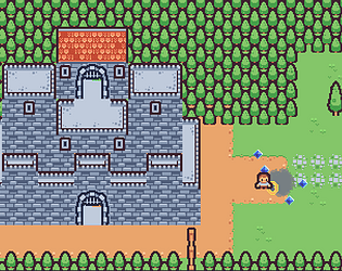
Beyond that, it's shaping up to be pretty cool! I really like the character and level designs.