Play asset pack
one bit rabbit tiles's itch.io pageResults
| Criteria | Rank | Score* | Raw Score |
| Clarity/Readability | #16 | 3.714 | 3.714 |
| Consistency | #17 | 3.857 | 3.857 |
| Restriction | #17 | 4.429 | 4.429 |
| Overall | #17 | 3.857 | 3.857 |
| X Factor (overall enjoyment) | #18 | 3.429 | 3.429 |
Ranked from 7 ratings. Score is adjusted from raw score by the median number of ratings per game in the jam.
Leave a comment
Log in with itch.io to leave a comment.


Comments
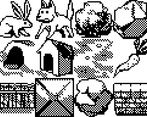
I quite like your dithered shadows, they really help make the objects feel solid and shaded.
I also like how illustrative the tiles look, as if they were translated to pixel art from a story book.
I think you might find building a scene with these tiles to be a little tricky, as they're mostly not designed to tile seamlessly. The brick wall for example has the 3D tapering, which looks great in isolation, but probably a bit weird when placed beside itself. The shadows on the fence tile wouldn't tile smoothly either.
Perfectly acceptable for an old-school puzzle game though. They look great!
thanks, yeah i agree. i was low on time bc goblins were chasing me and i didnt have time to build a test scene. wouldve probably adjusted some stuff if i did 🦧
I think I started to recognize your style
you think so? maybe
my stuffs usually based on a full black outline, and here i decided to do black on white background to still be able to do that. plus i've been doing 32x32px for a while, i need to try some other format in next jam
Maybe 24x24?
maybe, or maybe something bigger