The astigmatism gets worse with age. I've been gaming since the 70s, so I'm 59 right now. Also big in the mods and modpacks for Minecraft, linktree data on my creator page.
Kreezxil
Recent community posts
I feel like if I visit a tab that has the notification indicator on it, after I leave the tab, it should stop having notifications on it. I find it bothersome that I've started a new run, where I procured a 30% bonus to production buff, but because there are 7 buffs I qualify to purchase, the indicator stays up there. I don't want the other buffs because that 30% is good on this run. And I expect to be able to buy the better buffs later. Since there's no way to equip more than one of the buffs, I see reason for the unbought indicator to remain, especially on this tab. At a minimum provide a config that allows us to turn off unbought indicators after visiting a tab and leaving it.
to be frank, that's not an experience popup, it looks like a cooldown, becuase it typically appears as ~#/s and decrements don't to 0. Then the buy & sell buttons move back up in to normal place. I recommend the cool down move to the side of... or in-line with the material cost of the item. Or be embedded in the buy button itself.
Thanks for the responses. I see you say it's on the way, but I'm going to add to it.
For logs dialogue popup alone.
All these colors are way too dark.
It's ok if the background is dark. But, the texts need to be brighter. The dimmest text needs to be very visible in contrast. Like at the point where if you go a bit lower, it now enters the blind area.
I suspect you have very good eyesight.
To help you see how I see, put on a pay of blue blocking sunglasses.
Also view the screen from 3 ft away. I have 32" 1080p monitor that I am viewing the game on that is 3 feet from my eyes.
I suspect you developed everything on a laptop and are likely sitting with 12 to 18 inches away from the laptop screen.
These are just observations.
The Timer (muted grey-blue) and Comms Chatter (slate grey) are way too dark.
the Comms label (Light Sky Blue) should be the minimum color here as used for the timer and go up from there.
IE don't go overboard with the high contrast theme. Just need to the bring text forward some, so it can all be read.
The comms chatter part of the log, the part in italics, appears to be Italic, Sans-Serif Condensed width. I recommend a wider, slightly thicker font or font properties. A super thin font as is being used there makes it hard for folks with astigmatism to read.
that little +1s or w/e that pops up under the material cost when I click on buy is annoying as hell because it makes the buy/sell buttons move down ever so slight for a short bit. I would be able to tell you what it is but it's like a dark orange ontop of a dark brown. so I can't really read it. see previous comment about colors.
Is johnnynolegs a co-developer?
Something I learned by making many mods and mod packs for Minecraft as well as various forms of shareware starting in 1992 with the Amiga computer: When I defended my programs and apps, I tended to get less and less feedback, and eventually I would lose interest in my own projects. But when I was appreciative of the feedback without defending my stance on my projects, I found myself increasingly engrossed in the development of the apps in question.
Every bit of feedback is someone offering you insight to improve; you don’t have to accept any of it, but you don’t need to defend your stance either, as none of it’s an attack.
However, someone hating on it because you used a hammer instead of a screwdriver—that’s not feedback, it’s pure criticism.
AI has a place in society, and it’s here to stay. It was inevitable; what does one do with massive computer resources anyway? Maybe use it to better our lives, and what are lives but a myriad of many things? Some of it is enhanced by hammers, screwdrivers, chickens, grassland, foods, relationships, etc., to include applications.
What we do with AI now determines its usefulness in the future.
The mana well, which should be an upgrade, is less powerful than the dripstone. That doesn't make sense at all.
I think the mana well needs a better description. I see what it's doing. It's massively increasing the amount of mana that should be the ceiling, i.e., the 'y' value.
But as I said already, your 'y' value ceiling is broken.
I got an upgrade that suddenly made the mana wells feel worth it.
It definitely needs a better description. Because it feels so broken for a very long time. I'm sure you didn't mean for this to be played with an autoclicker so I'm able to tell that a normal player will feel the game is really broken and abandon it.
It looks like your mana meter has a broken ceiling. Even when you hit your max capacity (the 'y' value), the system doesn’t stop 'x' from increasing. This "over-clicking" allows you to stockpile infinite resources far beyond what the UI suggests is possible.
When combined with an auto-clicker, this completely breaks the game economy. Since you can accumulate massive amounts of mana in seconds, the cost of upgrades becomes irrelevant, allowing you to buy out the entire shop instantly. Effectively, the resource cap is purely visual and provides no actual limit on your purchasing power.
A decent middle ground would be to have a full configuration where default values are how you want it to be played, and we can turn them off or on at our pleasure to suit the control interface to our desires.
Here's another thought: instead of wiggling inside the droplet or using the mouse wheel on it, why not just be present in it? If you're not present in it, it doesn't disintegrate.
You could have your cake and eat it too. I just thought as I wrote that, why not also have it that if you're in the droplet and you move the mouse wheel up and down, it disintegrates faster?
Wait, okay, how about this: you go in the droplet, and that selects it by default and starts disintegrating it. There can be upgrades for that.
But if you decide to use the mouse wheel, you also get areas of effect; it makes the disintegration happen faster. Then, if you have the area buff, you can get more than one droplet.
That way, those of us who want to be in the droplet—that's on us if we don't progress as fast as the players who are also using the mouse wheel.
It feels like it would be more intuitive if the game detected that I moved my shroom over a droplet and that set the focus on a droplet. If I move to another droplet, the focus follows it. Then, instead of moving the mouse wheel around, which is odd—I've never had to use that in that way before...—I just have it so if I move my shroom around inside the droplet, that counts as disintegrating it.
That would give you more things to add to the game too. Like the radius around the shroom where other droplets can be acted upon and the strength of acting upon a droplet.
This game would be remarkable as heck with fewer things to use for controls.
I'm not sure if I like the mechanics behind the battery. Ok, why not have pressing the spacebar be the only method required to attract the battery? Having to click it to use the spacebar seems unnecessary.
so i'm prestiging, after the 3rd prestige I began keeping all my prestiges purchases making the rewards seemingly useless. Remember, when you prestige in a game like, only things that prestige purchases grant are what carry over.
Figured it out. So the first two stats are resetting on prestige but not the other ones.
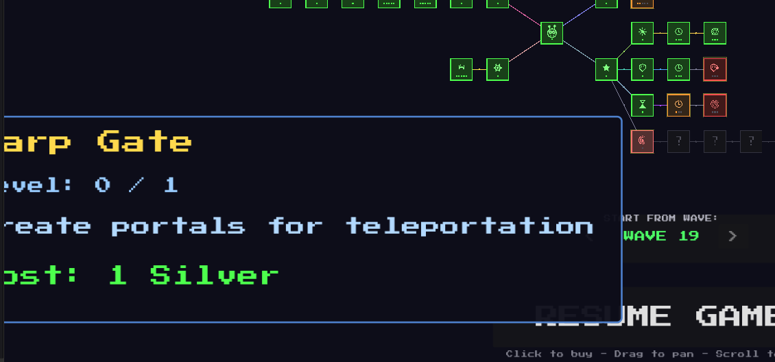
when I'm choosing a building or upgrade or anything else from the store, the box is pulsing. I think it also makes the mouse click not immediately register. If you're doing that to draw my attention to what the mouse is over, don't. Just changing the color to a contrasting color to the background is sufficient.
in the lower left corner where it displays the news, the stats that you are displaying there, the last line of it underlaps behind it.

The prestige system doesn't work. I have 29kbp in the bank and the messages there says you need 10kbp to cash in for chips. is that typo, do we maybe need 100kbp?
V2 is great. I would like the option to zoom out the skill tree even more, but as far as it remembering its zoom, you fixed that.
I thought of an interesting idea that could be used to gain perks like not having to click—for example, hover attack. You could have special nodes that, if selected, cause a tower defense mini-game. There would be an obelisk with the perk on it in the center of the screen and mobs attacking the obelisk. The obelisk has a hit point value, and there is a timer; you want the obelisk to survive until the timer has expired.
I’m thinking of something else that might not have been done before: instead of allowing someone every perk in the tree, perhaps certain perks—like the hover attack, earthquake on spacebar, or others—are linked in such a way that if you win one of them, the others are ghosted out, including their entire branching trees.
That would give a reason to try different runs beyond the game's procedural generation.
A local and global leaderboard might be nice. If you do a global one, you’re going to need some way to prevent people from abusing it; I’ve seen global leaderboards hacked before.
And definitely a save system.
Feature suggestion, not a must-have. I thought it might be nice to have an incentive to hit the bombs more, like you could buy an upgrade for them that gave them razor blades. The first upgrade slices one fruit, and the second upgrade slices two fruits. If the fruits are on the screen, that is.
And while typing that I thought also, you could go so far as to provide upgrades to the pegs, like knife upgrades. Turn pegs into knives so that any unsplit fruit is split, like making it an expensive upgrade.
You could easily do lots with this and your style—very addicting! Good job, well done!


