
THIS REPOSITORY HAS ROOM FOR BUT ONE GAMEDEV!
illtemperedtuna
53
Posts
4
Topics
28
Followers
7
Following
A member registered Mar 19, 2020 · View creator page →
Creator of
Recent community posts
Take your time dude, game isn't going anywhere. I don't really need art assets to be honest, but I appreciate the encouragement so i'll throw whatever you end up cookin' up into the next build! I can't gaurantee they'll be in the game forever, but I will gaurantee they'll be around for at least a few builds.
P.S. Don't let this get in the way of you working on your own project!
The (ONE ARMED DRUM) Beatings Will Continue Until Moral Improves comments · Replied to Antonio@UnlockdPixl in The (ONE ARMED DRUM) Beatings Will Continue Until Moral Improves comments
I'll look into the movement, no not a design choice but there are several movement systems with little quirks that could be causing this, the main one being the system that adds a bit of extra speed when you swim in a curvy manner, It might already be fixed in the recent build, but I'll keep an eye out for it.
Hey if you want to do a bit of art and feeling inspired go for it, i'll throw it in the game!
The (ONE ARMED DRUM) Beatings Will Continue Until Moral Improves comments · Replied to Antonio@UnlockdPixl in The (ONE ARMED DRUM) Beatings Will Continue Until Moral Improves comments
Nah actually it wasn't a scummy move. The art I did for that game wasn't up to its amazing standards. The artists who truly contributed to that game's amazing standards deserve the credit 100%.
This industry is riddled with people who think everyone needs all the credit. I absolutely did not help make that game better! But it's pretty cool knowing the crappy wallet I did made it in! I had also done some tomato assets and a lathe that I guess didn't make it into the game because they took that particular bit of story out.
You're getting WAYYYYYYYYYY ahead of me haha. I have some vague notions about how the long term rewards will work, but I have so much game to make before I can start shaping up those systems.
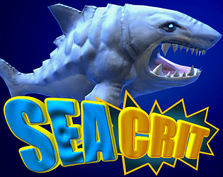
Have you found SeaCrit lake yet? I have a bit of lore in the game already, would be curious if have thoughts on it.
For bosses I plan to take the ancient, time honored tradition off... taking the base art of my existing assets, turning it red, making it bigger, giving it a boss bar, and shamelessly reusing the art assets XD
No idea how many zones i'll do. I think probably just 1 new zone at a time, but hopefully once we find our groove we put out new builds and updates maybe even weekly. So if we really find a groove maybe 2 zones a month?
It's hard to predict because when you're solo deving on a project such as this with so much to do, you really gotta just roll with the punches!
Most importantly do we actually get our mojo back and start hitting this hard again, I sure hope so!
The (ONE ARMED DRUM) Beatings Will Continue Until Moral Improves comments · Replied to Antonio@UnlockdPixl in The (ONE ARMED DRUM) Beatings Will Continue Until Moral Improves comments
Hey thanks dude! I would say make systems as modular as they need to be. But it's fine if once in a while or out of the gate you take a system or two too far.
That's how we learn! Sometimes we'll not make things modular enough and they break and they have strange internal logic that is a pain to work with, and we learn to spend a bit too much time. And at some point you're going to make a system you spend FOREVER on, make it perfect and allow it to work with other systems, and then you're going to find that you gotta take some of that functionality out and it was a big waste of time.
But there are no wastes of time in gamedev, so long as you learn from it! Unless of course you're just checking things off a TODO list for some crappy corporate tittle that makes no sense and you'll have no control over the stupid decisions of the future.
The only way we're ever going to figure out better ways of doing things and better stratagies is to try these things. And never not do something just because you figure someone else wouldn't. Because we'll all try different things and who knows, maybe you stumble across some new practice that defines your style or helps you come up with workflows that work for you.
Because there is no right or wrong way to do things, there's only the best way you've found so far that works for you.
The (ONE ARMED DRUM) Beatings Will Continue Until Moral Improves comments · Replied to Antonio@UnlockdPixl in The (ONE ARMED DRUM) Beatings Will Continue Until Moral Improves comments
I've only worked on failed stuff no one has heard on! At least on mod teams, I can't even remember most of it, one project had a little funding and I made beer money on it doing some unit artwork for a command and conquer clone.
The stuff you've heard on I worked on proffessionaly while I was in the industry. I did some water particle work for Days Gone, and a bit of particle stuff for the Magic the Gathering card game. I have no idea how much of my work actually made it in these games though.
I do notice the token particle effect seems to be largely what I made, and I got this crappy wallet asset into BioShock 2. I was one of the many artists that got an email from the guys managing the outsourced art on that game telling us we weren't allowed to claim we worked on that game. Well I prefaced that I did SHITTY artwork for it, assholes! Does that allow me a fraction of your wonderous glory!
Ha, to be fair the art I did for that game was in fact ass, so I gotta behonest, if you liked the art style of that game I can't take any credit to be fair, but it's cool to say I got an art asset into that game! My abilities as a particle artist were a more developed than as an environment artist.
Haven't seen too much from skyblivion, but I'm on the side of any small group of passionate startups outshining these idiot mega corporations run by money grubbbing douche nozzels any day... OBVIOUSLY
The (ONE ARMED DRUM) Beatings Will Continue Until Moral Improves comments · Replied to Antonio@UnlockdPixl in The (ONE ARMED DRUM) Beatings Will Continue Until Moral Improves comments
Whew, that's a lot of responsiblity to think anyone would be following along on this journey and actually think I have any idea WTF I'm doing! I'll do my best to give you some multifaceted advice, because what the right path to take in gamedev has to be the most random, "Who the heck knows?" sort of question EVER!
I don't even know what the heck I'm doing, so I feel a little weird giving advice from the position of abject failure!
Ok, i'll try to just be straight up, and bear in mind, sometimes the best thing you can do is just be stubborn and follow something if it's really calling you, follow your gut. It's not a guarantee of success, but it'll likely give you your best chance or at least be what you want to do stumbling down this rocky road.
My first bit of advice would be don't do multiplayer, eveyrone wants to do multiplayer until they start making a multiplayer game, to say nothing of the hidden pitfalls of your game just never being played since no one can find anyone to play a round with.
Multiplayer tends to be an evolution you make when the time is right, or at least that's how it used to be back in the day before everyone and their uncle was chasing some break out multiplayer hit right out of the gate for all the wrong reasons.
If I could go back in time and do something diferent after being a stubborn goof ball just pursuing SeaCrit with reckless abandon, it would be to make an idle game.
I friggin' LOVE idle games, and I think they have a lot of room to grow and evolve and the bar for making a break out hit idle game is SO much lower than to make a popular 3d beat 'em up.
https://cheerfulghost.com/games/candybox2
Too often as solo devs just starting out we want to make a Science based dragon MMO, but there is so much more room to try other things, inventive things with less limiting overhead of fancy graphics and netcode , and they're also easier for people to try and to put up on various websites.
The best advice is probably to just run and don't do gamedev this place is a meatgrinder, and the industry is fallen apart, and the storefronts are all locked up, and flash is dead, and in every conceivable way the asshole deep pockets could make this hellscape harder to succeed in, they have done so.
But if you're like me you just really want to make a game and have a damn the torpedoes mentality.
I wrote this article some time back, but it still holds up:
https://code.tutsplus.com/cubes-vs-space-marines-making-a-great-game-in-your-bas...
I think I've got some pretty decent insights in there about how to get started on this crazed journey.
Everything in gamedev is a contradiction. If you spend too much time on one project, you might be putting all your eggs in one basket and waste time on a game that's a dud. You also don't learn broader skill sets or force yourself to go through the motoins of retooling workflows in a wax on wax off manner. Jump from projec to project and you wont develop the habit of pushing things to actual completion, learning to set your standards high and invest into something you're truly passionate about. You kinda learn to chase that feeling of butterflies in your stomach like someone that goes on too many first dates, and then wakes up at 35 and realizes they're old and alone...
But in this era of game jams, I do feel like you can be a bit of a diamond in the rough if you learn to actually stick to something and give it the time these systems demand in this era of instant gratification!
At the end of the day, I would say just do what really calls to you. If that's multiplayer, stick with multiplayer, if it's an action RPG make that actoin RPG.
The trick is finding a way to make it doable, how do you simplify it? Because the truth is, that this industry learned the hard way, is the player won't know all the manhours put into something, they don't care how many years you put into assets, and rigging and all that jazz.
All they care about is the ratio of Secret Sauce you can put into every bite of your game. So for all our dreams of making these high end games with fancy graphics and assets and high art, a lot of players just wanna play match 3 games with images of candy in it!
Finding success in gamedev will NEVER be easy, the various pitfalls just trying to keep motivatoin up gets to be soul crushing after years of time, to say nothing of fickle player bases and chaotic markets, and industry manhandling.
TLDR: My advice would be find a game that's successful, that was RELATIVELY EASY TO MAKE, that you're passoinate about and you think you could be called to put your own spin on it.
When you think about it, there are genres of hugely succesful game that have only scratched the surface of what's possible! Idle games, games like peggle, card games, heck look at Balatro! Balatro is a fantastic example of taking a game that's easy to pick up and play and already has universal appeal and it throws a whole new layer of digital depth to it!
I do want to stress though, that you're probably asking the wrong guy as I have no idea WTF I'm doing and haven't had even the slightest bit of success after all these hard fought years, but I'm really stubborn.
So I would have WAYYYYYYYYYyyyyyyyyyyyyyyyyy more confidence in explaining how to FUCK UP your game development ROFL.
But there it is, that's my attempt at helping you course correct to a project that might suit you.
OH and I would recommend you check out Jonas Tyroller on youtube if you haven't already, that dude is AMAZING for helping other people find the right path of making a game, and the dude walks the walk too, which so many people don't appreciate. Guy is a total work horse and puts the hours in and deserves every bit of his success, I don't know where he finds the time to make YouTube videos on the side, I spend most my free time on youtube watching people bitch and moan about modern marvel movies.
Anyhow! Don't be shy about any follow up questions you might have Antonio. Hope this helped you in some way shape or form!
The (ONE ARMED DRUM) Beatings Will Continue Until Moral Improves comments · Replied to Antonio@UnlockdPixl in The (ONE ARMED DRUM) Beatings Will Continue Until Moral Improves comments
I HATE monsters scaling with player power.
In fact i'll share with you a little story about skyrim I had, Antonio
I'm a bit of a min/maxxer nut myself, I'm pretty good at getting a talent tree and finding the best means of maxing power, or finding broken aspects of gameplay in an RPG.
So in Skyrim you get all those talents, and the vast majority of them make you stronger, but I was playing for the long haul. I was going to max my social skills, get all the lowest prices for my regents, and I was focusing on blacksmithing as well, so my plan was to start weak, but finish STRONG. I'm also the player that saves every Megalixer for the final boss and when I get to him, of the 85 I have in my inventory, I use maybe 2 haha.
Well I get about a month into the game, I'm digging the hell out of it. But I notice that I am getting my ass handed to me ALL THE DAMN TIME, and it's just not that i'm terrible at video games, it's also that something just seems "Off".
So I went online to investigate WTF was going on because the game was becoming more and more unplayable the further I got into it, and I was JUST about to start trying to turn my talent points into actual power.
It was only then that I found out about the nature of rubber banding difficulty in Skyrim.
Suffice to say, fuck no we're not going to do that, enemy scaling difficulty is a bag of balls, and more a design principle suited to large teams where they need band aid solutions to solve problems stemming from lacks of communication
I'm too damned pretentious as a designer to surrender to enemy scaling difficulty!
That said... I have mulled over some elements of blanace that would invalidate power progression XD. What can I say, i'm a big of a hypocrite!
So let me explain, in most games you have fire and ice and lightning, and they're just different colors for the same tired damage formula's of magic.
I'm thinking of adding a damage type called "Pure" damage, and what this damage will do is a raw, undiminished percentage damage to your existing HP pool (aside from maybe shields, but to a lesser extent). And this essentially does the same thing. But I think having big hits is kinda important to have sometimes when you're facing things like bosses and mini bosses, or certain lumbering enemies.
What's great about this damage setup that I hope the players don't figure out is it creates only the ILLUSION of danger, because if you're tanky enough to survive 50 hits, but I have some mechanic that saps away 30% of your existing hits on top of those normal hits. You can still withstand a bevy of punches to your face, but as you watch your health bar get smashed towards zero, you're going to FEEL as though you're in danger, even if you're not!
There are so many little tricks such as this that i'm gearing up to employ to make the game feel thrilling and fun. This is probably one of the only trick I know of in my head now that I think about it, but it sounds cooler if I sound that.
Point is, I'm absolutely 100% a progression nut, I even posted my top 10 games on twitter the other day and most of them are games for people who just like to grind for power for months on end. Dota 2, World of Warcraft, Diablo 2.
I am a gear, power leveler, stat, talent tree nut! So rest assured I'm not coming into this half assed and running into the same problems as other teams as we go, we know this shit like the back of our hand. When we're not working on SeaCrit and "Goofing off" we are playing higher end progression games with inventive power progression and we're min maxxing our asses off. That is absolutely my jam and all the unseen work we've been working on over the years feeds into this! (And also all the sitting on our ass and playing other games XD)
It's a delicate balance. You need for there to be rules in your game of progression. If a player has that special run where they find all the right rare loot, and all the right bonuses and hit it big with finding lots of goldfish and got rich and bought all the cool stuff, they need to be powerful, no rubber banding mechanics in the game should trivialize that.
I really appreciate the continued interest Antonio, it's actually a really huge compliment.
It's kinda like when you bring food to a pot luck, of course everyone is going to say "OMG, your casserole was AMAZING", but if you look at the pan and there's only 1/5 of it eaten, you know you're a failure!
The greatest compliment you get can get as someone who makes something is for people to say they want to consume it!
I'll write a blog on this subject of skills in just a bit, going to meditate on it a bit and devise a plan for a blog post and for work today and it'll likely inspire work for today so i'll upload a video on that as well.
This should be fun!
I know I said I'd get to work yesterday, but I ended up slamming 2 cups of caffeine and playing DOTA 2 all fucking day.
Hypocrisy, thy name is IllTemperedTuna.
So TODAY, today is the day we get up off our ass and become the vengeance of gamedev, yesterday we had noobs to pwn.
The (ONE ARMED DRUM) Beatings Will Continue Until Moral Improves comments · Replied to Antonio@UnlockdPixl in The (ONE ARMED DRUM) Beatings Will Continue Until Moral Improves comments
Ha, I lke my blog posts too!
WTF IS WRONG WITH US!?
So glad there's at least one other crazed soul out there that gets a kick out of all this mental sperg outs haha.
Good timing on your post, I was just about to get up and get to work! Think today I'm just going to do a bit of world building and maybe get some work done on the axe and shield.
I had this epiphany that I need to build the enemies around what the most fun path to power the player obtains.
Too many games do the opposite, they create the enemies and their loadouts first, and then they try to fit the player power and abilities around that.
THAT'S THE STUPID WAY!
So I'm just going to build up the player and their weapons and attacks and movements in the absolute most intuitive and fun way I can, and then i'll tune up the enemies around that.
We'll see though, today might be a dud, but I do feel as though I'll be back to work in a big way soon, we really just needed an extended break.
Hope things are well wherever you're at Antonio!
This Blog is Tired and Redundant comments · Replied to Spiff in This Blog is Tired and Redundant comments
This Blog is Tired and Redundant comments · Replied to Spiff in This Blog is Tired and Redundant comments
Ah, you're a little confused, that's not my video I was linking it because it resonates with my own feelings towards the indusry, i've edited the thread so it clears up any confusion. Was NOT my intention to try to claim someone elses work, but I can see why your were confused with my choice of words! My bad for that.
Mugthief makes fantstic vids so give him a follow! I've only seen a couple of his vids, but he's been spot on from what I've seen.
This Blog is Tired and Redundant comments · Replied to Spiff in This Blog is Tired and Redundant comments
Ok, i'll add ya in next dev session! I'm doing pretty good, we all have our downer days, and the stuff out of our control there isn't any point stressing about anyway. Unity is really good about porting to other platforms, so barring any big bug I should be able to port to PC, Android, Mac, and Web all on the same day. Last time I did an android build I THINK it was low framerate but it's been so long since I made one. The Web build on phone is really good for about 2 minutes, and then over time the performance degrades. I'll dive into build specific performance stuff once I'm closer to releasing the builds!
One big seamless world, in fact one of the things i've been spending lots of time on is developing a load system, you can check out the work in real-time here if you want (though you probably wouldn't want to because it's boring XD:
I really appreciate that dude! Sometimes I feel like I'm wearing a straight jacket screaming at a wall alone, but it's nice to know others are hearing my blathers!Hey unless you're against it I'm going to add you to the special thanks list in the game for being so darned supportive over all this time, let me know if you're cool with that! And if you do want to be added let me know what name you'd like attributed to you, you can be eternally part of the crappy game of SeaCrit!
Don't worry about me Antonio, I only get in the dumps because I push too hard and get frustrated because I'm a goober, I'll be fine (I'm resilient as shit)! And thank you so much for the post, it gets quiet as hell in here and it's nice to not be talking to the voices haunting this cave for once!
If you'd asked me 2 months ago how long till the next build, I woulda told ya in 3 days. If you were to ask me today for the build, I'd say 2 days. That's just how gamedev is. It always takes longer than you think.
BUT! This next build is a doozy, it's so much more than just a new area. I'm try to get the dropped items in, all the enemy types, and polished mechanics and world building.
In short, HOPEFULLY not too much longer! :)
Oh and good on you for keeping the faith. It's not so easy these days. If there's anything missing in the world today it's faith and dedication.
I'm not religious myself, but sometimes I wish I had been raised that way. I think life is often better when we have something to believe in.
I know a lot of developers and studios look down on religion and old school values, but not atound here. In fact there will be almost a spiritual element to the story telling.
My goal is a story that resonates with everyone and I want sympathetic characters that represents people of all creeds. But more than anything with SeaCrit I want to try to teach kids the value of hard work, discipline, and positive morality.
A great deal of our world has declined in the wake up gluttony, sloth, and falling standards in both work and in spirit.
It is hard to make it out there. Wish I had advice for making it out there, but I've always struggled to find decent work myself, which is a big part of why I started this project!
Oh that video! That video is depressing because it's like 3 years old and in many ways the visuals and aimations are better haha! But I had so much less content in the game then it was easier to have things highly polished, and at some point once you start getting burned out and adding more things and you're a solo dev the polish drops a litte.
But I will make a not to add these fish! They seem to have some nice combat setups I'll try to mimic again.
I really don't know how long it's going to take, I thought I would be done with bonus code today but I ended up spending like 6 hours and didn't quit get it done. But I want to be sure things are as good and polished as possible, because once you start making the content, it's WAY harder to fix stuff up without risk of breaking existing setups.
But once I get these systems all wrapped up I think I can create content really fast. I won't have a finished game soon, but what I think I will have is a fun little sandbox sorta like in diablo. You don't need a lot of content, just a small section, but if those enemies scale in diffiuclty and they drop random items, you can REALLY show off the potential.
It might sound crazy, but my goal is to make the game so much fun that people find it, share it and it just goes viral. That's my dream. But if it doesn't work, i'll have more energy for making videos and getting the game out there once I've tied this all up. For the time being I just can't spread myself too thin i'm in a mad dash to try to get this demo out and once i get several hours of painful code done i'm really spent and can't really do other work.
Yeah, I don't know how the world works any more with AAA studios. At the risk of sounding crazy, I don't think anyone knows how the world works any more. Sometimes I think we're in a twilight zone computer simulation and with all this AI you start to wonder what's real and what's not real, and as it gets more and more advanced there's this increasingly unnerving feeling that maybe the line is blurrier than ever.
Anyway! I don't have anything better to do but try to finish the project as the world goes totally bonkers so that's what i'm gonna do.
Thanks again for all the intrest and question! I can talk about this game all day long :D
Thank you! I'll be honest, I am pretty damned proud of this project and I am confident about it being good in the near future, but sometimes I worry that this world doesn't want to see developers who are confident, they love the story of the indie dev down on their luck and filled with self doubt, and there are certainly many days I feel that way too.
Financially, socially, it's been really hard working on this project. But through it all i've been pretty stubborn and headstrong. So it's been a cycle of extremes. You have to be at least somewhat confident to push through all this craziness!
Where the most doubt comes from, is I jut don't feel as though I fit into this crazy world any more, I'm sure many other indie devs feel this way, that indie game community and want to elevate solitary developers seems to have been stifled. I don't think this world wants games like SeaCrit, or individuals like me to be successful.
Everything is stiff armed to make sure the mega corporation game that needs to make 500 billion dollars is all anyone sees or purchases or talks about on all these gatekept social media platforms.
But I'm getting a bit in the weeds here with some heavy sh*t!
None of those concerns matter anyhow. All that matters is that we put our head down and get excited for the future of our game and keep on workin'.
Thanks so much taking the time to create these videos!
I fixed those teleports, but I'm seeing I keep spacing that I need to fix that partial black area in the rant cave, that's going on the todo list now!
I was playing with the idea of the first enemies not doing any damage, but I think i'll go ahead and make sure they do in fact do a tiny bit just so it doesn't feel weird.
Not sure about those pink sharks, but i'm open to suggestions for adding more enemies! If you have any thoughts on what I should add i'd love to hear 'em. I'm not going to be adding TONS of fish just yet, still getting key systems online, but if you have a request for a certain color fish of a certain size with specific attacks i'll see what I can do!
And yeah, this indie dev is a total slog, and it often feels like we're fighting an impossible battle and it's gotten nothing but WORSE for developers over the years. Hopefully things get better so we all have a fighting chance again and this doesn't all feel so futile and pointless.
Heck yeah! It's rare to get anyone playing the game and it really lifts my spirits so thank you.
I'm super glad you like the movement, I've spent YEARS on it. It's a complex setup with various input methods and it's really taken a lot of polish to get it totally up and running.
It's a small and buggy game for now, but i'm working every day building out the key systems, and soon i'm hoping I will have a much more well rounded demo that will expose the core play full of items and interesting bonuses! (Think talents from diablo)
It's taking longer than I ever anticipated, but I've been going strong and making solid progress every day, just finished a dev session when I saw your comment. You can just give me a brief description here of the issue or post a screenshot link, there's a good chance i already solved the bugs though that tutorial area tends to break all the time as i'm not really gearing my builds right now for new players i'm trying to get the core systems set up and sometimes other things break in the process.
I'm in a very loose dev mode as i'm not quite at the point where i'm ready to polish the early game and I'm spread thin as I make big changes.
I'm taking the following notes from this post: I'm reducing the music volume by 20%, double checking portals, and zone transitions. Stop being a moron and link my game on YouTube!
I'm always so damned grateful to get feedback like this, because it makes me think that maybe I'm not totally crazy and that all this hard work is starting to pay off! Thanks a ton! I know the game is a little "shallow" right now, but the next update should really show a LOT more potential. I think i'm cooking up some pretty special stuff over here! But I don't wanna build expectations too high, I'm just one dude in a cave so it's hard to make big progress fast.
I'd say i'm hoping to have the next demo out in the next couple weeks, but i've been thinking that for a solid 2 months now, ha! But stick around I'll be having new demo's in the future and I'll be more than happy to have more of your feedback!
Thx again, Antonio. It means a lot that there are people like you out there will to check out and help us little fish in this huge sea.
Thanks so much for this! I don't get much feedback around here so it's very much appreciated. So glad you found the controls tight and responsive, I've been spending TONS of time getting this game feeling right on different devices and it's good to hear you enjoyed playing with just the mouse, you can also try WASD and mouse buttons, that's my personal favorite setup. I'll check out that waveswim cave and see if there's anything goin' wrong there and fix it up.
I plan on having a new build in the next couple weeks that will kinda give more form to the game, and i'll also make sure to create a clear "end" to the demo so people don't go wondering if they've completed it or not, even if its very close to the start.
Oh and as for the audio crash bug I THINK it's resolved but didn't do much testing.
Thanks again for playing and leaving some feedback!
Really enjoyed this. You might want to put a cap on how long you can charge your range attack, cuz i found I could charge for about 30 seconds and insta kill pretty much any level. The game felt too easy and then BOOM, dead in one hit. Played a few runs. A litte more enemy variety would go a long way.
Pretty fun, brought back memories of insaniquearium, but the progression loop needs some work. The game doesn't really know what to do with resource management and certain items and fish are very overpowered early if the player is finally able to get their economy going. Seems like fish require too much food to keep alive.
As it stands there seems to be just the one hurdle: Getting a steady flow of income early on, and you can play many games just trying to get this up and running, then the game becomes too easy. Needs more reliable means of economy and more nuance to play from there.
Absolutely loved this. This is one of those games you play as a developer yoruself and think, "Oh damn, the competition out there is fierce!"
Loved the inventive item upgrades. The way upgrades that increase fire rate for every bullet fired encourages different build paths than just the standard damage and crit rate. Very fun itemization.
The extra features of the base didn't make me enjoy the game more, I think you guys could make this something you unlock further along, and once unlocked gate its features more. I was kinda just overwhelmed by it all and didn't want to play the game as much. A simpler system that unlocked more mechanics over time would have kept me around longer.
Maybe more obvious permanent upgrades akin to vampire survivor that increases drop rates of powerful things, increase exp gain, gives innate passive regen would all be things that would add lots of replayability in the short term.
Really great game!
Oh, almost forgot! I REALLY disliked that there was no damage cooldown, and you could die so insanely rapidly. It felt like the game relied too much on enemies running up to you super fast and just outright killing you. I would have preferred more bullet hell elements to ramp up the difficulty before these more "cheese" mechanics ended me. Seemed like the only ranged attacks enemies tried to hit me with were really slow beams that were easily dodged as opposed to true bullet hell.
I got pretty far one run and some super hard enemy just flew to me very fast and killed me instantly. Felt really cheap, like I feel like I should have barely survived lots of intense bullet hell type stuff before some uber creature just runs up and kills me instantly.
Hey Leon was really nice meeting you at the event the other day! I'm getting to work on a new build very soon so this feedback is very valuable. Hoping it will fix a lot of these issues you ran into.
The main things I will be adding to address the above problems:
1. Lots of level building. I want to really build up the world to be a nice big place with lots of cool places and secrets to explore. I want to get zone 1 and 2 done with a couple secret areas. I agree there is too much complexity in area one, so i'm going to take out item drops from there, and also remove the ranged fish, and make it so you don't find pistols which allows you to swap until you reach area 2.
2. I'm going to experiment by moving the text box to the top of the screen, rather than bottom right, hopefully this will allow for more, larger, and easier to read text that doesn't get in the way of the gameplay. I also plan on totally revamping where I place NPC's. Less NPC's in combat areas or more out of the way. Hopefully this helps.
3 & 4. I'll take a look at the UI, I agree it can be a bit overwhelming, but not sure what UI isn't necessary to be on the screen (Feel free to reply and clarify what specific UI is bugging you). I do realize the constant display of the current exp gained is really annoying. Things like regen and wounds are always showing up on screen. I'll see what I can do!
5. I'm hoping as I build up the world and make new areas with unique music, and art it will become more obvious when you reach a new zone.
6 & 7. Yeah this needs work, I am planning on revamping a great deal of NPC's so there is less talk about the game being in a beta, and more talk about story!
Really appreciate the feedback, Leon. I've been thinking of having a special fish in the game that gives a thank you to everyone that gives valuable feedback during this early phase of the game. Let me know if you want your name added to the list!
Expect a new demo in the coming weeks that addresses all of the above and then some. Big dev push coming soon. Always happy to have engagement here, feel free to add me on discord if you ever feel like chatting about the game: illtemperedtuna#4015
Love the game, bought this on steam and I have a few suggestions, using links since I seem to be unable to link images directly
1. I think the bottom left icon should bring you to the loadouts tab. I almost never click it and it's one of the most accessable buttons, kind of frustrating. Conversly, loadouts is super convenient, but hard to find. I'm not a fan of using the keyboard when playing an idle game, even if it's a great, active one like orb of creation so even though if i were hardcore i could easily access it with z, that doesn't help my lazy ass out.
2. The naming is super confusing
https://i.imgur.com/rZkMzPY.png
I never know what i'm getting because all of these panels sound like they do the same thing. Casting you can delete and it would be better, It's much easier to just use the icons in the bottom Left and it would reduce the real estate of the game and let you find things easier. "Loadout" is fine, "Skillbar" might be better. You could delete the "learn" section of spellbook and just auto give players the abilities, doesn't seem to serve any purpose other than the player clicking arbitrary buttons, or maybe make it a sub page at the bottom of "manage" this would greatly simplify the excess buttons of the magic section of teh game. So "spellbook" could be renamed "Manage" using the sub button within spellbook instead as it's much more identifiable. "Wizardry" is fine and is the one panel name that doesn't often make be click the wrong panel.
3. I would love if right clicking a spell brought up a list of spells vertically that would allow you to replace a spell if it's not on cooldown.
https://i.imgur.com/mBLFWTq.png
(Imagine if that wood spell were all the other different spells you owned, glyphs could be set per spell in the loadout panel so whatever you have them set there, would affect this assignment)
4. Also if the spells were larger and had a slightly larger area in the UI it would be much easier to use them and justify getting rid of the "casting" Panel as now you would just have one nice area to cast spells with decently sized icons.
https://i.imgur.com/pwtADBq.png
I feel as if this is the most important UI element and it's also the smallest. If they were stacked on top of each other and made larger it would be nice, you could save some room by allowing the user to collapse the orb/ make it smaller for the resources to display more.
Just some random feedback! I know some of these might be impossible to add for whatever reason, or they may be niche ideas or whatever, take 'em or leave 'em.
I enjoyed the multiple elements, but they felt a bit uneven. Like the first world was just so dense and all the upgrades interconnected and led to all this great layered experience, and then boom you start doing alchemy, and you start doing carpentry and not only did they not really connect, but the first area just became completly forgotten. Which to me felt like a step back because the first area was IMO head and shoulder the most fun. If the first area with its mixing and matching of magic somehow played more a roll in the other areas throug hte game it would have been a better experience in my opinion.
It's kind of a pet peeve of mine in idle games when you have all these buttons and UI real estate for thigns that are no longer relevant and the game slowly turns into cat and mouse trying to find what was relevant.
This game really has the potential to be the best idle game BAR NONE. Hoping for longer loops andprestiges in the future that invite you to start over from scratch to get strogner and stronger. Also just when i was starting to get the hang of the early game, it forced me out. Dev if you read this, the first 25% of the game is far superior to the rest, please try to expand on the core casting elements rather than building up the other areas too much. All the cool spell combos and bonues just combine to be FAR better than the rest of the game, and it seems crazy you're expanding outwards rather than layering on the what your game does so well. If you gutted all the alchemy and crafting, and combat and focused on improving the UI and hotkeys for the magic elements of the game and simply build prestige's around this core experience this game could be something amazing. Don't make 2 or 3 games in parrelel that are kinda ok, make ONE fantastic game. I feel like you're spreading yourself thin and missing what the core of teh game could be, getting lost in several elements of progression that don't really build each other up, they just draw potential polis and UI real estate from other areas,
Big optimizations, locked in phone build pipeline comments · Posted in Big optimizations, locked in phone build pipeline comments