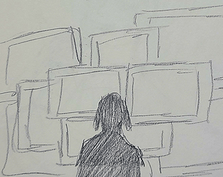
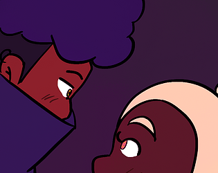
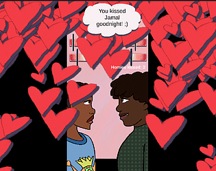
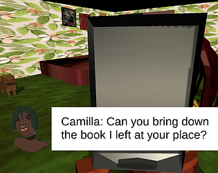
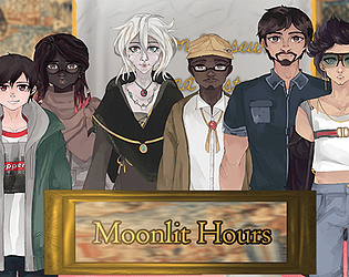
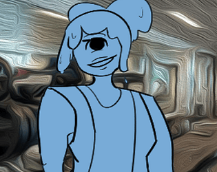
Got to play this for vn club ^-^ I was so happy this game was chosen as I've been meaning to get to it and adored this from start to end! I really enjoy mala's writing and am excited to explore basicbean's work because this collab worked so so well.
A member registered May 01, 2016 · View creator page →
Creator of

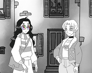
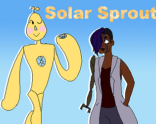
Visual Novel

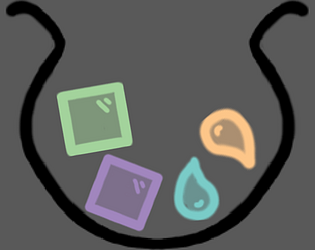
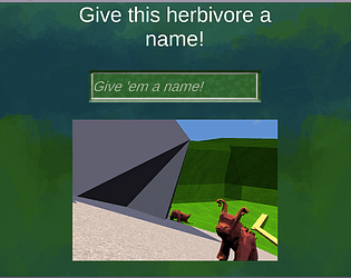
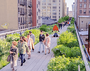
An abusrdist sim game about commuting home from work
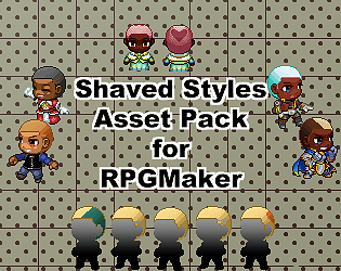
PWYW Shaved hair assets for RPGMaker MV/MZ
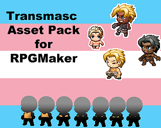
PWYW Transmasc assets for RPGMaker MV/MZ
Play in browser
Play in browser
Play in browser
Play in browser
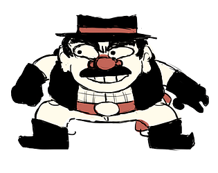
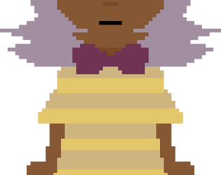
Take & make orders for a rush of customers at Starducks coffee!
Simulation
Play in browser
Play in browser

Play in browser
Devlogs for game school ( its my hw)

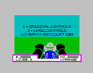
Talking feels like a battle - especially when it's at the gym!
Visual Novel
Play in browser
Play in browser