
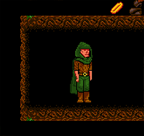
Feels nice to control. Too early to give any real feedback. Reminds me of the Robot Wants Kitty games.
A member registered Apr 14, 2022 · View creator page →
Creator of
Recent community posts
Played until the third mission. The StarCraft vibes are definitely there but I think it's unfair to call this a StarCraft-like, since the best thing the game has going for it is that it's a non-standard RTS with a unique way of managing your forces. Without that I would have been much less interested in the game at the start, however the execution is where it gets a lot more messy, so even though the game is fresh enough to grab your interest at first that's not enough to compensate for the problems for long. It's an impressively competent game that on a base level has a lot of potential. It doesn't fail in any technical or fundamental way - every single problem comes from minor design decisions and balancing. You clearly know what you're doing on a technical level and would have had a real diamond on your hands if you had found a way to focus the gameplay experience. Since the game is close to release I think it's too late to change things in a major way but it's still valuable to know what was done well and what wasn't.
I'm not going to comment on the artstyle too much. I will admit that for the longest time I didn't pay any attention to the game because the graphics made it look like an unserious project. The assets clash with one another but I will say that I didn't have that much of a problem with it while playing. It's more of a problem when trying to attract new players. It gives the game a unique surreal quality but it creates the impression of a messy game.
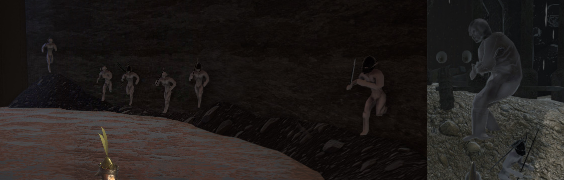
Two missions into the game and the game is already as relentless and unforgiving as the late Brood War campaign. The StarCraft campaigns are still fresh in my mind and I don't think that even Omega (last Zerg mission) ever got that brutal with how absolutely inhumanly it treats the player. I would call that more unfair than difficult, because difficulty has some relation to skill. Here it's about replaying the mission enough times to learn and get around the ways in which it steamrolls you, which reminds me more of a challenge run than it does of any RTS campaign I've ever played. I've never played RTS games in multiplayer but I assume that this is what it probably feels like. Zero time to recuperate and think, just beat the opponent as fast as possible before he beats you. That might be fun for elite players, but it's baffling to see it in a single player campaign. A good campaign is typically a sequence of interesting scenarios that have some kind of strategic gimmick that has to be overcome.
It's fine if the game's target audience is limited to top RTS players, but considering that this is an unconventional RTS with its own rules, even the most hardcore players would need some introduction or tutorial to get the the hang of things. If not that then at least the first few missions should be more forgiving to give some breathing room to experiment and figure out how to play without enemies constantly breathing down your neck.
The two weakest aspects of the game are the sound effects and presentation. If we compare this to StarCraft that game would be diminished massively if it didn't have its amazing sound effects and story presentation. The sfx of Hypercoven are not punchy or memorable enough, sometimes there outright aren't any. This isn't just for atmosphere but it's also because in a genre like RTS sfx are one of the ways in which information is communicated to players extremely quickly. There's not even an alert when you're being attacked here. At least have a jingle when a mission is completed, Presentation is very important for user satisfaction, more so than difficulty or anything like that. For story, even a small improvement like displaying the mission briefing in a new window without any distractions and some sound effect would improve the emotional player experience a lot.
The game is ultimately too unfocused. From a technical perspective, amazing work, this is a big accomplishment. From an abstract perspective, it could have been amazing, but that's usually the hardest part .
Interesting game. My thoughts are very mixed. It seems like a really great concept with really questionable execution. The atmosphere and the gameplay loop (in concept) grabbed me, but the moment-to-moment gameplay is clunky for a long list of reasons.
MAJOR IMPRESSIONS
The gameplay loop works but it's filled with a lot of little things that left me wondering "why?" To begin with, why is the game designed around controllers? This seems to me a pure PC game. I don't know why anyone owning a console would ever play a game like this and I don't know enough about PC players who use controllers to be able to understand what sort of games they enjoy, but for a management game like this it's a strange choice.
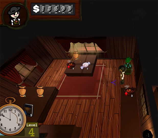
The game is in desperate need of a tutorial or the bare minimum introduction which at least explains coherently the basics of how to run the shop. A lot of it was obvious to me and some of it took some trial and error to figure out but I've played a lot of similar games so I knew more or less what to look for. Even if you want your players to figure out the fine details of what everything does it's still essential to at least make sure that the player has complete awareness of the basic loop and how to do the bare minimum.
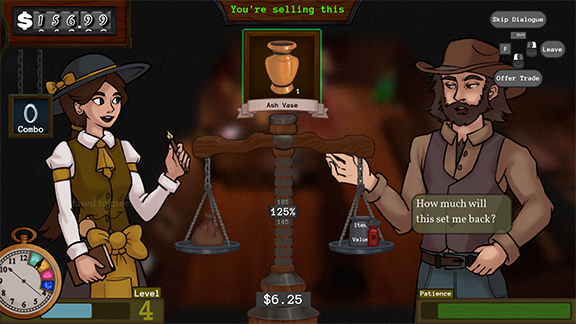
I found both haggle layouts to be functionally alright. The scale layout is a more visually clear indicator which makes it more user-friendly it seems. But I don't think the game's trade system problems come from the trade screen visuals. In my experience it's much more frustrating that there's very little clarity about what factors determine how to find the best deal. It feels like taking shots in the dark because the game doesn't ever imply there are other factors like preferences of the individual clients or other things like that, so it seems almost random, and that's not very engaging because it reinforces that it's all random and you don't need to pay attention since it's all about random guesswork after you make the basic consideration of what items are plentiful and scarce on that day. What I mean is that I don't see a way to make an informed decision on the first try in most cases (if that's intentional you can ignore this). I noticed that displays give a bonus to sale price but at least for me the haggling wasn't fun, and I would think that it's crucial that it's engaging in some way since I assume the whole game is built around it. There is also very little way to know how to decide what items are best to display for any given day. I would guess that it's best to display scarce items and to keep plentiful items in storage but I could be wrong.
I don't understand what kind of players this game is for. When I first opened it the atmosphere sucked me right in and I assumed it's a game for people who want to relax, but the game generally seems obtuse and systems-focused. So I don't know if it's supposed to appeal to cozy games players or management game players who prefer a bit more complexity. If you're aiming for the first demographic you don't have to dumb it down but you're going to have to really make the game experience as smooth as humanly possible and make a really thorough tutorial that even a child can complete. If the goal is the second group then you will have to make it more engaging and lean into the complexity, but you're still going to have to explain the rules of price manipulation more clearly.
MINOR IMPRESSIONS & BUGS
The music becoming quieter when you tab out of the game is a weird but nice touch.
The UI navigation is counterintuitive sometimes but I assume that stems from the controller-first design. It was most noticeable in the interface for moving the furniture and changing the decorations.
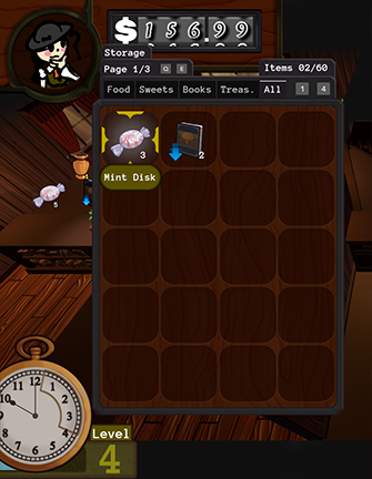
Generally the UI is well designed (the storage for example), though I would personally prefer that if I press the movement keys it automatically closes the inventory-storage screen.
The table highlight often highlights a different spot than the one that opens when you interact with it - sometimes is highlights two spots at once. It's difficult to replicate but it happened at least a few times. Overall the game is bug-free.
Had a few lag spikes when I loaded into the shop. Happened when I used the broom and went through the back room doors the first time.
The music is a good choice. It sets the atmosphere and isn't grating. I left it running in the background for over an hour and it never got annoying.
~~~~~~~~~~~~~~~~~~~~~~~~~~~~~~~~~~~~~~~~~~~~~
The display management, the haggle system, the economy dynamics - it's all a really solid foundation for an incredible game, but it didn't engage me because it wasn't possible to understand how my actions affected my results most of the time.
Your atmosphere is great. Your art direction is great. Your art quality (on the finished assets) is great.
I went into this game thinking it's not the type of game I'd enjoy. I was wrong. I also went into this game thinking that there's a reason why so many people praise it. I was wrong.
Let me start by saying that you are one of my favourite devs; I see your passion; I am taking into consideration this is a prototype and not a complete game; and I can appreciate the creative vision I see in the demo. However, that doesn't get you off the hook. I'm not gonna beat around the bush.
This demo is bad.
MAJOR PROBLEMS
Is the game stimulating? Yes. Did it feel like playing something from 20 years ago? Yes. Is it clear that you put a lot of effort into it? Yes. Is the game fun? No.
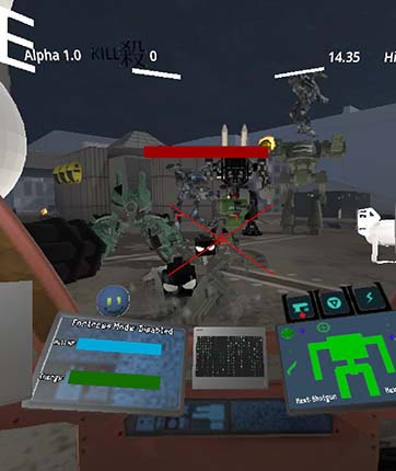
There's almost no weight to anything. It's a mech game, yet you can't feel the weight of absolutely any part of it. The combat it good for a dopamine hit but it's not very engaging at all. There's no tactical angle to it. The enemies do not display any sign of strategic thinking. The guns aren't interesting to use and there aren't different enemies and situations that demand different approaches and weapons. These are all things you should be thinking about if this is planned to become a game that people want to play and replay.
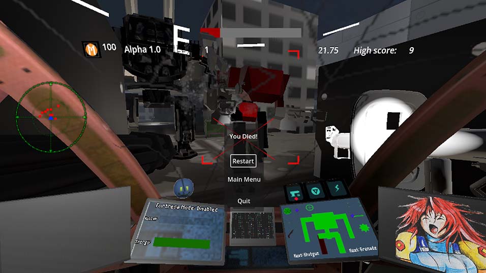
This is UI gore.
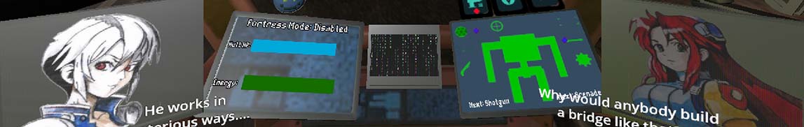
The UI is distracting, messy, and disorienting. I get what the game is going for since it's a "mech game" but there's two problems: The UI takes up an enormous part of the screen in a game that's supposed to be an FPS. You have limited readability of an environment and enemies that are hard to read to begin with in a game where having awareness of your surroundings is key. Second problem is that all of the important parts of the UI do not have the contrast or colour design to make them stand out, which means that the player doesn't have immediate awareness of those UI elements unless he takes his attention away from the action to check the interface. It's unclear if a lot of the UI icons serve any purpose or if they're just there for decorative filler. I did like that the screen cracks as the health goes down because that at least give a good way to track health.
Lag spikes constantly. Sometimes happens when beginning to shoot a group of enemies or when walking into some objects. It happened the most often when you open fire for the first time during any level.
There's a lot of jank. Twitching and teleporting across the levels. Some of might be intentional (I assume) but the game doesn't make that clear so half of the time you wonder what even happened.
The level design fluctuates between good and awful. For some reason the best designed level is the arcade stage. The story mode levels are really barren and boring to traverse through.
I remember someone in the thread saying that the game is messier than ever and needs polish and I agree.
MINOR PROBLEMS
The bots that snipe you with perfect accuracy from across the map are bullshit. I'm not even sure if the game has health pickups to recover from that in any way. Even if it does it was never made clear.
In the arcade mode enemies spawn in these big piles. Often they spawn stacked on top of each other.
What does fortress mode do? It's not explained even in the tutorial.
The text boxes overlapped a few times.
For some reason getting hit by a rocket turns you 90 degrees to the side.
Since the cockpit bobs up and down, this happens constantly which makes it even harder to read the dialogue.
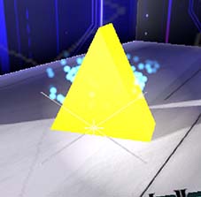
There's a lot of objects around the levels such as the yellow triangles and the transparent blue orbs where it's unclear what they do or what they are or if they even do anything.
CONCLUSION
Here's some positives: The character art is really good and looks professional. I was mildly intrigued by the story and I thought the dialogue was uniquely styled. I hope this feedback is useful to you.
If this is just a learning project and it's not supposed to be a commercial product eventually then this is great work, but the game I'm seeing now doesn't do anything special to make people want to play it again and again and again. I enjoy seeing your progress.
Really enjoyed it. I can see myself playing this for hours if I have a lot of time to sit around. It reminds me of the sort of games I played in the flash era to pass the time. It's really addicting. The music fits and doesn't distract from the game too much (some tracks more than others).
The only major thing I have a problem with is the drop marker -- it's too small and not very attention-grabbing and that makes it more difficult to keep track of it, especially because the player's attention is so often divided between several points in the screen which means most of the time you're not looking at it directly. This makes it unfair and unmanageable to play on the higher difficulties. I think it should be possible to track it with just your peripheral vision.
It seems to me it would make more sense if the game ended immediately as soon as the sand touches the top of the screen.
I enjoyed it. Graphically it looks nice and the gameplay loop looks like it has promise so I'm looking forward to when the environment interactions are a bit more developed.
I liked that playing with fire is a balancing act where it has to be close enough to you to grow but not too close so that you burn yourself. I think when the flame is far away from you it should do almost no damage otherwise it's unfair to the enemies.
Would be better if the flame produced more light even when it's smaller and farther away from the player. It would make it easier to get oriented. As it is right now it's not possible to get a good light while walking.
Wind simulation is impressive and the grass physics are cool. I'm not sure if it's intentional but the wind can be used to give the player a speed boost.
Don't know if there was any point to the weird multicoloured patches of ground.
The music is not grating but repetitive which could discourage from playing for longer periods.

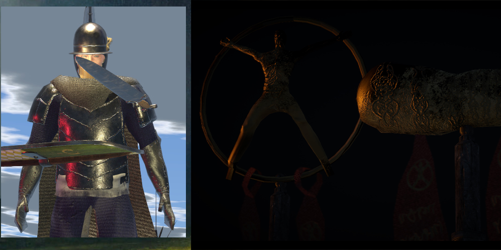
This is jank, and not the good kind. I'll start off by saying that I've never played the Dark Souls games or any games like that. I don't like games of that type but I do like Dungeon Siege and Diablo so you can take all this with a grain of salt. Feel free to ignore anything that you think I've misinterpreted about your game or your intentions for the game.
OVERVIEW
First off, out of every single game this Demo Day, this seems to be the one that unambiguously has the most impressive production value, presentation, and sheer scope. Even judged against other Demo Days it's still in the top 10. The game successfully captured a very fitting atmosphere. The cutscenes at the beginning are very well made and wouldn't feel out of place in a AAA game from 2002. The UI art looks very stylish. These things are a good reason to give the game a break over its many shortcomings, but they also set the expectations enormously high. The intro sets you up for a complete and polished experience, and then the game starts...
This is the most bug-ridden game I have ever played. Somehow that never resulted in a crash or anything serious breaking, but there's so many bugs here that I don't even think it's possible to cover half of them. The game's most impressive accomplishment is also its biggest shortcoming -- it's clear that the game's development focus has been on content development when it would have been much wiser to first ensure to make the gameplay as bug-free as possible. The scope is grand, but it's easy to forget that even AAA studios with thousands of employees struggle with the sort of thing you're trying to do here. It's admirable, but the mountain of bugs speaks for itself. The fact that you manged to pull off a working 3D combat system is great. The fact that you implemented over 10 distinct classes is great. The fact that your presentation is outstanding is great, but it feels like your priorities are backwards. To me it seems that you should get a single class working without any problems before you start adding the other 10.
PRESENTATION AND GRAPHICS
Presentation and graphics are amazing if looked at on a macro scale. The individual models, animations, UI design decisions, and so forth are questionable. They get the job done as temporary assets.
If the lore presented in the game is anything to off this might be one of the most unique and unconventional fantasy worlds I have seen. Using something that unique as a base for an straightforward action game where the lore is nothing but background flavour seems like a massive waste. There are no opportunities to engage with the story. The dialogue system is clunky and sparsely used. The choice to put the dialogue box at the top of the screen is baffling and makes the dialogue screen unpleasant to use. The (click to continue) prompt requires you to click on the text itself rather than to just click anywhere -- the wording is misleading. Sometimes the continue dialogue option is (click to continue). Other times it's just (continue).
I don't understand the obsession with taking the deepest most fleshed out fictional worlds and making action games or movies out of them.
The rock theme in the intro doesn't fit the game.
Not a fan of the depth of field blur. It makes the game look cheap.
Breakable containers are nice but the way they shatter looks weird.
The tooltips that you get in the item and character menus are positioned in a nonsense way and seem way too big for their purpose.
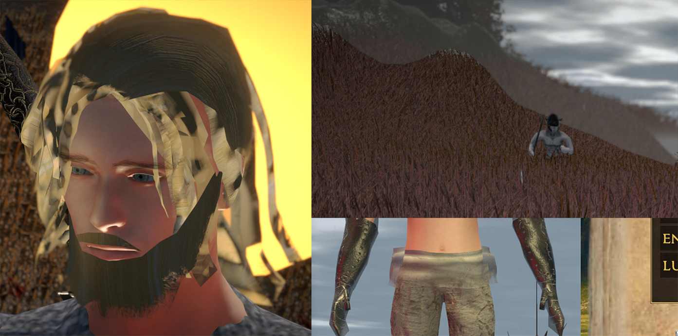
The eyes option during character creation doesn't appear to do anything. For this sort of zoomed-out game a "face" option would be much more appropriate. That's besides the option for facial hair.
Hair looks strange but then you notice the transparency effect that it uses can be seen almost everywhere. I don't understand why it's made that way because it doesn't look good.
GAMEPLAY
When you're creating a character for the first time you are given 0 information what each stat does or what they affect. This is a horrible game design mistake that turns off people who actually like these types of games immediately, since they are left to guess.
Why are the controls only viewable in the tutorial starting area? Ideally you should be able to look over an overview of the controls at any time, especially for a game that uses more than 5 keys.
I'm not sure if the tutorial works. It tells you some specific controls like the jump in a good contextual moment (when you actually need to use the jump to get over the tecnch), but a lot of the tutorial text just seems placed at random intervals and can easily be overlooked. The first few popups just show up one after the other. The tutorial does nothing to teach you about the significance of the character screen or the upgrades there, or even the character skills as a whole. It's very easy to completely forget the skills exist with some classes.
The loot drop system is bad. I'm going to assume this is probably how the Souls games do it but this type of loot drop approach is usually associated with MMORPGs where they do it out of efficiency. Dungeon Siege and Diablo have much better drop-pickup systems and while those systems are more complicated to implement they compliment the flow of gameplay much better and help avoid the type of confusion that the Great Ordeal creates when you have 100 enemy drops stacked in the same 50 square centimeters. The fact that interaction targets are automaticlaly selected and very difficult to control by the player makes in even more diffcult to target a specific loot container which means some loot might not be even possible to get to unless you also pick up all the loot around it first. I just stopped caring about the loot after a while, and this is a bad sign, since your primary audience with this game is loot junkies so if you can't appeal to them with more clarity in the loot system it's a huge missed opportunity.
The level layout is extremely jagged with a lot of steep inclines. Given that the character doesn't seem to be able to climb slopes too easily this makes traversal frustrating and sometimes makes you wonder if you're even supposed to be going the way you're going.
The combat feels nice to engage in occasionally and there's definitely the foundation for something good there but it's completely broken and spastic in its current state. Constant rubberbanding; lag spikes every time there's more than 40 npcs on screen; lack of any clear difficulty progression -- the way the gameplay works right now is just constant trial-and-error. There's nothing particularly challenging or strategic about the gameplay loop and there's nothing particularly satisfying about the combat encounters besides the enjoyment of dispatching the enemies one by one, and watching the occasional head fly off.
Enemies spawning out of thin air in the tutorial is obnoxious and doesn't look right. Consider having them run out of some kind of tunnel or something similar
The way that enemies spawn is ridiculous. The player is close enough when it happens that it's extremely obvious they generated out of a single point you see them rubber band away from each other.
BUGS AND ISSUES
Too many to list, but I will mention the ones that stood out to me the most.
Visual glitches constantly. Animation poses don't load sometimes. Skyboxes turn black sometimes.
The game makes my PC's fan enter overdrive mode. This is standard with Unity when the FPS cap is removed in the editor but I have never seen it happen on a game build until now.
The intro doesn't end on its own. You have to skip it manually once the cutscene ends.
The interaction prompt is weirdly coded. It shows up when you're 1-2 meters away from the thing you need to interact with but not when you're standing right next to it. Sometimes you can't get it to appear and have to move around like a crazy person trying to activate something.In some very rare cases clicking the interact button when the prompt is visible on screen does nothing and you have to leave the interaction range and come back. I remember this happening with the map at the camp. Interactions in general are really unreliable since some times you can't seem to even get some of them to activate the prompt, so you're blocked from interacting with them.
You can't enter the menu when character is locked-on to an enemy and a lot of times when you are in combat in general. Ignore if intentional.
Characters switching to T-pose for a few frames every time they are switched on the "continue" screen.
Opening the battle summons screen makes the cursor disappear your only option is to back out with ESC.
After you change your hair from bald to any hairstyle for the first time you can no longer go back to bald. The character model is stuck with a basic hairstyle while creating a character. It's possible that the default setting is not supposed to be bald but that is another bug also and it just activates the default hair for the first time only after you switch hairstyles.
During the intro cutscene the character controller is working and you can hear your character attacking when you click.
Exiting a save and reopening it changes the time of day. You can exit in the middle of the day and when you come back it's early morning. Why? Speaking of which the transitions between the times of day happen instantly which gives a strange impression.
One time when I loaded into the world the game was stuck in "cutscene" mode for some reason. This is just loading into the world, no cutscene was played before that. I could still control the player character but the UI was disabled, there wa a "skip" button in the corner, and all interactions were blocked until I clicked space to skip.
At all other times opening some menus (such as the map selection screen) which seem like they should freeze the character controller also allowed me to just use attacks and skills to my heart's content while the screen was open.
After jumping into the first "mission" a dialogue interaction is displayed but you can walk around while it's on screen. I don't think you should be able to move around while in dialogue. When the point captures happen this also starts dialogue interactions but in those cases you're in the middle of combat usually so you almost immediately click out of dialogue by accident or don't even have time to read anything because you're being attacked.
The healthbar of every single enemy that has taken even the slightest amount of damage is permanently visible no matter how far away from them you go. It doesn't seem like it should be that way.
You can still hear the outdoor sounds of rain and the horn ambiece while you are inside the Nonman's Well
The levers start twitching after you use them.
Broken or missing display on the geography underlay of the minimap in some locations.
The summons just keep hitting the air after there's no more enemies to kill.
Some enemies spawn stuck in the level geometry. This is the Scrancs at the bottom of the Nonman's Well and the big guy enemy in the first level.
Odd choice to allow players to access the missions after the first two considering they are unfinished levels.
~~~~~~~~~~~~~~~~~~~~~~~~~~~~~~~~~~~~~~~~~~~~
Great work on what you're accomplished but the issues need a lot of attention. The game's scale is grand but the polish and attention to quality is not there.
Interesting. It's smaller than the old test area.
GAMEPLAY
It's extremely weird that the game has no main menu or pause menu or any consideration for user accessibility. Did the game have menus before? I don't remember.
I think the old test course did a much better job to show players what the game is about. I think it would have been a good idea to keep it in the game while this area is being worked on.
The character feels nice to control. The different items are cool but some don't seem to have a clear use at the moment. If this is supposed to become some kind of environment puzzle game I can see it working.
Combat is alright. Mostly stems from the fact that the game controls nicely. The controls are intuitive and I don't have any problems with having to remind myself what does what. The reaction you get when an enemy damages you is juicy.
VISUAL
It's nice to see the game finally getting some actual environments.
The art direction is outstanding. One of the best looking games here and I think it's mostly due to the lighting. Animations, models, etc are all good quality. It seems like you've been focusing a lot on the juice since the game already has a lot of particle effects.
The stone castle/cyberpunk mix is an original setting idea and I think it can be very effective to attract players.
BUGS AND ISSUES
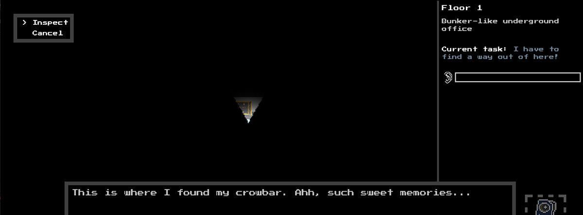
Game is technically sound but it's obvious that the level has been rushed to get it out on time which is why it lacks any limitations for players. The player can just jump out of the level if he walks down some paths like the blast doors at the start.
Falling out of the level doesn't even kill you. Would be convenient if it at least respawned you to the beginning so that it doesn't force you to close and reopen the game every time.
The item selection wheel doesn't track the mouse properly. It seems to always be off-target, and when you try to force it in a certain direction it starts twitching like crazy.
Cat just glues itself to you once you get near it and follows you around like that forever. Not sure if that's the intention but it's strange.
~~~~~~~~~~~~~~~~~~~~~~~~~~~~~~~~~~~~~~~~~~~~~
There's not much to say yet really. Systems are solid but no content yet on which to give feedback. The game works.
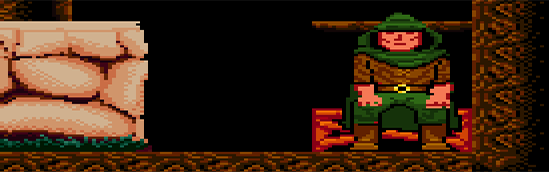
Another day, another Dirk...
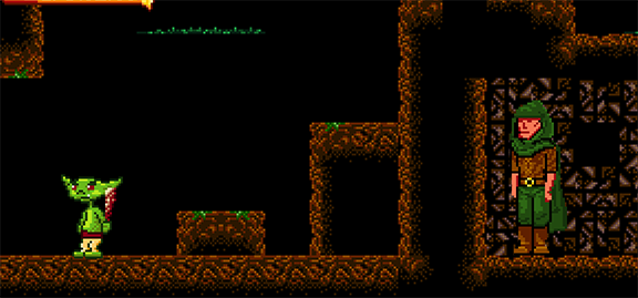
I wasn't as impressed by part 2 as much as I was with part 1. Taking into account it's a work in progress but I'm gonna go over my impressions.
GAMEPLAY
Part 2 has a much bigger focus on platforming, combat, and action, something which wasn't that big of a focus in the last version. This is good, since the parts of the game which were easily overlooked last time were put front and center this time which helps get a better sense of them. Helps you to get feedback on those things but it has its own problems which I'll explain later.
Not a fan of how the combat works. Goblins are extremely aggressive which means that there is very little actual player skill or stat-dependency involved. The only way to fight is to spam the attack, which works even if you only have 1 in strength. Doing anything else allows the goblins to strike back, costing you precious health points.
I'm assuming strength makes your hits deal more damage while agility makes you swing faster, but I don't think the basic enemy should be that annoying to deal with. The easiest, most common enemy type should really be less dangerous otherwise the game turns into kiting and looking for exploits. Having the goblins be that mobile and fast teaches you to avoid combat more than anything.
Having an enemy that behaves in this way would still be a good encounter for the game, just not for the "easiest" most common enemy type which is also the only enemy type which you can use to teach yourself how combat works. It's an unnecessary difficulty spike, and a very frustrating progress block when every single goblin you meet somehow manages to hit you at least once before you can stunlock him.
Would have liked if there was some way to restore health instead of having to die and restart to restore it every time. You don't have to make it common or even a consumable. Just some sort of "fountain of life" that you can find every few screens would be nice so you can restore yourself there after you've progressed through a bunch of enemies.
There wasn't all that much dialogue compared to last time, which is a shame since the dialogue has a lot of personality and is fun to go through.
Content density on this one was pretty sparse. Much bigger levels with much less to do in them, and more walking between points of interest. Very few interactions.
The stat boost items were a nice addition, but when combined with the skill point consumables they become extremely OP. Either the consumables' effects should run out after a while or there should be some other way to prevent the player from becoming a maxed out God.
ROLEPLAYING
I don't think the game should require the player to max out all his skills to beat a specific part of it. It takes away from the most interesting quality the game has. The game plays more like a metroidvania than it does an RPG and if that's your intention then you can ignore this.
Since the second adventure has such a strong focus on platforming and combat it feels like a completely different game which neglects everything that makes Dirk special. There were no item puzzles, no dialogue puzzles, and barely any use for intelligence, charm, or stealth. This version felt like it either required you to already have gained extra skill points from the first adventure or to use the free potions, which I assumed were supposed to have been a sort of easy mode cheat, but so far I have not found a way to beat it without using the potions. The end of part 2 is locked behind a requirement to have at least 4 or 5 in agility, and as far as I could tell there is no way to finish it with any other skill.
The one single use for intelligence that I came across (the cook book) was probably my favourite part of the whole demo since it was the one thing that had an element of RPG gameplay in it. I think it would be interesting if going forward intelligence was used multiple times to discover new recipes and get specific items that way.
I don't think there is any way to beat the second adventure with 0 skills. I really liked that part about the previous version. I don't think it needs to be done again but it would still show good RPG design if it was still possible to beat the whole thing with just 1 skill point in a single skill (it would just be harder - like an extra challenge for players who want that).
The game needs more stat-locked interactions, items, areas, and etc (and not just locked behind agility). That's the best thing it's got going about it in my opinion. It's a good hook for RPG enjoyers if it's implemented right.
BUGS AND ISSUES
Everything worked fine on the first try when trying the second passage on the updated version. Didn't even need to use the new setting.
After using the attack a few times the character controller occasionally freezes. Can't jump and can't move. Hitting attack again usually breaks out of this lock.
Fighting goblins pushes them out of bounds all the time. Also that specific area with the three crates requires you to have both 2 in agility and in strength to get out of, which is baffling.
Getting into dialogue or opening the inventory while blinking after respawning freezes the transparency animation until you close the UI.
After getting Agility 4 it's ridiculous easy and even unavoidable to jump through the level geometry.
Got the blue screen twice -- once when going into windowed and trying to shrink the screen size when it was already at the minimum size, and once while spamming the attack button really hard when the stamina was at its lowest. First one was easy to replicate. Not sure about the second.
~~~~~~~~~~~~~~~~~~~~~~~~~~~~~~~~~~~~~~~~~~~~~
The game is amazing and I hope you have some good ideas on where you're taking it.
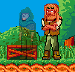
Happy to see Dirk back.
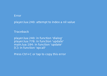
Unfortunately, a bug blocked me from trying the new content. Trying to enter the second adventure just turns the screen black and the music loops while nothing happens. None of the controls do anything while in this state. It just stays stuck on the black screen until you close the game. Restarting the game and trying again gives the same result.
Only thing I can report is that in the dialogue with Sophie both of the options are unlocked at the same time. This is with no points put into charisma. It allows you to play both the regular dialogue and the "get away from me" dialogue.
Also the coloured speech text to differentiate speakers is a nice addition. Really helps.
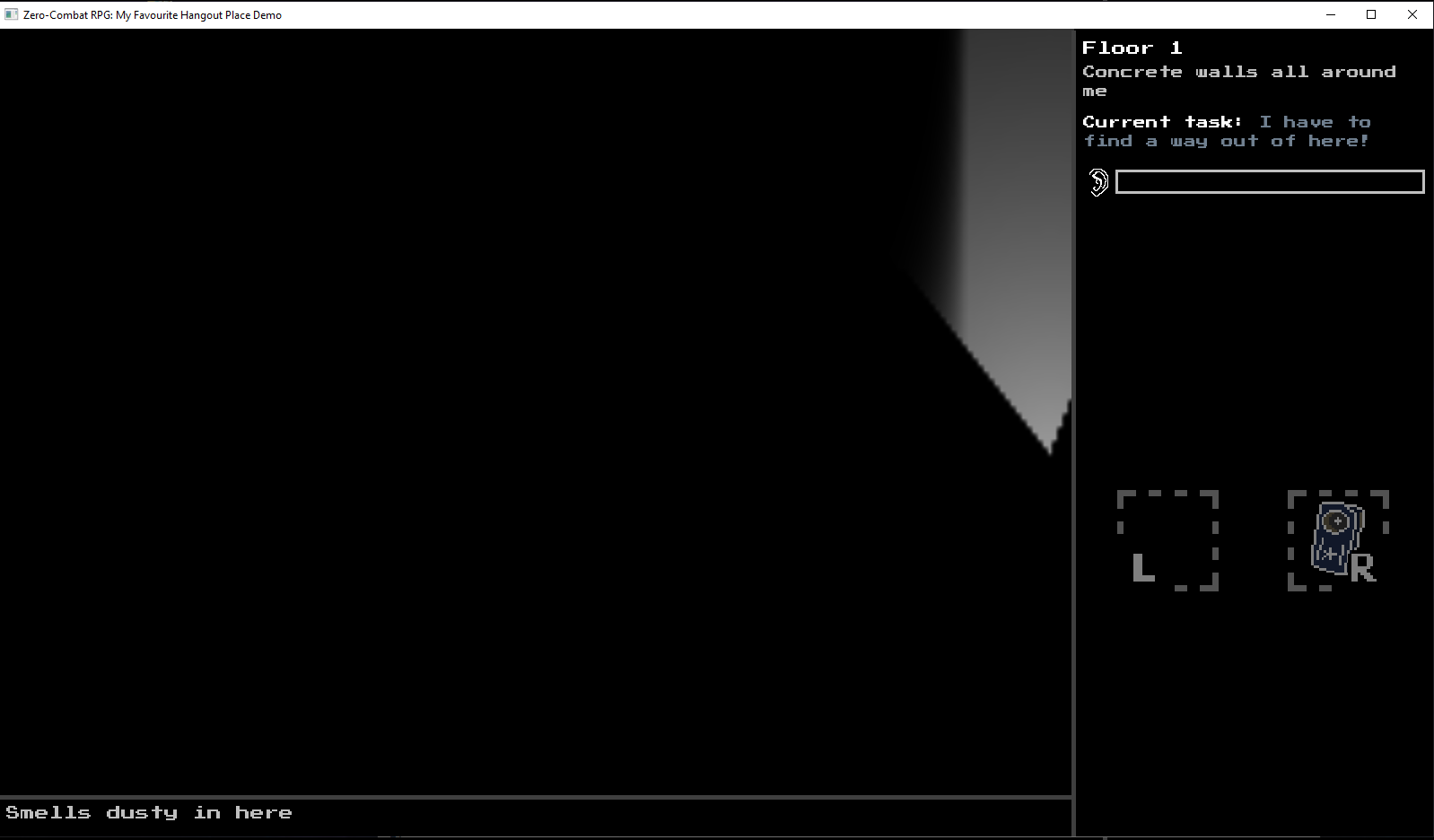
Starting with a warning that I'm incredibly biased since this game appeals to me, personally.
The game is technically impressive considering that it's a custom engine. I don't think it's something that players are going to care about but I'm taking it into consideration. I understand just enough to understand the level of complexity that went into the dialogue system or some of the interaction update mechanics. The fact that the
game came out on the other end as even just the foundation for a solid gaming experience is impressive.
When I hear that a game is a zero combat game I know to expect something special. I like stat-dependent progression. I think the use of the skill types is applied very well within the limited scope of the game. Beat the game and will definitely try different stat builds.
OLD-SCHOOL GAME DESIGN
I admire this game for being faithful to its retro vibe but I always try to bring attention to outdated game design conventions when I can. If your intention is to convey that with your game then just use this feedback as a general pointer on how it's being perceived. I do the same thing so I know the dilemma between authentic retro mechanics and overly-modernized mechanics simplified for the convenience of the player is a constant game design question.
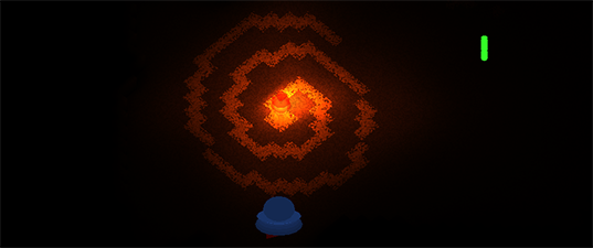
The observation display at the bottom is a great mechanic, it just seems very easy to overlook a lot of the time since it's tucked away in the corner like that. Maybe there could be some kind of blinking colour indicator there to attract a player's attention when something is being "observed". Maybe pause that system from showing those messages while the thought chatter window is running, since it divides the attention of the player.
Interaction mechanics are a little clunky and since the little interaction window is tucked away in the upper left corner you instinctively just forget it's there all the time and try walking while it's still open.
Inventory is just a tiny bit obtuse given that using items doesn't require the player to select them or equip them in any way and the interactions just appear in the interaction selection automatically. Would be nice if that was clearer.
In the few places where you get information about you goal (making the fuel), after inspecting the instructions once, it updates to a new inspection text and you can never read the exact instructions again. Would be nice to be able to read the list of things you're looking for as many times as needed, to at least remind yourself what you're missing.
All things considered the game actually dodges some age old problems pretty skillfully -- this is stuff like the point-and-click game moon logic problem where you never know what to do next. Never had that problem here. But then again this demo was pretty straightforward so it's something to be more careful with when the game grows in scope and complexity.
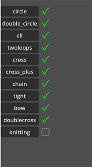
Going to test how much the run changes based on stats.
TECHNICAL
Got no serious bugs. No system issues after the resolution issue was patched.
Flashlight's light looks kinda weird but I think it might be as good as it needs to be for that level of graphical fidelity.
Some manual errors in interaction scripting but nothing that broke the game.
SOUND AND MUSIC
The copyrighted music is cool, but very distracting, especially for this kind of gameplay. I agree that the royalty free is a lot more generic and boring but that allows for better concentration and better awareness when playing. The copyrighted music is still a fitting pick but feels like it should be reserved for specific moments rather than used as a main loop.
The vibe of the game is completely different depending on the track. The first one sound a bit more somber and atmospheric the second one is very arcadey and energetic. Depends what the game is going for.
The protagonist TTS voiceover is also pretty distracting. I think it's still a good idea to have some kind of brief sound effect for the
protagonist's thoughts, but complete sound clips for every line seems like overkill unless the game is normally voice acted or uses softer sounds that aren't as hostile towards the ears.
Text-heavy games should do everything possible to settle down the mind of the player and remove any unnnecessary distractions during reading time.
SETTING AND WRITING
Enjoyed it because I just love exploration interaction adventures. Scenario seems like something I would come up with, and it's a promising start to an interesting adventure.
Writing was clever. Gets too clever in some places but that's up to taste.
Want more. And thank you again for the great stream.
When I start the game it puts my character in the corner of the screen. I'm assuming that this is windows' fault since that seems like the obvious explanation. I tried resizing the window in different ways. I tried just opening the game and not resizing the window in any way. Nothing changes. I can walk around and interact with stuff but I can't see what I'm interacting with and I can walk off screen to what I assume is the next room you're supposed to go to, but you can't see where you're going so can't progress.
Most of the screens display correctly though. UI works. Dialogue screen is working fine.
From what I got to experience it got me intrigued. Gonna keep trying to get it working but I'm not tech literate enough to know what's going on.
This gets wild. Time to cover some issues.
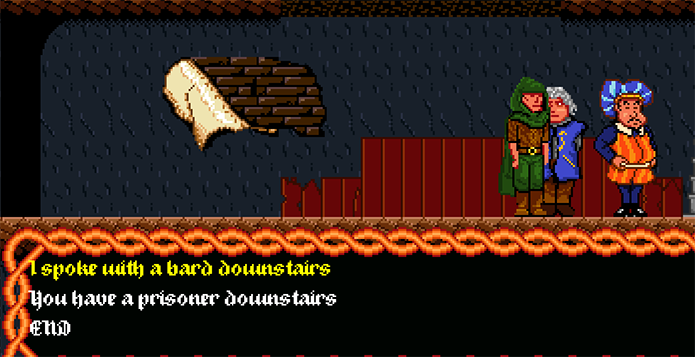
Did the treasure map ending and escaped that way. Managed to free the bard but couldn't do anything with him so no idea if there's another unexplored path with him. I can't give the makeshift comb lute to the bard or really do anything obvious with it.
If you want to make interaction points a little less frustrating you should make sure that every single interaction point (the nest, locked doors, etc) should give interaction dialogue by default.
Very often it seems like it's very easy to break dialogue order and trigger dialogue lines which you shouldn't be able to access in the current context If you get the sparrow without talking to the lady and only talk to her after that she still gives you the task and the sparrow is RIGHT THERE.
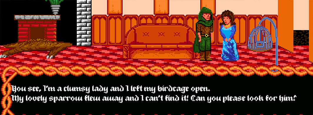
After returning the sparrow to the lady it goes away again and I can capture it one more time but this time I no longer have the option to return it to the lady. Not sure if a bug or just an endless cycle of negligence that's intended so that the sparrow can be used for another purpose.
Since the game allows you to inspect objects at any point and that counts as dialogue you can trigger the animation while Dirk is facing backwards.
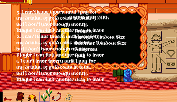
Pressing the escape key triggered this screen at one point. This is after starting a new game 3 times in a single run. The ESC menu was stuck like this from that point on for the duration of that session.
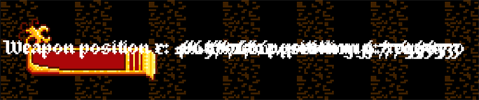
Using the bow displays debug text for each arrow fired and it keeps stacking. It disappears when the arrow hits something or you leave the room you're in.
Some objects are rendered over the health bar.

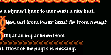
Grammar and spelling mistakes are too many to list. I came across at least 30+ lines like this. Some of them seemed intentional but others are just errors.
I didn't get the blue screen crash again. The only thing I remember is that the one time I got it was when I pressed two keys at once and the other time was when I was just walking. No idea.
I'm gonna start off by saying that this game has potential purely because true RPGs are a genre completely abandoned by studios and indies alike at this point. There's a lot of games out there that call themselves RPGs, but which do not do the thing that this games does -- changing the player's journey based on his stats. I like that you start off the game as someone with literally no skills. I like that lacking certain skills locks off paths to the player. My advice about all of this would be whatever you do with this game in the future please do not make it possible for a player to max out all the skills in a single playthrough. It takes away from the main strength that this game could have. Also a fair warning that making any kind of true RPG can very quickly escalate into terminal scope creep due to just how many different stat configurations have to be accounted for and having to provide unique content for different stats.
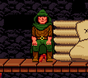
I got two endings -- the naked guy one and the goblin one. Sedating the bird was funny. I think the graphics work really well for the type of experience you're going for and I think they're evocative enough to work as is. Of course most people might not agree with me, so maybe your ideal sweet spot would be to keep the art direction and just improve the fidelity a bit.
The story all on its own is fun -- not just funny -- fun. The tone is just right for this style of game. I liked the writing but it has a lot of ESL spelling and grammar errors all over the place.
Still felt like playing some kind of lucasarts game from the 90s (except actually funny) so that's good.
The thing I like the least is the pixel hunting. Some interactive objects have way too small of an interaction collider or blend just a little too much into the background (the grain). If you overcome this properly you've solved one of your main problems.
The core of the game is absolutely the stat system. This is the one thing that makes this game stand out among a sea of other games. Focus on that. If you didn't have it it's possible I might have come to the conclusion that the game has nothing to offer.
PROBLEMS AND BUGS
Only serious bug I encountered is that when you click exit game it just places you in the home screen (with the stats) but everything is frozen. Pressing Z just refreshes the whole program but nothing happens. Have to alt+F4 the game to close it.
Starting a second run spawns you in front of the mounted head without any of the intro dialogue. If you walk left to the intro dialogue position only then is the dialogue triggered.
Finishing a second run tells you you have 3 spare points but only allows you to use 2.
This happens too from time to time. Just randomly.
The game starts off great in the first half and completely falls off in the second. It takes less than an hour to run through the first 9 stages. It takes dumb luck and saintly patience to get through the last two. Puzzle games don't work like this. Level-based puzzle games require a setup for each level -- some kind of difference in levels that places a limitation on your actions to give you a nudge towards the solution. The rail pieces are not enough to indicate that. Here you are not given setups -- only vague goals, and the player is given way way too much freedom which means it's near impossible to narrow down your options by using your brain. This is 10% thinking and 90% blind experimentation when ideally it should be the opposite. Two ways I would approach this is placing obstacles that limit your placement field or starting off the stage with one or a few permanently placed sections of the rails.
It would be convenient if you could delete rail pieces by right-clicking them.
Controls are intuitive but fighting against the rails deciding their own rotation is not satisfying.