It's one of the best games I've ever played in my entire life. The graphics are so realistic that I can't see any difference from real life. The gameplay is incredibly fun and addictive; I played this game for three days straight without sleep. I only stopped because these green guys burst out of my screen and damaged my PC. Literally everyone in the world should play Survo!
Fetis
Creator of
Recent community posts
Proc: nice pixelart | combat is really cool (reminds me Undertale) | like the plot twist | good music
Cons: text in the beginning is too fast | the game stops after some time in browser (so I downloaded it) | sometimes there is a bug with damage sound when it repeats and repeats for a long time
Note: the best character for me was a warrior
Thank you for your feedback! You are completely right, I need to make the player more focused on upgrades. Actually I am aware about bug with jumping/running on slopes, but I am not sure why it appears. I am gonna try to fix it again and to make the player blood decrease slower. Thank you very much!
Proc: great concept | cool art style | good balance
Cons: no in-game tutorial (it was pretty inconvenient to go back on itch.io page to see what every stat does) | overall impact on earth should be on top, because it's most important stat I think | I tink the game is too easy dor me (I reached year 2051 and my world was "Absolutely healthy" and I tink I could reach more, but I've already spend too much time on it)
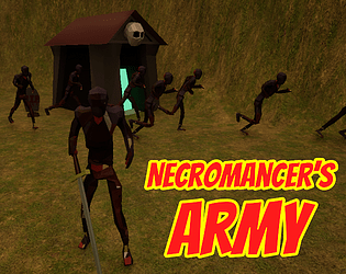
Thanks for playing! In Necromancer's Army you army should reach the dark energy source, but castle's guards try to prevent it by attacking your zombies. When zombie reaches the source - it dies, but fills your dark energy storage. You should deliver the energy from your base to the cave to increase your blood to stay alive. You can also spend your blood on upgrades. But I tried to write all of this in the tutorial in the main men. But it seems the tutorial was unclear to you, right?
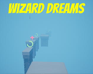
I've read the game idea on itch.io page and it seems pretty interesting, but the game looks completely different from the concept. These big cubes don't looks like radio towers. I didn't understand where radio tower HP, money and how to buy upgrades. It seems the blue team doesn't work at all. And it was hard to understand the controls, so I would like the game to have some tutorial at least in the main menu. But I liked the music and "Triangle, Circle, Square, hit the start button if you dare")
I really like the concept of 1 bullet at a time, but implementation is pretty poor. Your graphic is nice, level design is pretty good, and the music sounds cool, but the game is too difficult in the beginning, it's pretty hard to take the bullet (try to make collision bigger), there is no mouse, so click play button is a real challenge and also I this game really needs score, because it motivates player to play more. But as far as I understand, it is your first game jam and you don't know Unreal Engine well so far (I also use Unreal Engine), so this is a pretty good result for the first game. Keep learning Unreal and good luck)
Oh, yes, you are absolutely right. When I don't click blue full-screen button in the right down corner, I see everything. But I don't have any zoom enabled. And also I use Yandex Browser, but as far as I know it uses chromium, so it should be similar to Chrome in such situations, but I may be wrong.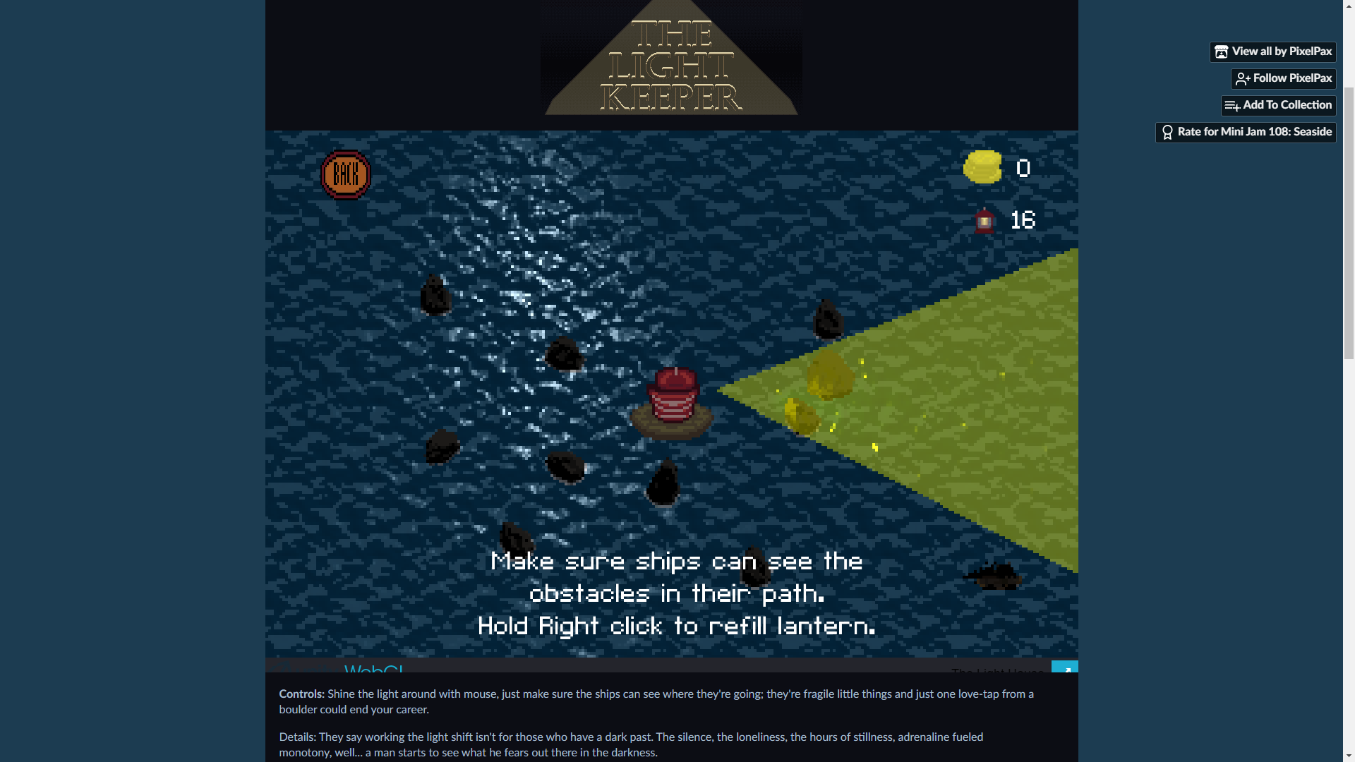
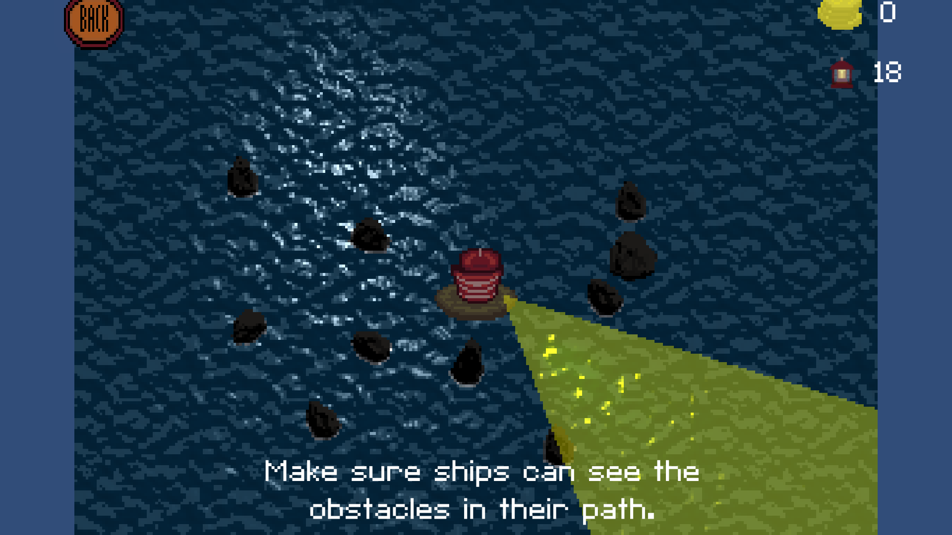 Sorry, I wasn't clear enough. I meant tutorial about monsters and the fact that when you run out of fuel your lighthouse goes out (I didn't notice that indicator in my first play) and also, that screen is shown, but it doesn't have text "Hold Right click to refill lantern" (I play browser version). And as I said these are minor things, because the overall atmosphere and gameplay give a lot of satisfaction.


