Indie game storeFree gamesFun gamesHorror games
Game developmentAssetsComics
SalesBundles
Jobs
TagsGame Engines

Fenris-77

143
Posts
89
Followers
26
Following
A member registered May 19, 2020 · View creator page →

Creator of
Recent community posts

No apologies needed, the presence of a a few other typos made it very possible.

A lay is a lyrical, narrative poem written in octosyllabic couplets. Amiral, on the other hand, is definitely a typo that I and my crew of pirate editors missed somehow.

Thanks! I just wanted to say that Exploding Congee is a magnificent user name. Kudos.

I use a program called Affinity, which is free to download. The real trick is that I read and learn about layout all the time, both in terms of theory and practice, You can do it too.

This is a cool concept, I like it. Giants in many flavors is very AppN indexed. So. to start, the cover is a great bit of collage work, really well done. You've got a pretty solid mechanical chassis to run the adventure too. The map lets you down a little though, it's not easy to scan at a glance. Better visual hierarchy would have helped a lot.

There's some good stuff here! The cover reminds me a little of Luka Rejec's stuff. The spacing of your layout is good. but I have a couple of suggestions. First, those black lines in each are write-up are way too thick and the area title is way too small. What you lack there is visual hierarchy, which means the most visible element is the most important, working down to the least visible being least important element. The most important info on your pages should be the area locations, but the most visible element is the black lines. I hope that makes sense.

This is great. I really like the art and layout generally, and the map is very cool. It took me a second to figure out what you'd done with the name Hastur, but that's a great idea. Makes me think of some of the  CyBorg Design. Very nice adventure.

I see you've done some fancy colour coding of your own! I like the approach, and I think you managed to scrunch those lengthy stat blocks in quite well.  Your cover is fire too. Nice work.

Thanks! I do love layout. Anyone who wants to do better layout should take a really hard look at Johan Nohr's work on Into the Odd Remastered. Simply magnificent.

You've got a lot of really cool little details packed in here, great vibes. I think a little bit more on the mechanical side might make is easier to run at the table.

I love the cover map a lot. It gets better the closer you look. Great use, overall, of the Shadowdark format - nice and clean and easy to use at the table.

I like this a lot. Just enough mechanics to keep things ticking over and lots of juicy evocative bits to chew on. One of the best public domain covers in the jam too, nice job.

I love MB and this does the ruleset justice. Great evocative writing and handling of the various mechanics.

The map and other art is so good, and your medieval vibes carry that along very well. This is a cool hexcrawl with a ton of flavour, I like it a lot.

This is a cool dark fairytale adventure with some nicely evocative written bits. You may want to consider some bolded key words or bullet lists to streamline room contents for faster use at the table.

Love the cover. There are some nice science-fantasy vibes going on here for sure. You're losing a lot of real estate on your lefthand margin because of the list inset. That's easy to claw back.

This is really good. I love the cover and use of spot illustrations in a layout that puts me in mind of turn of the century newspapers. Great vibes.

OMG, Trophy Gold with mimes! What a great idea. Well written and executed for one of my favorite systems.

What a wonderful idea! This is essentially Untitled Chicken Game but with added demons, and it's awesome. I love it.

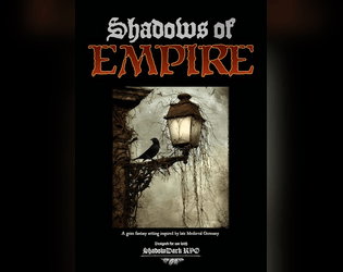
I've got a bunch of stuff on Itch already, mostly for my Shadowdark setting Shadows of Empire. I'm currently working on a city supplement for that as well as several other projects (probably too many, but oh well).

You layout here is super-slick: palette, fonts, spacing, the lot. Really nicely put together. Strong theme and evocative prose too. Very well done.

Thanks! The baseline for things known is zero, although I don't think that was made explicit at any point. There's no practical ceiling but there is an implied cap via the rewards mechanic. I think the players should have as much fun a s possible putting the story together.

The science-fantasy vibes are strong here and remind of Clark Ashton Smith and some of the other classic Mars authors. Really well done.

The art is magnificent and layout is clean and effective. Really nice work here.

This is marvelous. I love the found document layout and you make some modern touches there not clash with the mostly fantasy content.  Kudos on the blueprint style map, very nicely done.

This is how you do system agnostic well! A wonderful central conceit with great writing and layout/art. I'll use this for sure, it would be shame not to.

This quite well written and thematic. I think it might need some additional formatting to be maximally useful at the table.

The writing and minimalist layout is rock solid. Great vibes.

Excellent use of the Shadowdark style layout. The rooms and monsters are clear and well designed. 

This is a pretty slick solo format. The layout and mechanical design are both effective and who doesn't love using cards as the randomizer?

This is very cool, although I'm not sure how I'd use it at the table. 

There's a lot of cool evocative stuff here, well done. If you had more room a bit more detail on things like the room full of traps would have been cool, but space was limited.

I think you've got the bones of a good idea here, but it needs work to better fit for play at the table. More specific interactions and mechanics and less fuzziness. The hand drawn cover is cool.

Great vibes and strong use of collage-style art and layout. It's a trip.

I think you have a good concept here and I like the paired art/description layout. Obviously you haven't quite finished, but I think you definitely should.  You may want to do a little of formatting to help the GM parse those paragraphs during play. Bolded ket words, bullet lists, italics, something.

I appreciate the extent to which you've used different symbols and formatting to identify different mechanical parts of the various areas. I think you may have veered a bit too hard into that though. I use many of the same basic ideas, but I think the GM needs a little bit less to parse when using it at the table. 

The water mechanic is really cool. It ties the adventure together very nicely.

The cover is fire, great work. The concept is very cool and I like the downtime mechanic. I wonder if the anti-magic bracelets wouldn't really kick some groups in the face, but I'd be willing to play to find out.

Great science-fantasy vibes. I love the rounded text-box layout too, really slick.

All hail His Majesty the Worm! Lovely work.