
Thanks for sharing your creation, I love it! ❤️
A member registered Nov 05, 2017 · View creator page →
Creator of
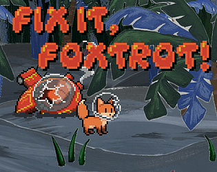
Asset jam submission
Asset jam submission - a D&D item card
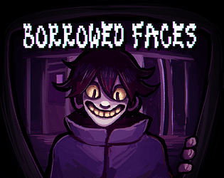
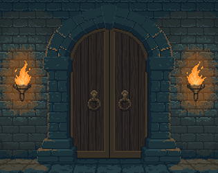
Shine a light on bloodthirsty living statues in an old manion and get out with your paycheck!
Strategy
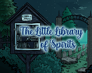
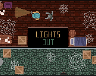
What secrets lie within this little box of books?
Visual Novel
Play in browser
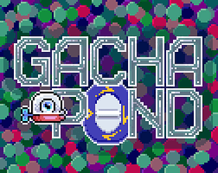
A gacha-themed aquarium simulator to feed and grow your silly knock off fish!
Simulation
Play in browser

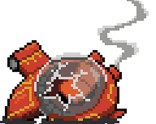
Asset jam submission - pixel art sprites