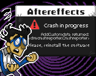
Sadly I wasn't able to go past the main menu. It threw some error at launch about Windows Mixed Reality and it didnt detected any input while in the menu.
The music in menu was nice
Haha. finished the tower!
This is easily a top 3 contender together with the 1-key bird game: Superb pixel art, I loved the Warrio style influence on the designs. Great music.
Really astonishing the amount of content (and the quality of it) you managed to put into this. Congrats to the 3 of you. 10/10
Cheers!
I gave it a 3rd go just in case I really missed something obvious (like the password being in the first paper), but I wasnt able to read the paper. I didnt even noticed you could input a password in the lock block, since the only way of guessing it is by hitting random keys other than X/Z (which is the text shown: press X to exit/z to burn, nothing about a password).
But at least my feedback may help any other tester to try the rest of the game. So there's that
Completed in 2:26 (i think, the screen was too tiny!)
Fun game. Simple to learn mechanics.
Slow-motion well implemented. Maybe too forgiving being that you can hold indefinitely to aim your next target (it could be caped to X seconds) but I feel the helping hand works for a game-jam prototype where most reviewers cant spend more than 5 mins testing each entry.
Simple but catchy music.
Cheers!
Let's be real. This will probably be the winner. I feel like a 5/5 in all the boxes.
In my first run I started so careful and slow that the first enemies felt tough to me. In my second one I rushed it and it was really easy. I'd say maybe the first enemy encounter could be a little more gradual (1 spider instead of 3). But it works fine nevertheless.
cheers!
Loved the chiptune and it was refreshing to see some genuine 1-bit style pixel art (and not just "black and white stuff drawn on Ms Paint like many entries).
Gameplay wise, sadly the controls where a bit confusing. (like being able to move with WASD AND the arrow keys but the arrowkeys letting you open chests with down but not being able to open them with S).
My first run I burnt/exited the first paper text by missclick without being able to read it. After dying a couple of times in the first room by running out of light?, I gave up (couldnt get through the first lock symbol).
Cheers!
Edit: I gave it another go and still cant go through the first lock-block
Loved the horror elements. I was genuinely scared after the sfx of my first encounter with an "eye" enemy.
The flashlight mechanic was really well implemented.
I cant think of anything negative that doesn't fall inside the margin of error" of being a gamejam.
Even not having music enhances the eeriness of the setting. Nevertheless It would probably benefit from some synth ambience background noises (that doesnt interfere with the main active sfx)
Cheers!
Nice pokemon style project.
I only managed to find Pengos throughout my run. But that's ok, because there was no penalty for running away haha.
One little thing: I would scrap the final not-labyrinth corridor inside the tower since (I think) the game finishes in that dead-end and it serves no purpose other than wasting the player's time. Correct me if I'm wrong please!
Cheers!
Floor: 4
Runtime: 12 mins
Really good top down shooter. Loved the 3D integration for the scenery.
I would like for the map to show how many levels are there. But I understand it wasnt possible to implement within the deadline.
Maybe a button to sprint or make the player go a little faster to make traveling the levels a bit quicker at least for this prototype.
Loved the music!
Excellent entry overall!
cheers
Run time: ~35mins
Well, it's definitely a good prototype for a dialog story-driven experience.
Honest review: The writing and the story feels genuine and has heart, BUT, I have to be honest, I also feel like you made most of the project and at some point you artificially added a somewhat controversial theme over it. Unconsciously or not.
The cussing at the end with the Koala also felt a little off being the whole story was 100% wholesome at that point. And being you already subverted expectations with the plot (I wont spoil), I dont feel it was necessary to also break that line throwing a bunch of F bombs, at least by how the script was built upon that moment.
Anyway, dont take me wrong, I really feel this would be a solid entry, including the dialog, but the american politician theme whatever thrown over felt like an unnecessary addition to the real story you made.
cheers!
Nice little metroidvania. Loved the character design.
The platforming felt a little punishing because of the physics (the first ladder was a special challenge to climb without falling), which is understandable being the time constraints of a jam. Our game suffers from that too.
I think it couldve smoothed a little with more checkpoints (now that I reflect on it, I may add some in my platformer too if I get the time!).
The light mechanic was really well implemented. And the amount of enemies you managed to add is really remarcable!
cheers!
Yes, the platformer controls leave a lot to be desired. It was Sasha's first game and first approach to Godot, so he and I agreed that it'd be probably the best we would manage to get in the jam timeframe, and we needed to define the physics variables to start building the levels (if we changed the values we would've had to change the design).
As for the screenshake, I'm wondering how could be implemented to improve the difficulty curve. Can you give me a hint on that?
Coyote time: I dindt know the term haha. You are right on that and we wanted to, but weren't able to implement it.
cheers!
Congrats! You managed to put a lot of content in the short timespan of the jam and as a solo dev!
I also think the music is great given it was made by yourself in this short amount of time. It would be much easy to just use stock music and don't tell about it, as others do.
Some constructive criticism:
Mage's weapon: If you are not planning of adding more levels where combat is more actively used, I would scrap the weapon mechanic for the wizard for this prototype. It bloats the amount of already confusing controls and it really doesnt gets applied in the level design. The couple of killable enemies in the levels are easily avoided by jumping over them.
Control layout: As they are right now they are quite confusing. It's almost like a single-keyboard-2-player game (that would work great btw). I'll simplify them as making the wizard only using the arrows+space for activating the monitors. And WASD+Q,E for the bat. (and even the bat could be simplified by removing the vertical control and adjusting the levels accordingly).
Level design: In the short timespan of a jam it gets really hard to design levels if you also do all the other work as a solo dev. That's why I think it wouldve better to scrap unused mechanics that werent quite applied into the levels. There were 2 levels that I managed to complete only using the wizard.
I really enjoyed the short experience.
Cheers!
Solid shooter. Nice implementation of the 1-bit style into a 3D environment.
Was fun shooting those cyborg bellprouts. I wasnt able to manage to understand the hacking minigame. I even failed it multiple times which prompted to spawn 10000 enemies in the next hall and I got rekt.
It seems to get softlocked if you press esc during the game over animation.
Nice visuals! I think I beaten it but not sure because it got softlocked in a black screen.
My only feedback will be that the ornamental black windows should be dithered too because they are easily mistaken with the black walls and platforms (It took me a little to realize some black rectanlges where solid because i thought they would be background details as the windows).
Cheers!
Good looking infinite platformer. The procedural level design seems to be correctly implemented. Though the inconsistency of the platforming (walljump sometimes goes opposite to the wall and sometimes to the wall) and the big delay after the jump press and the jump action made it impossible to go farther than lvl 10 for me.
Also, remember to state the credits in the description of the members and the assets used (if any).
Keep it up!
Nice opportunity for testing platforming ideas using a prefab project as a base.
As magn said, it would be better for the player to get used to the basic movement mechanics gradually. It took me a couple of tries to go through the first platforms and get a grasp of the movement. But I managed to complete the first level. I got a chuckle at the end with the time counter stating "Time: Some time for sure".
cheers!
Really well executed. I was amazed when I saw you have been able to add mechanics such as the targeting system for each auto-turret.
I was thankful that there were volume controls (opposite to most entries including mine) but quickly realized they are stuck in place (probably didnt have the time to implemented it), i laughed out loud when i realized it haha.
Cheers!
Good looking tech demo and great implementation of the 1bit style into a 3D engine.
Opposite to the previous poster, I dont have problems with the prefabs. I'm glad you correctly credited them. What's a pity is that, as you put it, you ran out of time to flesh out the prototype. We can relate as many of us were in projects that lost ourselves in the details and got out of track of the main objective haha.
Cheers