😸
Abbie Gonzalez
Creator of
Recent community posts
I am so glad you found the solution! And I’m glad you posted a comment. :) I’ve gotten many comments on the side about the game, in person or as private messages, but very few comment on it publicly.
An explanation of the number
The reason is a logic error I’ve found to be pretty common in rushed projects I’ve had to debug and maintain in the past: sometimes people forget to make a condition to exclude values inclusive.
For example, if a system can only accept the numbers 0-5 (the numbers 1,2,3,4) , there are a number of ways to write a condition ensure an input is valid:
if input_number is <= 4 and input_number is >= 1
if Not( input_number is > 4 or input_number is < 1)
but sometimes you might see:
if input_number is < 5
Which might work if input_number is ensured to be an integer only, otherwise values just above 4 will get through.
Or, misreading the requirements,
if input_number is <= 5
I had hoped I put enough hints to point out that the solution to the game was a similar edge case: a process was in place to prevent buffer overflows and it worked, but they used the wrong condition or put the wrong numbers in. The temperature adjustment
And as a bonus, once you know the solution, you can use it successfully almost everywhere in the game.
And its not just one number. Both signed-integer overflow points will work. And there are a few other options that work too, but I’d have to look at the source. Right now I’m reading the answer from page 31 of the Visual DOS Professional Standard Concise User’s Guide. It’s a real thing. As is https://visualdos.com :)
And now that you beat the game, it should mention the signed-integer overflow in your inventory and achievements.
An explanation of the number
There are several reasons for the ending, and I may elaborate in detail at some point, but the two of the three main reasons are:
-
Doing the right thing doesn’t always mean success in the immediate TV-story sense we all love to see. Sometimes the ending is horrible for the person taking the action, but results in an incredible shift. History is littered with these stories.
-
Visual DOS Integer Overflow is a prequel to Visual DOS 2024 Professional Standard. If you like substitution ciphers, Visual DOS 2024 is entirely substitution ciphers. But in order for Visual DOS 2024 to exist, there has to be an event that leads up to it. Integer Overflow is that event.
“I hope that helps.” :D
- Abbie
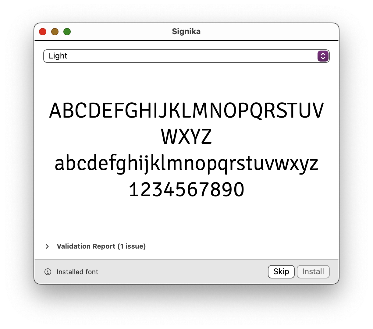
You can use the free OpenDyslexic app to install OpenDyslexic on iOS.
Installing fonts on the iPhone is done differently than on most other platforms. Instead of opening a font to install, Apple requires a provider of a font to create an App that installs the font. Removing the app also removes the font.
On Android, there is no method for installing fonts, but many apps have their own individual methods of recognizing a font they can use.
That is really odd.
The proof pdf might be low quality from most providers, but text should still be sharp. It sounds like at some step, BookWrite or Blurb is rasterizing the pages and rendering as images?
Embedding the font should just embed the actual font, and not have the pdf rendered in this way.
Unfortunately, I no longer have Microsoft Word, and cannot troubleshoot it. I have seen that happen with other fonts in Word in the past, but never had the opportunity to track it down.
There are no OpenType features that would change the font sizes (at least not in OpenDyslexic), and I can’t think of any reason the font itself would do this.
I’m glad Bookwright shows it correctly, and I’m glad you were able to find a work-around. I wish I could have a better solution outside of recommending a different word processor like Pages, LibreOffice, etc.
don’t take this the wrong way, but you could have added information in your original comment that would have saved time.
- Virus scanner that reported the positive
- Any effort you made to see if it was a false positive (scanning with Defender or another product, sending it to McAfee for verification, etc.)
Checking with VirusTotal, and McAfee does not flag this as suspicious.
However, this game was made in ClickTeam Fusion, and ClickTeam does trigger false positives. For example, this thread about Mr TomatoS.
It could also be with how I compressed it way back when I uploaded it Preventing False Positives, ClickFusion Academy.
For the antivirus vendors that did flag this, it seemed to indicate concern about modifying a desktop.ini. This file controls seeing a folder in a list, thumbnails, icons, etc, but also can be used to have a custom icon for an application. Depending on how ClickTeam compiles the game, it’s possible it’s using desktop.ini for the game’s icon.
I’ll upload the game’s actual exe without the setup to make things easier in the future.
Hi!
After installing OpenDyslexic, open the app and tap the button to install the fonts.
Try using it in an application with a font selection after (pages, numbers are good to test with because they do not hide the font choices). If it does not appear, you may need to ensure the app is closed before opening it again.
Not every app uses Apple’s method for checking available fonts. Some still have it hard-coded from years ago. The ones that use the proper methods will show OpenDyslexic in the font menus after install.
I didn’t push myself i promise, but I used some time I was feeling better to make fixes and uploaded it.
I also made a visual timeline of where everything should fit: https://visualdos.com/timeline/
The loop is intentional, but it should have been obvious the loop was intentional. Now there should be extra accessible content, and the loop where selecting the scrapbook causing the scrapbook to be infinite should be fixed too.
Thanks for the feedback! I really appreciate it
I posted an update, i was slower making the fixes, wanted to make sure I did it right lol.
depending on perspective, a more complete one is Visual DOS 2024 Tech Preview, because it contains some of this in it.
But this was the story i wanted to tell for this one, and tech preview is the story i wanted to tell for that one. I don’t know if Ill expand on this, except that in fixing the bugs the story is a bit longer and less confusing (I hope). I might change my mind when I’m feeling better. :)
part of it might be, I’ve been sick with covid.
And reviewing the code I realized a lot of variables are misspelled in the silliest ways.
I’m slowly working on fixing those problems, but the brain fog can be bad and I don’t want to fight through it and release more misspelled variables and bad logic.
Hi,
You can download it by clicking “Download Now” on the project page (https://antijingoist.itch.io/opendyslexic).
You can download the zip file, double click it to open it, and double click each font file to install it on Windows 10.
I don’t think paypal likes me very much, but recently If I’m understanding correctly, paypal doesn’t like itchio very much either.
I appreciate your attempts to donate very much, and it’s all very helpful. But if you’re having issues, please know that OpenDyslexic is free, and you are absolutely able to use it as needed, donation or not.
Sweet! I’ll give that a try.
I’ll try it first on Tech Preview: its an OS running under an emulator, and the emulator is prevented from regaining focus entirely on some platforms. There’s no save (yet) because i haven’t finished the file system, so losing focus can be pretty catastrophic.
I also have the interpreter in tech preview written better so it supports a dynamic man command, and also the /?to get help, and a help commands command to list all available commands.


