That will be fixed next update
A member registered Feb 25, 2022 · View creator page →
Creator of
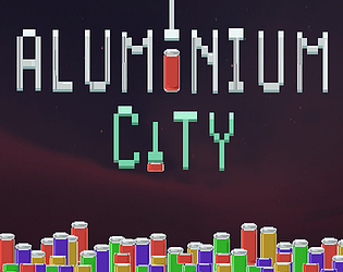
Crush empty cans and sell the aluminium to pay off your debt.
Simulation
Play in browser

Help the Dworfs obtain all the Forbidden Gold to Build a Rocket Ship to Outer Space!
Simulation
Play in browser
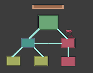
RoadMap es un programa especialmente creado para hacer un seguimiento de ideas o tenerlas anotadas.
Tower defense-like, play as 9 different characters. Every pj has an unique play style. Survive, spent cash in shop
Strategy

A Rogue-Lite, Bullet hell-Bullet heaven game. Kill enemies, Die, Get Stronger and Kill more Enemies
Action