Pretty well made overall (gameplay, art, music), with a few readability issues imo : the text is too small, even on fullscreen (I played in browser), and the shadows casted by the walls feel too opaque : in other games in this genre you can see the difference between walls and shadows, it's not the case in your game and it gave me a weird feeling of claustrophobia.
2 years ago(+1)
Can you clarify what you mean by the text being too small? I've set the canvas to stretch, so it should be the same size on all monitors.
Thanks for playing!
2 years ago(+1)
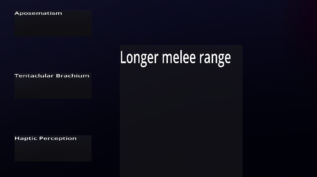
Here's an example of text that's too small :
This is an extreme example because the game is not full-screen, but even when full-screen, the text is still flattened for some reason, and the upgrade description text is squished in the other direction, which is quite jarring.
While replaying, I heard that there are sound effects for information that I did not notice before, it's a nice touch.