Indie game storeFree gamesFun gamesHorror games
Game developmentAssetsComics
SalesBundles
Jobs
Tags
(+1)

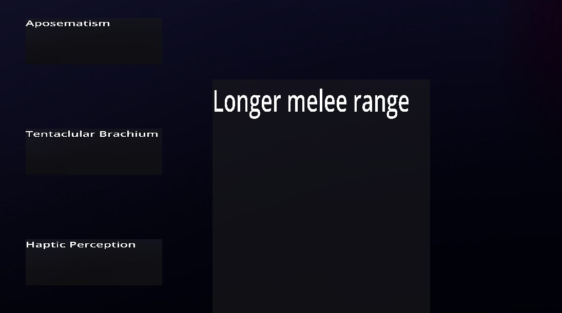
Here's an example of text that's too small :

This is an extreme example because the game is not full-screen, but even when full-screen, the text is still flattened for some reason, and the upgrade description text is squished in the other direction, which is quite jarring.

While replaying, I heard that there are sound effects for information that I did not notice before, it's a nice touch.

Okay, I think I see what happened here. Your aspect ratio is significantly different from the one I set it to by default and it stretched the canvas in a weird way. I'll keep this in mind for future projects and maybe add aspect ratio options. 

Thank you!

I feel like this is not the only issue, because this does not look right (full screen) :

Oh, that screen just looks bad lol. I ran out of energy to want to make it look better before the end of the jam lol