
You might have, or perhaps I just wasn't clear in my explanation, in which case I apologize ^^;
This is a fixed-width or monospace font:
This is a screenshot in an image editor of the file that we made for use with Bitmap Font Pro. Every single character is EXACTLY 18 px wide (the black lines are a grid I set to show with squares every 18px just to prove this) because that's what Bitmap Font Pro needs to correctly figure out how to divide the image up, to know where one character stops and another starts. So even a narrow character, like i or l, takes up exactly as much space as a wide one, like W or #.
This is a varied-with font:
This is approximately what this same image would look like after Bitmap Font Pro converts it. Bitmap Font Pro automatically looks for characters with empty space (such as the aforementioned i or l) and removes that empty space, so this is what's left. This is why it takes up less space on the line overall and why there's a gap on the end. I turned the grid off for this shot because it doesn't line up to said grid anymore.
What we're asking for is that if it's possible to add an option for Bitmap Font Pro to skip the empty space removal step of that conversion and simply take something like the first image there (which we used for the input) and render an in-game bitmap font exactly like that. Rather than changing each letter from 18px to (18px minus whatever empty space it removed,) simply do nothing, leave it looking like that, unchanged, lining up with a hypothetical grid like that, etc.
The appeal of having this kind of fixed with/monospace font is that you know exactly how many characters' worth of room you have on a given line (you don't have to guess and try to account for the fact that typing "iiiiiiiiii" takes up less room than "wwwwwwwwww" despite being exactly ten characters each), and when you have text that goes on for multiple lines, a monospace font lines up with itself in a way that is varied-width fonts don't:
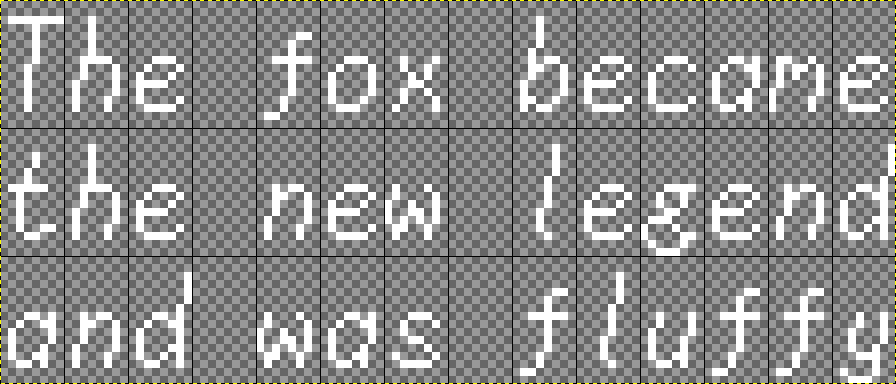
As long as the line has a three-letter word, a three-letter word, and a six-letter word, the spaces in between them line up neatly--every letter lines up neatly, for that matter, regardless of whether it's an l or a w or anything in between. This can be useful for things like displays with a lot of numbers, for example. (For flavor, it also gives the text a sort of monotone "mechanized" feel to it, which could be useful to help convey that mood if one of your party members is a robot or is interfacing with a computer terminal or something?) And it is something that Bitmap Font Pro currently cannot do, as inputting a monospace file like the first attachment here leads to it converting it into a varied-width bitmap font like the second one.