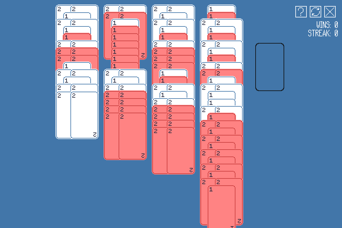
Thanks for the feedback! I wonder if reducing the offset between cards when the stack gets high enough would help - it'd make the cards lower in the stack harder to read but would be a bit more elegant than a scrollbar.
Could you give an example of a situation where the red colour breaks?