Indie game storeFree gamesFun gamesHorror games
Game developmentAssetsComics
SalesBundles
Jobs
Tags
(+1)

Trying the game again in better conditions. Overall I like the base very much but something is not clicking (yet). It would be about situating myself on the board and seeing the elements interacting with each others.

Also it's more personal, but nowadays I like more modern/minimalistic/sober designs for such dense games. I don't think it's incompatible with having a style and identity (thinking more of the AAA japanese approach than the typical occidental open world game for exemple).

I'll be happy to retry the game in the future.


Things I like :

  • Sound Design
  • Screen / Phases transitions
  • Fluidity of Action
  • Visual Effects (simple but effective so far)
  • The whole randomisation theme

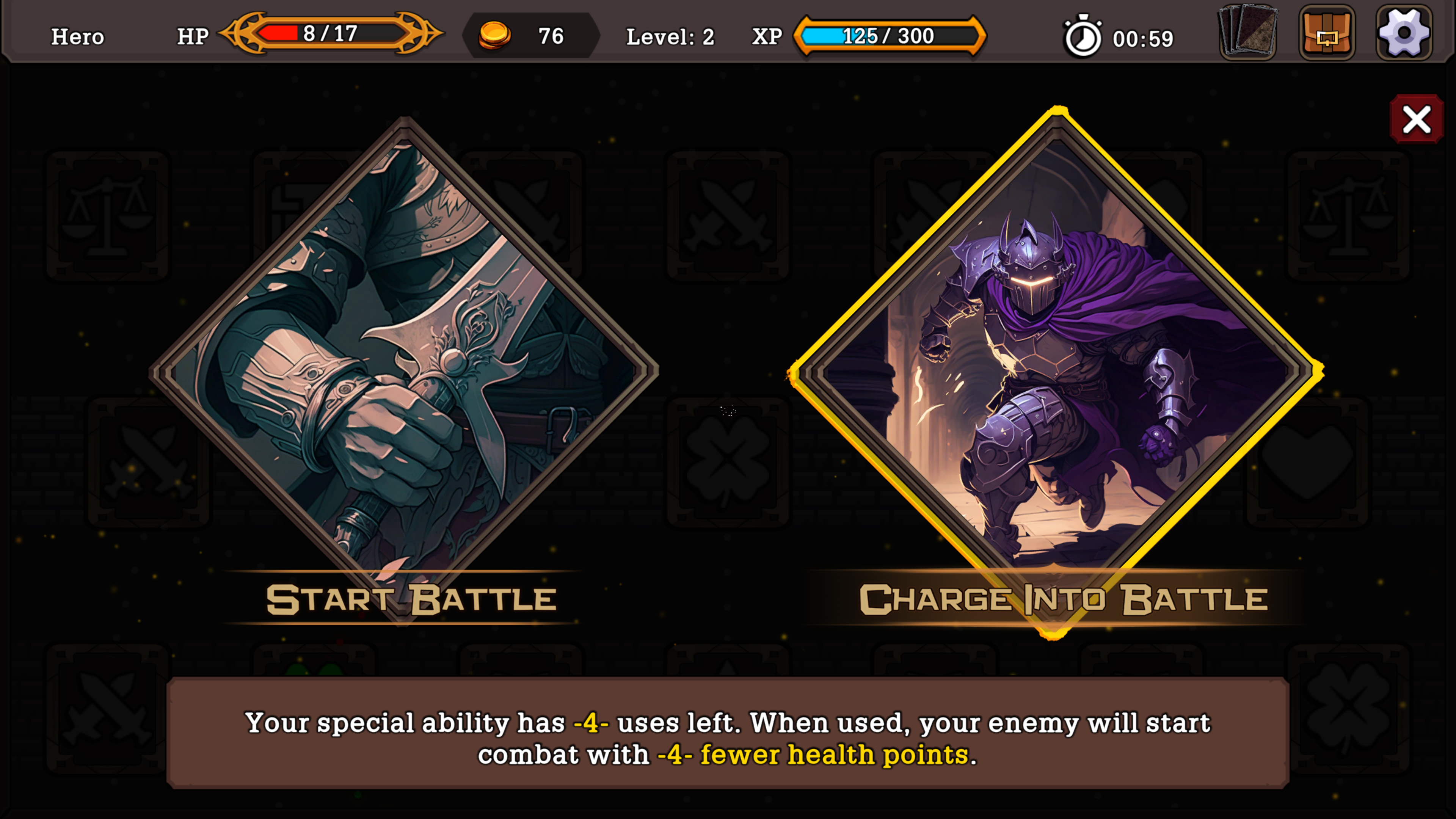
Things I'd like to see :

  • A smaller HUD/Interface, or a slider to reduce its size. I think it could serve the game aesthetics, make it more sober and serious
  • A more sharp and serious looking main font
  • Less different fonts so the game elements are more quickly acquired visually, partitioned, and don't clash between each others
  • Better card "hitbox" when they're in your hand so the hovering put them forth more smoothly
  • Better visual separation of the card Title and Type
  • More distinct frames for different card Types
  • Not sure the mouse wheel to display a fixed frame of hovered card is nice. I'd like to just hover cards and have them being zoomed a bit so I can see them better. If I have to right click it would be to really admire the card and contemplate it for a long time, or think hard
  • Maybe having the active card and the discarded card piles facing each other and being differentiated would help me better situating myself. Would allow for less mouse traveling too when countering a spell for example

Thanks for playing and leaving a comment, fren.

I agree with your comments about having a more sober design, but I'm meeting my limitations here since I'm very untalented when it comes to art and overall UI design. While I understand that something cleaner would be better, it's very hard for me to pull off, so I rather spending my time improving the mechanics and gameplay loop for now and maybe revisit the idea of giving the game a fresh coat of pain at a later point.

I will try to implement adjustable HUD sizes in the future, things might be a bit too big since my eyesight is not great and also I spend most of the time deving on a smaller screen that I should, so I might've overcompensated for this fact. Again UI design is not one of my fortes, so this might take a while to be implemented.

I'm in absolute shambles about the font because this is the "new and improved" font. Finding and choosing the right font is a Sisyphean task for me, I'm open to suggestions if you have any.

I've tried hover to zoom before but it ends up being too chaotic since you end up zooming stuff you didn't meant to half of the time.

Regarding the other visual changes you suggested and the repositioning of the graveyard and stack, I will keep them in mind and see what I can do to improve those aspects in the future.

Thanks for your feedback!

(3 edits) (+1)

If the HUD thing becomes a real block later in development, there's always the possibility on finding a freelancer with a portfolio meeting your design choices. You provide him a screenshot or two, and ask him to tailor it (using keywords like I did to you). You're right on focusing on gameplay so far tho, card games are for brain players first and eye players come later.

If font is something you hear several times, I'd suggest going for less fat characters, and a tiny less round. And again playing with their size relative to their frame. Then try to see concordant aspects of each different fonts if you still mix many.


This for exemple : Bottom description is almost as big as the big Action font. The bottom font could maybe pass if lower size to begin with. But the Action font has characters not parallel (check the T and B). Makes it cartoony and fun. Your game is supposed to be entertaining, not the font. When you enter in game it's a big clash between all of them. The card description looks ok so far compared to the rest. If you can't lower the size of that, you would need to redo the card design to have more vertical space. Totally doable if you make your dungeon interface less big.

Don't know if you remember but to me your game reminds me a lot of Monster Train for some reason. I don't like (while appreciating and respecting) the artstyle. But it's a bit cleaner and partitioned to me. On top of my head I'd say take inspiration from Artifact, FORCED SHOWDOWN. Slay the Spire might not be a great candidate. (Edit : and simply modern AAA game with minimal interface, without going soulless. Get references from Japanese AAA)

Only my opinion, see what you can do as you go.