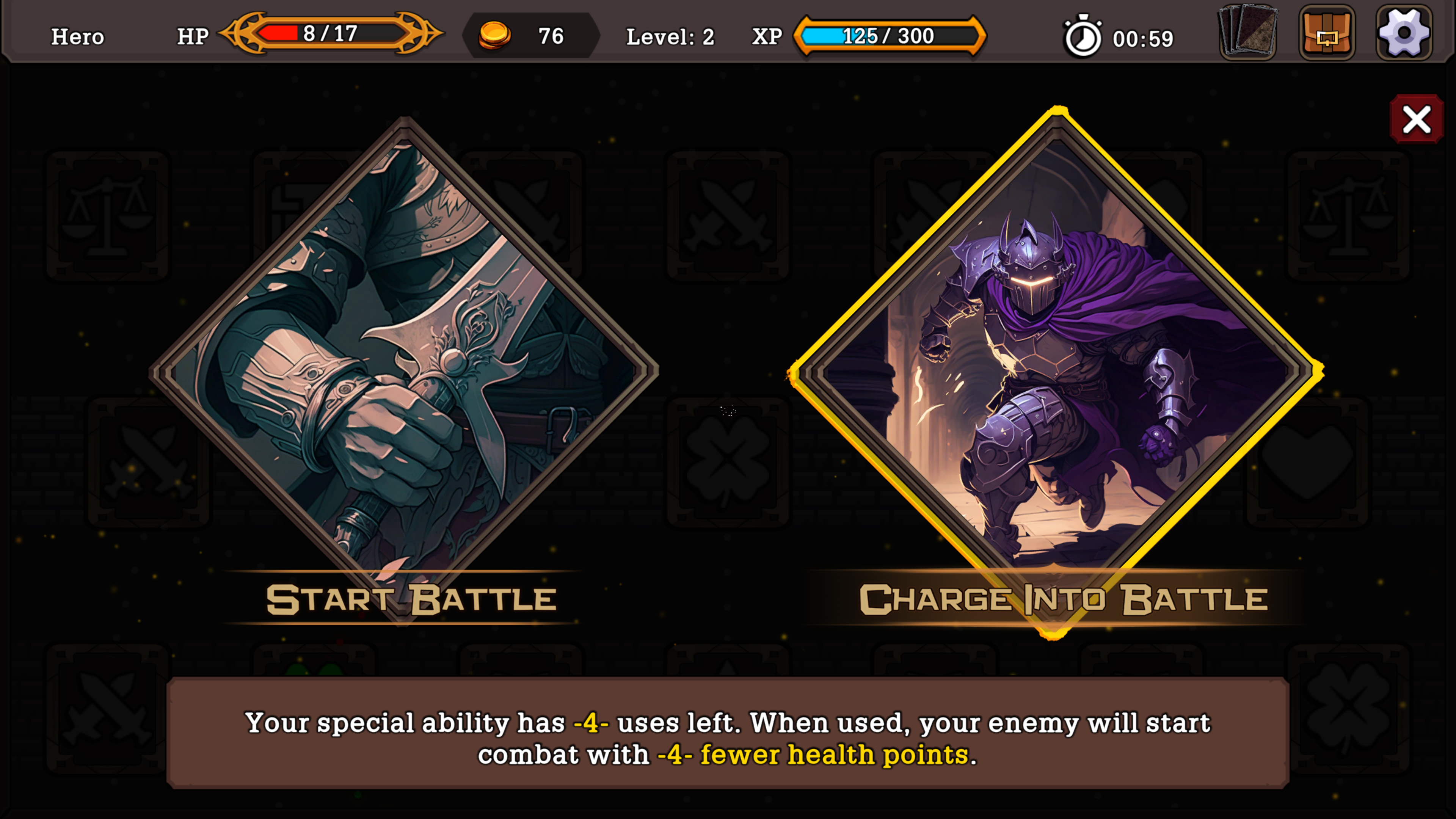
If the HUD thing becomes a real block later in development, there's always the possibility on finding a freelancer with a portfolio meeting your design choices. You provide him a screenshot or two, and ask him to tailor it (using keywords like I did to you). You're right on focusing on gameplay so far tho, card games are for brain players first and eye players come later.
If font is something you hear several times, I'd suggest going for less fat characters, and a tiny less round. And again playing with their size relative to their frame. Then try to see concordant aspects of each different fonts if you still mix many.

This for exemple : Bottom description is almost as big as the big Action font. The bottom font could maybe pass if lower size to begin with. But the Action font has characters not parallel (check the T and B). Makes it cartoony and fun. Your game is supposed to be entertaining, not the font. When you enter in game it's a big clash between all of them. The card description looks ok so far compared to the rest. If you can't lower the size of that, you would need to redo the card design to have more vertical space. Totally doable if you make your dungeon interface less big.
Don't know if you remember but to me your game reminds me a lot of Monster Train for some reason. I don't like (while appreciating and respecting) the artstyle. But it's a bit cleaner and partitioned to me. On top of my head I'd say take inspiration from Artifact, FORCED SHOWDOWN. Slay the Spire might not be a great candidate. (Edit : and simply modern AAA game with minimal interface, without going soulless. Get references from Japanese AAA)
Only my opinion, see what you can do as you go.

