Indie game storeFree gamesFun gamesHorror games
Game developmentAssetsComics
SalesBundles
Jobs
Tags
(+1)

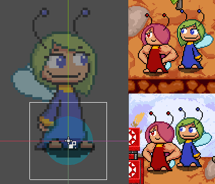
I'd played the game before in a previous build before the art swap, and it's still as solid as it was. Now that you've gone and updated the art though, I've got a couple nitpicks that you'll maybe be interested in, amongst a couple other things:

- The player hitbox is weird; it starts at the shadow and goes up some distance. You have a nice circle at the base; why not center it around that? It would make more sense imo. But I guess then you'd need a different hitbox/target point for the tongues maybe.

- I keep waiting for the level titles to transition automatically. Maybe you could add that in, but maybe it's just me.

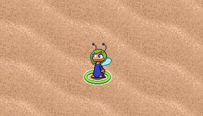
- The pixel-perfect option seems to not hold true, unless it's just for scaling. Clouds and characters move off the pixel grid.

- I think the upscaled clouds at the bottom of the title screens are very jarring.

- The sand tiles feel too noisy

I've gotta say the art is very charming now, although I'll miss the smug energy of the old blue fairies! These animations are very good.

Thanks for playing again and the feedback! I appreciate the nitpicks, polishing is very important for me at the moment. 

- The fairies hitbox are a doozy. The fairies are in profile view in a top-down world, which doesn't make any sense and causes troubles. The hitbox is a circle which fits nicely in width of the sprite, but not in depth. What you noticed is the sprite offset.


Here you can see the fairy feet are slightly below its origin. This is so when they are touching the bottom of a tile, they look close enough to it. In the pictures to the right, I modified the blue fairy and its shadow to be in the middle of the collision circle while the red fairy is how she currently is in game. Notice how the blue fairy looks very far away from the tile boundary in the top picture. Maybe it is just me, but such a big separation felt off. Meanwhile when both are on the top part, both have a separation from the top but even when the red fairy looks much farther away, it is doesnt feel very strange.

Did the collision feel weird when interacting with buttons and levers? That is something I have to update and maybe making them graphically smaller will fit the fairies collision better.

- You are not the only one that felt that way. I will add a timer which will load the level after a brief wait.

- Pixel perfect only does something in "maximize" and "full screen". In anything but zoom x1 there will be some pixels off the grid. I have tried to change it but didn't manage to fix it. I still have to tinker with this. At least the sprites don't get deformed when pixel perfect is on.

- Yeah, you are right. I should replace them.

- From all the things I tried, making it noisy looked the best. It is sand after all and the fairies are tiny. Maybe if I was more skilled I could pull off something better. I might adjust the contrast between sand grains a bit though.

(+1)

Yeah, I understand what's going on with the hitbox, it's just that for me it's the opposite. I think the blue fairy looks better aligned (though I think you should keep the shadow positioned relative to the sprite not the hitbox). Interacting with stuff indeed felt a bit off for the same reason to me.

I think for the sand, something resembling a dune-y texture would work better. Something with a wavy shape and two tones, like this perhaps? How Fish Makes Textures [Semi Realistic Planks 2/12/2012] - Resource Pack  Discussion - Resource Packs - Mapping and Modding: Java Edition - Minecraft  Forum - Minecraft Forum

> Yeah, I understand what's going on with the hitbox, it's just that for me it's the opposite. I think the blue fairy looks better aligned (though I think you should keep the shadow positioned relative to the sprite not the hitbox). Interacting with stuff indeed felt a bit off for the same reason to me.
Ok, maybe it falls into personal preference, but I will keep an eye on this in the future.

>I think for the sand, something resembling a dune-y texture would work better. Something with a wavy shape and two tones, like this perhaps?
I tried something like that. The issue was that it made the fairies look human sized. Right now the sand does have some waves to it though but they are on the larger side of things. Maybe the effect could be improved a bit.