
I’ve seen all three ending and i think that the neutral and good ending feel “rushed” compared to the worst ending. It’s like the talk with the wife comes as “Divorce? (Silence). Cool, bye.”, while there is so much detail in the scene with the lover.
I assume this is just because of time constraints, nothing more.
I am a bit perplexed with the art, because it looks like it was done in Microsoft Paint, but on the other hand that fact gives them so much personality that they become good. (I do not know if you actually used Paint, and i am just referring to the style, as it looks like a submission for Paint Jam; no disrespect intended — they are cool, is all i am trying to say.)
I have a problem with reading the text depending on the background’s color, but just on my main monitor. Once i switch to the secondary, I can read it perfectly well. I tried to edit a screenshot to show you how i see it on my main monitor:
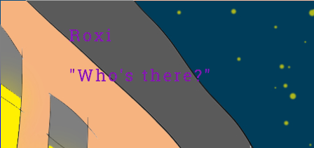
The violet look darker on that monitor and kind of blends with the background.