
although i've already played this game, i felt like leaving a bit of a longer review
sadly i didn't get past level 4
the art was ok, it could've been better.
i really liked the visual cue for when the die has reached the goal
some art tips if you're interested:
for game art and especially pixelart it helps to have a very reduced colour palette that you use for the entirety of a game or level.
this, for example, is an early version of the colour palette i used for my game
other than that, i recommend looking at colour theory, and trying to see colours for what they are instead of your idea of what they should be.
for example, a white chair could be pink, it could be green, it could be black, it could be brown, it could be all kinds of colours, all that depends on what light is actually illuminating the chair.
you can exercise seeing colours for what they are by looking at images, picking some random part of an object, opening a colour picker and trying to replicate its colour, and then seeing how far off you were.
very important thing if you want pretty art: strong, realistic, lighting makes images look pretty.
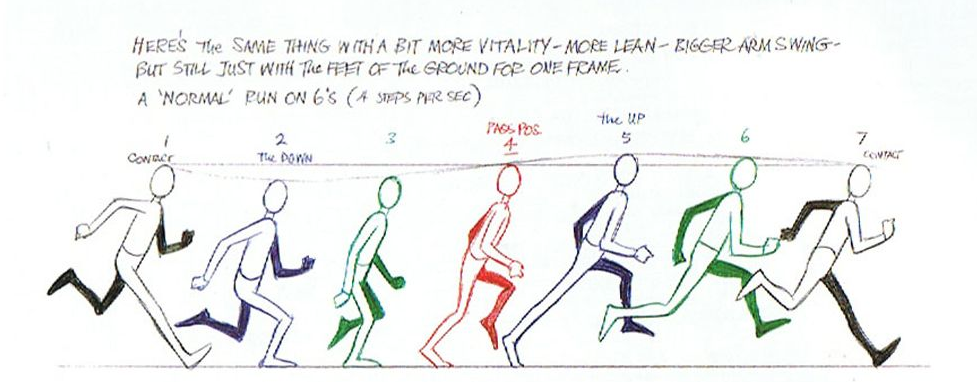
seeing some animations would've been nice, when it comes to running animations there's an image that i used to make my character's running animation. you might find it useful.
i would've enjoyed more sound effects in your game, i think that would've given it a way more polished feel. i'm glad that it's something you're already planning to add in the updated version.
the level design was a bit problematic imo. the way the level works has too many variables and as such is quite unpredictable.
i like that you had many movement mechanics in the game and instructions on how to use them, the font could've looked nicer though. it's a font i'd expect to see in a word document, and not a game.
what might've been even better would be explaining them with symbols instead of text.
it was a good decision to not mount the camera on the player but have it be static instead. for puzzle games seeing the entire level is probably a good idea!
more levels could've been added, but this is a gamejam game. it was not meant to be a final product.
as such i personally would've first cleaned up the existing levels before adding new ones.
it's the experience that matters, even if it's short
very adorable penguin character.
if you're planning to make games in the future it would be cool to reference him in those.
overall this game was actually quite enjoyable.
i just want you to know that for your first gamejam game, you did significantly better than me.
last year i did not end up uploading anything.
good job!