Indie game storeFree gamesFun gamesHorror games
Game developmentAssetsComics
SalesBundles
Jobs
Tags

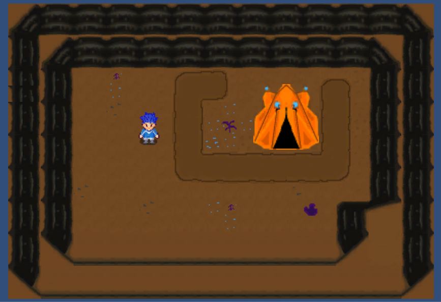
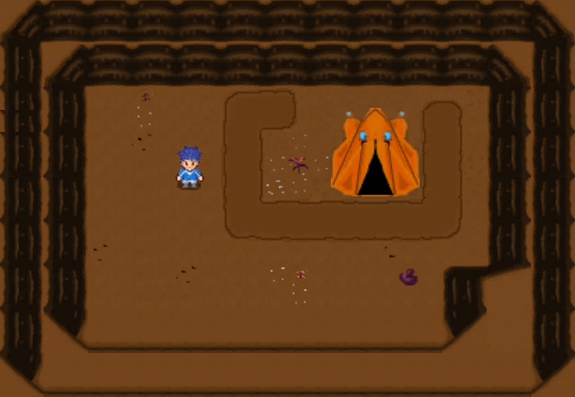
Here's the gist of what I've got so far. The tent and the bottom row of walls is just a rough draft but the rest is pretty much final cut.

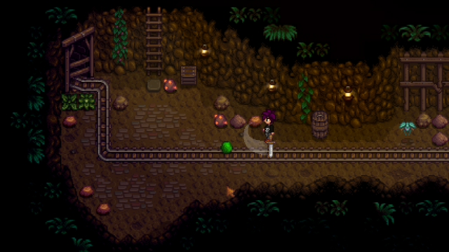
I think the colors are pretty dynamic personally. As far as graphics I'm going for the feel of harvest moon, with the aesthetics of Pokemon.
It's gonna be an underground SCI-FI


I think the ground could have more going on and more contrasts with the little rocks and plants. the tent and the protagonist's hair seem too vivid compared to the background.

The background also could use a single tone of color to bring more focus to the protagonist.

I tried to represent what I was saying but you might have a different opinion on how to handle these subjects.


Stardew Valley has nice cave designs you could use as inspiration:

(4 edits)

This is the effect and layer look I want. I want it to be a mining game where you mine down 4-5 levels.
I really like what you did with the stones, but I kinda liked my background even though I have to agree that yours does add more emphasis to the protagonist. Is that important?
Also, I was going for the vivid buildings to kinda have them stand out, but now that you say that, they really aren't important in the visual field.
I'll change them, thanks! :)

Oh, I also plan on adding robots as minions. As far as color, I'm guessing you would say they shouldn't stand out very much from the background?

Also, how did you change all those wall tiles to brown so fast? I use paint.net and it would take me an evening or 2 to redo all the colors because I would do it individually.

Sorry for the late reply, it was late in the evening when I remembered to check my inbox.

Emphasizing the protagonist is important but not constantly needed. With one light color and one dark color, the design helps itself in most backgrounds. Again, the player just needs to know where their character is on the screen.

You can keep vivid buildings as long as they're distinct from the protagonist and other objects/characters. Earthbound 3 has vivid buildings as well, but the characters have black lines around them so they don't blend into the background.

The robots can still have noticeable colors but do avoid using colors that can be confused as the protagonist's. You can still use blue for example, but you could resort to a more purple-ish blue or a less saturated blue.  Just remember light, saturation and color can be helpful in indicating what's important in a scene. Like how pokeballs with items in them are vivid red even in a cave.

And the caves' ground would benefit from some kind of seamless, non-intrusive pattern to become more interesting.

I used to draw with paint net as well but nowadays there are more art programs available.
I now use paint tool sai 2. I selected anything other than the protagonist, rocks and tent, and applied a layer set to "Color" with brown over the selected part.
I recommend firealpaca, or even Krita for a free alternative if your computer can handle it, in mine it's a bit slow but gets the job done.

I'm off to sleep for now, I'm on a different time zone but feel free to leave a reply whenever you want.
I don't often check itch io but I do have a deviantart account with the same name, but without the exclamation point in this username.

K I'll make some edits and get back to you on how it looks :)
Thank you, thank you, and thank you again for all this Auapaulo! You're a God-sent, and God has definitely blessed you with a lot of talent when it comes to art my friend!
Oh, and have a merry Christmas :)  (and don't forget that Christ is the reason for the season ;)

Thank you very much, have a merry Christmas as well! :D

If you need any future remarks on your comics give me shout! :) 

Would be a pleasure :)

Thanks! I won't be as active until next year but then I'll surely start posting on my deviantart the revamped story!