Indie game storeFree gamesFun gamesHorror games
Game developmentAssetsComics
SalesBundles
Jobs
Tags

JKleinsasser

11
Posts
A member registered Dec 14, 2018

Recent community posts

If you need any future remarks on your comics give me shout! :) 

Would be a pleasure :)

K I'll make some edits and get back to you on how it looks :)
Thank you, thank you, and thank you again for all this Auapaulo! You're a God-sent, and God has definitely blessed you with a lot of talent when it comes to art my friend!
Oh, and have a merry Christmas :)  (and don't forget that Christ is the reason for the season ;)

Also, how did you change all those wall tiles to brown so fast? I use paint.net and it would take me an evening or 2 to redo all the colors because I would do it individually.

Oh, I also plan on adding robots as minions. As far as color, I'm guessing you would say they shouldn't stand out very much from the background?

(4 edits)

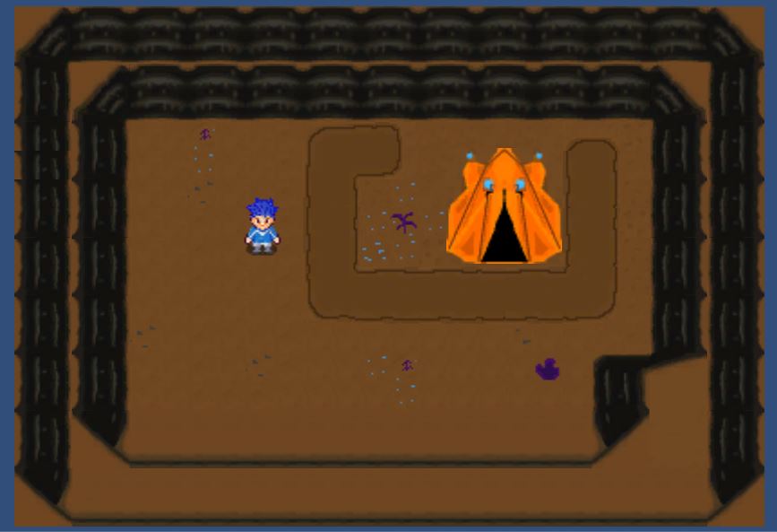
This is the effect and layer look I want. I want it to be a mining game where you mine down 4-5 levels.
I really like what you did with the stones, but I kinda liked my background even though I have to agree that yours does add more emphasis to the protagonist. Is that important?
Also, I was going for the vivid buildings to kinda have them stand out, but now that you say that, they really aren't important in the visual field.
I'll change them, thanks! :)

Here's the gist of what I've got so far. The tent and the bottom row of walls is just a rough draft but the rest is pretty much final cut.

I think the colors are pretty dynamic personally. As far as graphics I'm going for the feel of harvest moon, with the aesthetics of Pokemon.
It's gonna be an underground SCI-FI


Let me know how you like it. I found it quite simple and fun :)

I was just wondering because I'm working on a game  currently with a friend of mine and since it more a hobby thing I'm in charge of the art even though we're both programmers :P lol.
I've gotten decent at it but all I'm doing right now is drawing it roughly in 320x 320 and then resizing it and letting the algorithm do all the work for me :D
I would very much appreciate some tips if you wouldn't mind

Now that you mention you were cramming in I do find that some of the panels were quite intuitive in getting a lot of stuff across quickly.
I remember actually liking the one panel where you have just the faces with straight back and forth dialog.  I liked that because it's a nice flow of quick humorous dialog, uninterrupted by anything. Putting that dialog in through 4 panels or so would have totally ruined it.

Btw, do you know anything about pixel art?

My unprofessional opinion. I downloaded the entire booklet and here's what I think.
1: There's a lot of dialog. I'm not sure there is even that much or if that font is hard to read but there' s definitely a lot.
2: I Love the art!! Lots of talent there. Making me jealous.
3: Story flow could use some help. seems a little choppy and sometimes I was confused by what panel came next.
4: Sense of humor was pretty good. With the flow of the story fixed it would be something I would read.
5: Plot was a little bland. It was fun, but also kinda repetitive after a few panels. (Nothing ever serious)

Overall I would rate it as such.
Art- 10 /10
Humor- 5.5/10
Plot- 5/10
Flow- 4/10

What needs the most work is the flow of the story as the panels show it, and definitely add a more serious tone to  it sometimes.
Very good job though.

PS: I hate sexy anime, but that's just my opinion as a Christian. Keep up the good work!

Personally after trying a couple different ones I ended up using Paint.net with an animator plugin. 
Simplest workflow and surprisingly efficient