Got 1rst place :D. I just wish the playing area was in the middle of the screen, it was very stressfull not to be able to see further on the sides / below. Good job !
Congratulations! And thanks for the comment too.
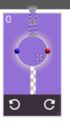
I tried to place it mostly on the center but I know there is a little less space on the sides than up and down. Did you feel that it was also not in the middle in vertical axis? Would you consider it better if the whole game was zoomed out a bit? I tried experimenting with this earlier but zooming out also makes everything look smaller on the screen which also makes dodging projectiles difficult. The problem is finding the right balance.
3 years ago(+1)
I felt like there was enough space on top / bottom, maybe just making the resolution something like 10/8 will make room for the ui (20%) below and give the player a square shaped playing area.
The playing area is smaller on the top, so i was mistaken but you can see it here.