Unplanned improvements feel awesome!

I didn't plan on doing much to the game as we're so close to the end. I didn't want to stuff something up or get caught mid way through something. However, I got on a role and had some great progress. The only down side to this is I'm up late again and I'm going to pay for that tomorrow.

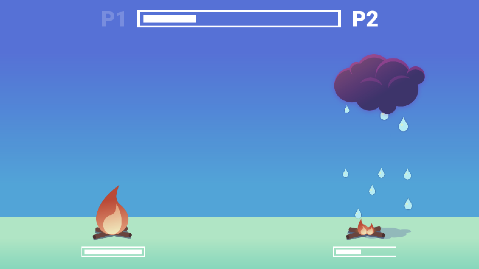
New art direction
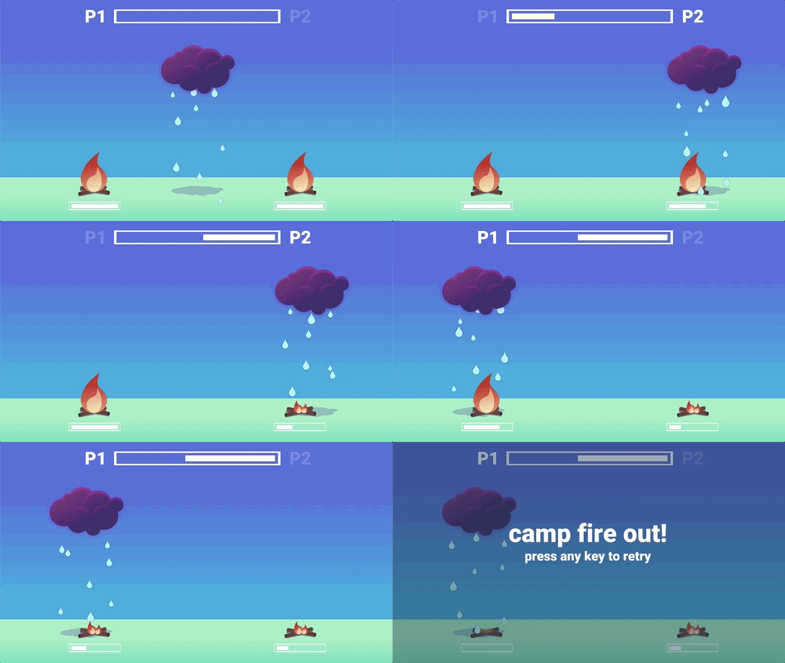
I didn't think I'd get time to update the art but I'm glad I did. It was very dull and boring with the placeholder assets. I was worried I'd struggle making it dark and gloomy while still appearing lighthearted but I think I've done ok capturing that in the new cloud. Let me know your thoughts on progress with the new art direction! (Here's a GIF with crazy banding)

Big UX win for player turns
Another change I got to make and wasn't expecting was related to how players build up their next shot. I knew how I wanted it to play but after a brief playtest today with a workmate (thanks, Rob) he said exactly what I wanted to do, without being prompted. That inspired me to have a look at it in spite of not wanting to touch the code from here on.
I figured it out (quite easily, which was odd) and in the process removed around 20 lines of code. <feelsgoodman.jpg>
Tonight's progress
- Complete colour palette overhaul
- Added shadow to cloud
- Updated art assets
- Added ability to hold button to power up next move whilst previous move is still in motion (big UX win)
- Added 3 visual stages to fire assets
- Player settings configured, ready for build (icon will need revisit with updated visuals)

