Well, look:
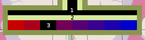
What's in red - is red component, what's in blue - blue component.
And what's in green - is all the same color all the time. Effectively, you don't have to look at the top part of the tap, as it's just a supporting graphics. You can play only looking at the black circled rectangle. And at the boy's status, that helps a lot.
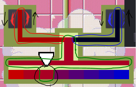
Yeah, I've given the game to another person to test, and she caught the way pretty fast, and found even better strategy than the one I used the whole time while testing. The only problem she reported was no signs on the buttons. That's why I added some arrows and rearranged buttons, to "open" counter-clockwise. _I've literally just realised, and the arrow facing down, which is meant to "close" the handle, is actually facing the same "oppening" direction xD_ But if I'd made it looking up, as clockswise "closing", that would just leave us with 2 buttons showing "up" (hence - "increase"), which would be even worse.
So, we have 1 up - more - and 1 down - less - button on each side, and a nice reck just in the middle in gamma, to easily spot if it's redder or bluer than needed.
I'm guessing it's just terrible design and graphics, if this is not as intuitive as I supposed. I'm really bad at those, sorry(