Indie game storeFree gamesFun gamesHorror games
Game developmentAssetsComics
SalesBundles
Jobs
TagsGame Engines

I gave this version a try and here's some feedback:

- The SFX that plays when summoning is too loud (the "ding ding ding")

- The AOE projectile attack from the slime felt a little too strong. Maybe I was using weak characters but one of those attacks almost killed 2 of my party members.

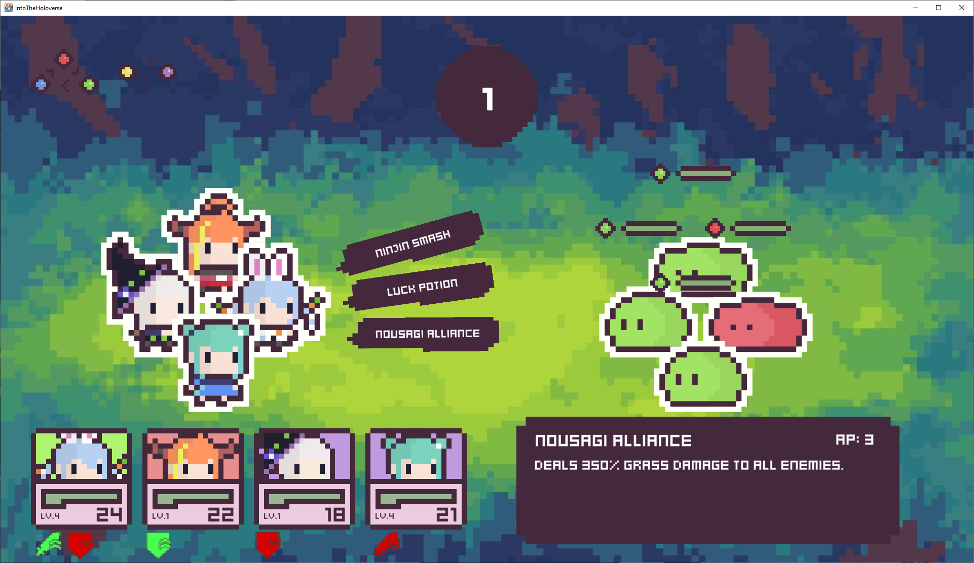
- It's not evident if the character/enemy has an active buff or debuff, or maybe I'm blind. I know clicking on them opens a new window with details, but I think it would be nice to have a little icon or something on the battle screen or hovering over the character.

Can't wait to see the skill icons. :D

Thanks for the feedback! Currently the shuriken slime is a joke slime implemented for the discord members who are saying combat is too easy!

Buffs and debuffs generally get shown once, like a red line effect, etc. Still trying to figure out a way to show buffs wihtout making the main combat scene too convoluted or ugly to see.

Maybe something like this under each character card?


Should they only show stat changes like attack, defense, evasion, criticals or should they show statuses like poison, stun, etc. 

(+2)

I think stat changes would be good as icons with positive and negative variants.

Status effects like poison, stun, burning or others could be represented on the character sprites themselves. For example: burning with a red color tint, poison with the typical green bubbles and stun with spinning stars on their heads.