Indie game storeFree gamesFun gamesHorror games
Game developmentAssetsComics
SalesBundles
Jobs
Tags

Hey! I'm so glad to hear that you loved the art style, I put a lot of energy into making it look as nice as I could (see here!).

I agree that top down would have made more sense, but the 2.5D view allows for more artistic expression as there are more surfaces that can be drawn to add contrast and readability to the environment. I can see that it has made it harder to pick up items that are blocked though. It was actually next on the todo list to make the selection glow of items show through hedges but I ran out of time. 

But thanks for playing! Do you have any other suggestions? 

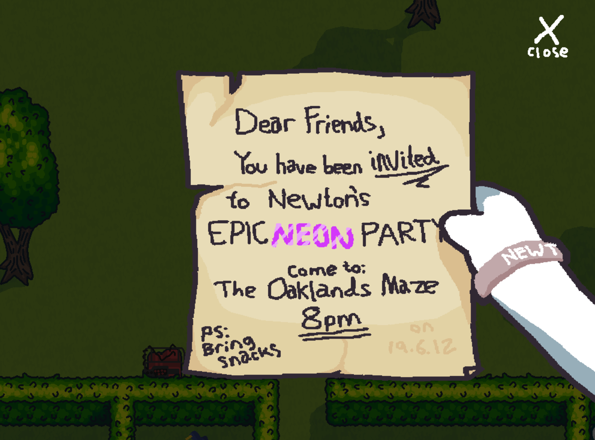
No, there is nothing else I would change, I think it's great! If you can make the visibility better while keeping the angle the same that would definitely solve my issue with it. Maybe one very minor thing is you can have the pick-up button also skip the intro, instead of the close button. That didn't catch my eye for a few seconds.

(2 edits) (+1)

Well hey that's great to hear!

I'm not exactly sure what you mean, initially I thought you meant that the controls were visible on the party invite screen which made it harder to notice the close button, but they're not.

Do you just mean that the close button should be more obvious? Perhaps it it was moving, so it catches your eye?