Indie game storeFree gamesFun gamesHorror games
Game developmentAssetsComics
SalesBundles
Jobs
Tags

Advice for foliage thumbnails.

A topic by coffeeANDsoda created Feb 26, 2018 Views: 570 Replies: 8
Viewing posts 1 to 5

I was practicing refining my ability to create foliage using krita. What advice could you offer me to improve upon them?

Thanks.


Admin

I'd say there need to be more defining characteristics. Consider making distinct shapes for individual leaves and chunks of grass. For the dirt you can spend time making the texture sharper, or adding details like rocks and different clumps of dirt.

Look at any of the many guides floating around on pixel art color theory. I specifically recommend reading it from the context pixel art, because a lot of guides use limited resources (3-4 colors per object), which then places emphasis on things like contrast, effective colors, and composition.

Your grasses just look like blurry brushstrokes, because that's exactly what you've done - you need to refine it and add detail if you want to make it pop, and this is true of any artwork, not just digital drawing.

(1 edit)


Your grasses just look like blurry brushstrokes, because that's exactly what you've done - you need to refine it and add detail if you want to make it pop, and this is true of any artwork, not just digital drawing.

Even for this image?

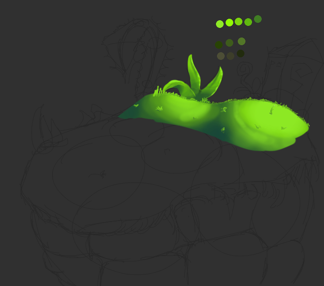
There's more  detail there, sure, but individual objects are hard to make out.

I look at the main area and see a gradient or two, so those must be rolling hills. It bleeds onto the rocks a bit, so that must be long grass?  I see shapes that suggest shrubbery, and what appears to be a vine of some sort to the right? Looking at the image as a whole feels difficult because so many elements just blend together.

The color range is good, and even the blending isn't too bad. But it would greatly benefit from having edges around your grasses, etc, to define them better, as well as simple shading.

Leaves or parts of grass look like is to add more to it. Not to add weeds, or flowers.

This is sort of what I was describing. While my blending isn't the greatest, it should give you a good idea of what I mean. Try to add more detail to individual objects, and use light and shadow to give more contrast to things so that they appear differently from their neighbours

Similar to this study below? It's hard to see your foliage, looks too small.

As well as this one.